 2011-12-20, 04:45
|
Link #1 |
|
Criminal Unrequitor
 Graphic Designer Graphic DesignerJoin Date: Jul 2010
|
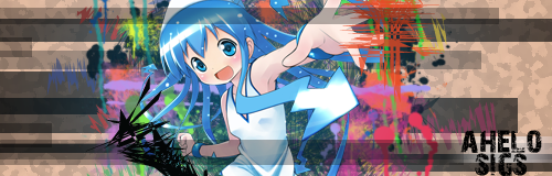
Ahelo Sigs
Well its time for me to finally open up my own thread in FC.
 I'm pretty sure I'm a beginner. I only started PS 3-4 months ago so I'm sure you'll find my sigs a bit rough in some parts, but I did work hard on them so. . . please be kind I guess (though I definitely appreciate C & C). The banners I made for AnimeSuki. Spoiler for Animesuki Banners:
I also made three sigs to start my thread off: Spoiler for First legion of sigs:
Spoiler for After 4 months!:
I guess if you think I'm good enough for you  I can make a signature for you. Just PM me and send me the image you want me to turn into a signature and I'd be honored to make one. I can make a signature for you. Just PM me and send me the image you want me to turn into a signature and I'd be honored to make one.So for now 
__________________
Last edited by ahelo; 2012-04-17 at 08:13. |

|

|
|
2011-12-20, 06:13
|
Link #3 | |
|
Criminal Unrequitor
Graphic DesignerJoin Date: Jul 2010
|
Quote:
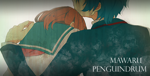
The butterflies on Sawako though are brushes
__________________
|
|
|
|
|
|
2011-12-20, 06:25
|
Link #4 |
|
Sleeping
Join Date: Sep 2011
Location: psn
Age: 12
|
Ahh ok", I think there is an import option for illustrator to photoshop aside from kapepasting!
im not using illustrator that's why i asked", your works are great but i think it needs more time and become more stylish", but please don't make it seriously lol",
__________________
|
|
|
|
|
2011-12-20, 06:36
|
Link #5 |
|
Senior Member
Graphic DesignerJoin Date: Jan 2011
Location: Brazil
|
Just a tip, when putting a render at the sig, try just not put the head.
And since you're new try varienting styles, and reading tutos, i really recomend smudging for the beggining since it is a very easy basic techinique But Good Luck for your galery,and welcome to FC ~
__________________
|
|
|
|
|
2011-12-20, 13:23
|
Link #7 |
|
Quietly Lurking
Graphic DesignerJoin Date: Mar 2010
Location: Beneath the prodigious sky...
|
Welcome to the FC subforum!
Your sigs are very nice considering how new you are to everything! You have an interesting style, but in order to develop it more, try varying the width and length of the rectangles more (like in your most recent one but even more), and also try experimenting with clipping masks and other shapes/tilting the rectangles. Also, make sure to work on those fundamentals (lighting, flow, typography, focus, depth, etc.) Here's a tut I found very helpful. And keep experimenting and practicing!  Oh btw, have some cookies! 
__________________
|
|
|
|
|
2011-12-21, 04:51
|
Link #9 |
|
Criminal Unrequitor
Graphic DesignerJoin Date: Jul 2010
|
@ Renrir
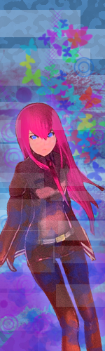
Thanks for the tutorial link, I'm trying to learn some stuff from it right now. @ Endless Soul Sawako is a perfect girl for sig-making. Plus she's totally one of my favorite female characters.
__________________
|
|
|
|
|
2011-12-21, 05:15
|
Link #11 | |
|
Criminal Unrequitor
Graphic DesignerJoin Date: Jul 2010
|
Quote:
I love Yune. I'm glad someone liked my Yune Sig for the Sig Contest
__________________
|
|
|
|
|
|
2011-12-28, 12:38
|
Link #20 |
|
Strangely dependable...
Join Date: Nov 2006
Location: some random place out there...
|
I'm so late but Welcome to FC! *cookies!*
You have a very interesting style here - very unique and a great start to sig making. I really like these two sigs you made:   Love the colours and shapes you applied in them. My only suggestion is you should add some lighting to your sigs. This will give them greater depth and bring out certain elements in your image to catch the eye even more. Overall, though, very lovely. I look forward to seeing more from you.
__________________
|
|
|
|
 |
|
|


 :|::|
:|::|