Comments and rating (0-10 which translates roughly to: "oh, a lonely pixel" - "I'ld scrap my current signature for it"). Beware I am in a ranting mood today *puts on his angry face... okay lets get this started*
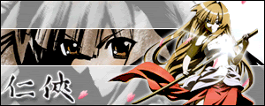
1. Reith: I think she lacks some fighting spirit. Pose and setup of background is nice. But the whole character has an outlining. So the character does not seem to integrate in the background. Furthermore there is much grain/noise.
(6)
2. Bearshare: The ambient lighting is very nice. The character lacks a little bit fighting spirit. It appears rather soothing to me. A thick black outlining is usually used in obituary notices in newspapers

(8)
3. KholdStare: I can feel the fighting spirit. The size of the sword appears unreal and impractical, but thats not going to influencing my vote (having a broad sword myself - and knowing its heavyness, I can't help but feel amused when I see your entry). Tha card background is an interesting one. I miss borderlines on the sides (like the horizontal 1px lines). The font-shadow effect makes the text appear in front of the character. Though the character is more important and should therefore be in front.
(6.5)
4. CrowKenobi: Border, background, character, pose, font, cholor-scheme and lighting are very nice. Though her left eye is blurred too much imo.
(8.5)
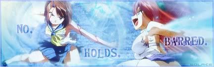
5. Cyz: Hm, looks more like a catwalk scene with weapons... the fighting aspect is quite implicit/indirect. Pose and background setup are okay. I think the two iconsize images look very separated from the background.
(5)
6. Spectacular Insanity: The blurred out background is rather dull. The remaining signature is nice, but oh... the background.
(5)
7. Ice Climbers: I can sense the fighting spirit, even though she will cut her own hair using the sword like this

. The background is a little too white washed for my taste. But more important is the overall impression which is nice.
(7)
8. reflection: Well, its a little too overloaded with effects for my taste. It might by better to not use text, if it is unreadable anyway, now its quite confusing. This surely does sound like a lot of bashing, but it is actually not so dramatic, the overall impression is nice.
(6.5)
9. Mitsu Aoi: The animation is nice (timing, quality). The character looks like she is in a fighting mood. Yet there is one thing that irritates me a little, the glow or blur of the (dai)katana. Its supposed to be very sharp, blurring or outerglow will make it look blunt or soft... not like a hard and sharp weapon.
(7.5)
10. Miko Miko: Yep, there is fighting spirit... I can agree with the text.
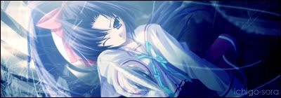
. The background though is undistinctive.
(6.5)
11. Shinbou: Cute battle is an oxymoron, that kinda kills fighting spirit. The background almost swallows the character (too loud).
(5.5)
12. Rhyel: There is fighting spirit (did I mention that I do not like this particular character design?). The sword is not a claymore in size (I know the series' title is meant :P). The fire effect blends well with the character pose, but the background in general is too empty.
(6.5)
13. Runa: The effect and the character are somewhat at odds in my oppinion, it does not perfectly integrate each other. I am not sure if this already in the render... but the red light style element bleeds too much.
(5.5)
14. Utter_iMADNESS: Well, see I am not such a fan of this particular character design. In addition the background seems very chaotic. The font is too blurred. (but hey this is just my taste, don't take it personally ^^')
(6)
15. nammerboi, oi oi ecchii again? Though on a second, closer look... hey there is (dai)katana. The fighting spirit is somewhat killed with the ecchiness. Nice script effect. Background is kinda generic though.
(7)
16. Kira_Naruto: If thats not a nice animation then I do not know what else. Nice contrasting background. Not overly using vintage effects aids in making the signature not too monotone.

(9)
17. cicido: Its deep green and blue and overall very dark. Then a windeffect white text and an overlayered rod/spear. Short, it looks a little odd.
(5.5)
18. Endrance: Hm... the arcane-circle-textures look kinda familiar to me ^^'. The background is not very well setup though. My feng-shui powers tell me this will give a bad karma. The character bleeds very much into the background.
(5)
19. Avantoe: It does not look outstanding, though besides the signature being quite pixelated I can't complain much here.
(6.5)
20. shinobiknight0: Now I just do not like too dirty effects, looks like its been used to cover an area so that painting work is not going to taint whats beneath it.
(6)
21. Ichigo-Sora: The sparkly overlay kills it. Absorbs so much contrast that the signature becomes boring. But the fighting spirit is there.
(5)
22. KasumiGirl: Tones and contrast are too brown/boring for my taste. She could be fighting or shooting for fun...
(6)
23. Solcae: Characters look washed out, I don't know if this was intended, but it makes the signature look dull.
(5)
24. MagicaLideaL: pure violet... well I am indifferent towards violet. Fighting spirit is okay.
(6)
25. Deathkillz: Not bad, but too much FX
(6.5)
26. konstargirl: Nah, warrior girl... she is performing a blade dance (with other words... fighting spirit, I am not so sure).
(6)
27. Renegade334: Meh, not this character design again. Monotony... at least there is a nice contrast in the picture.
(6.5)
28. mimi_girl: the characters clothing blends too well with the background. Another violet signature... makes me feel indifferent again. My feng shui alarm is set on by the two figures in the background.
(5.5)
29. Bakakami: Basically its nice, in particular the overall setup. It just feels sound.
(8)
30. bkg9990: I never liked girls who can't handle the recoil of a firearm using them (makes targeting random, and friendly fire a matter of luck). But I am wandering from the subject... it is red, it has fightinf spirit, but the blending is not quite my thing. (the trigger group has the following positions: safety, single shot, and peace -a german military insider joke-)
(5.5)
31. pcube19622: a gray washed character... overFXed
(5.5)
32. sphyre: I have to credit the animation, but somehow this weapon seems to seperate itself from the character (different shading)
(7)
33. Marina: Knowing whats supposed to be shown, I'ld still critisize the blending, which a little too much imo. But the signature is nice in general.
(7)
34. Riker: Well, this a fine animation, now if the pedals partly flew behind the character it would have been even more impressive and plastic. BG and pose is nice.
(8)
35. Loli Gurl: The character is almost completely blended away. The text looks be out of place.
(4)
36. genryou: yep, it definitly reaches out for a good voting. Quite plastic if I might say so. But where is the fighting?
(7.5)
37. Klashikari: Well, imo she looks too cute to convey the fighting spirit. Technically it is well done... but it does not feel fighting enough for me.
(7)
38. mikoo: The setup of the signature is nice. The character is interesting too.
(7)
39. Thingle: Black and White, feels rather monotone. And its this dirt effect again. The fighting spirit is implicitly there.
(6.5)
40. Faeyice: BG is there even any? Its quite empty imo. Though fighting spirit is in it.
(5.5)
41. retro_plexus: *reads the text* Okay then... fight on....
(6)
42. kamo: Now thats a nice scythe, a little bit impractical for farming though. Bledning into the BG is not so good. BG itself is rather boring.
(6)
43. Sephi: Must be some sort of abstract fighting beyond my understanding. And it doesn't help, that it is rather dark. But lighting is well done.
(6.5)
44. Jinto: Oh no, not that signature again.
45. Nyao: Nya(o), I must say its not bad.
(7)
46. V.Velour: The dot effects make it difficult to decipher the supposed pose of the character. A little too sketchy for my taste.
(5.5)
47. Bernkastel: Wah the colors (Thats how I think an LSD-trip must be).
(5)
48. Miyoko: the pose is format-filling... too much actually.
(6)
49. Bonta Kun: Inverse black and white looks very strange.
(5.5)
50. JFX: Victory smile... okay, but I want fighting. The blood is it added? It looks kinda odd.
(6.5)
51. aolas: too much FX kills character. The overal setup of the signature is not so good.
(5)
52. kayos: No, the colors... boah and this look.... but that is fighting spirit.
(6)
53. Shana: BG is very random, not well blended. The fighting spirit theme is rather weak.
(5)
54. Ledgem: Its a little too gray in my oppinion. Btw. that message is worn out and cheesy
(6.5)
Now you are free to rant about my rant. In all honesty, its not as bad as I wrote here. But I was too lazy to sugarcoate everything

 2008-03-16, 23:49


 Graphic Designer


")


 Administrator