 2013-11-09, 10:56
|
Link #20584 |
|
Constellation
 Graphic Designer Graphic DesignerJoin Date: Jan 2008
Location: Pearl of the Orient Seas
Age: 31
|
MogMoogle1
8/10 I'd rather you put the series' logo instead of text. If that's the logo already, I'd prefer it textless. anyway, Mirai is too cute lol ganbaru 7/10 I've gotten used to your style and I've pretty much gone to like it. It's pretty distinctive since it's unique. Good work! Masuzu 7/10 too sharp IMO Libros 5/10 It's pretty simple. I don't hate cropped sigs (I do that sometimes) but of course, I won't rate it that high since it's just cropped/resized Knightrunner 7/10 Onani Master Kurosawa! How nostalgic. Border fits great Myo 6/10 waifu sig? 
__________________
|

|

|
|
2013-11-14, 22:17
|
Link #20586 |
|
Enjoying Snack Time!
Join Date: Oct 2011
Location: Where It's Legal to Marry Clara and Alice
Age: 35
  |
Been awhile since I was here. None the less...
Ahem: Knightrunner: 8.5/10 - I really like the classroom scenery between the guy in the girl in the sig. Makes you think they're having a romantic conversation. ganbaru: 9/10 - I can't tell if you're trying to be creepy, cute, or both. Which is is? On the other hand I'll give that oversized one the same score and the same sentiments. Looks great. Nice work! Myo: 8/10 - Really cute. I like the characters in your signature and I recognize them too. Nice! Libros: 8.2/10 - Cool picture. Forgive if my eyes suck, but is that suppose to be Predator? Wow, I really need to go back and see that movie. MogMoogle1: 9.5/10 - Give me! Give me! Give me! I really like the scene you've used with Mirai so unpleasant cute! Masuzu: 9/10 - Totally sexy. Too bad summer is long gone now. Seriously depressing. Frailty: 8/10 - Looks cool but a little plain. I don't have much to say besides that. Sorry.
__________________
|
|
|
|
|
2013-11-15, 19:05
|
Link #20588 |
|
Constellation
Graphic DesignerJoin Date: Jan 2008
Location: Pearl of the Orient Seas
Age: 31
|
Clarami
7.5/10 well, I guess I can't please everybody. I do agree it's a little plain but it's because it's probably the smudged stock bg anyway, unto yours. Quality is a little low, it looks like it has jpeg artifacts and I noticed why, the filesize is just 16kb if you saved the file in full quality with a higher filesize (larger than the limit here) and you uploaded it here, it tends to lower the quality to lower the filesize. I suggest saving the image as JPG while keep the quality high Kaken I'm gonna rate the one you posted since you're new, I'll rate it 7/10 You're a lot better back from when I just started I used to do the same thing as you did with your work, Brush spam but without regards to the position of layers. Those are brushes, right?
__________________
|
|
|
|
|
2013-11-15, 21:36
|
Link #20590 |
|
books-eater youkai
Join Date: Dec 2007
Location: Betweem wisdom and insanity
|
Clarami 8,3/10 did I rated this one before ?
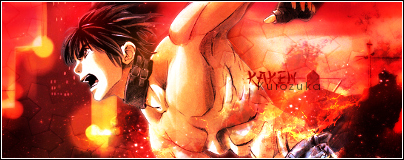
Kaken , Used: 8,5/10 nice background. I would had placed the text a little lower but it's a question on taste posted: 8,1/10 some of the brush do cover the guy a bit too much
__________________
|
|
|
|
|
2013-11-26, 21:00
|
Link #20592 |
|
Sekiroad-Idols Sing Twice
Join Date: Oct 2009
Location: Blooming Blue Rose
Age: 33
 |
Kaken--Similar colors, different enough. The blue at the bottom doesn't get in the way. 8.3/10
ganbaru--I love the two diagonals you've got going on. 8.5/10 Frailty--The text could use its own border. 8/10 Clarami--Fall colors and winter meshing together. 8.2/10 MogMoogle1--Flawless loop, seamless text, good focus. 8.7/10 Masuzu--Have I rated this before? 8/10 Libros--Cinematic look works too. 8.1/10 Myo--Quality issues and it could use a border. 7.8/10
__________________
|
|
|
|
|
2013-12-25, 15:16
|
Link #20597 |
|
ヒットハード&高速
Join Date: Jul 2010
Location: Scanning...
Age: 37
|
Ganbaru: 8.6/10 nice blends but i got so used to some poetry from you with your sig it deels a bit empty without now lol.
Krytonis: 9.5/10 nice colors and overall sig, plus is Laura my fav IS character XD. Masuzu: 8/10 agreeing with Akito a border would also feel nice. Akito: 9/10 overall nice and festive ^^.
__________________
|
|
|
|
|
2013-12-26, 08:33
|
Link #20598 |
|
books-eater youkai
Join Date: Dec 2007
Location: Betweem wisdom and insanity
|
Krytonis 8,5/10 the background look nice.
Masuzu 8,2/10 white text on yellow background rarely work. Akito Kinomoto 8,5/10 good picture delorean2200 8,3/10 merry Xmas to you as well
__________________
|
|
|
|
 |
| Tags |
| rate, signature |
|
|


 Made by rikikai


