AnimeSuki Forums

Register Forum Rules FAQ Community Today's Posts Search

Go Back   AnimeSuki Forum > Anime Related Topics > Fan Creations

Notices

Closed Thread
 
Thread Tools
Old 2010-04-20, 11:25   Link #161
Evil Rick
Black Dragon
*Graphic Designer
 
 
Join Date: Dec 2007
Location: In the Netherrealm, thinking who to betray next...
Quote:
Originally Posted by OceanBlue View Post
Either increase the contrast on the left side or make the text more transparent. Your signature has some very nice effects [I like the transparent gradients], but the text is off-balancing everything and pulling all the focus to the top left. Considering your signature is also top-heavy [the characters looking up increase the weight on the top, I think. Or I can't ignore the text], you might also want to try moving it to balance the top and bottom.
Quote:
Originally Posted by Marina View Post
@Evil Rick
I'd also point out that I find your sig kinda blurry. Don't get me wrong, I love blurriness in specific doses, but not throughout the entire sig and especially not covering up the renders' faces.
Colors are an interesting blend, but they feel a overly saturated right around Marisa and Reimu's hair/eyes.
I'm not sure what going on between the pinkish smudge by and onto the left side of your sig. I don't know if its the shapes and textures which seem off, but they oppose each other in my eye.
Agreed with Oceanblue on your text. It completely draws my eyes away from the focal point and the name, while yours and completely fine, has a different connotation from the moods I get in the rest of your sig. "Evil" Rick and these two lovely ladies? My, my, my!
Quote:
Originally Posted by felix View Post
I like it.
Thnaks for the opinions. Okay tried to fix out the text's distractiona nd the blurishness. Perhaps it'll make the sig more clear and focused.

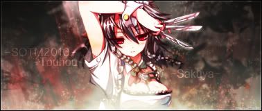
V2


V1 (For comparation)
__________________
Evil Rick is offline  
Old 2010-04-20, 11:28   Link #162
ganbaru
books-eater youkai
 
 
Join Date: Dec 2007
Location: Betweem wisdom and insanity
@ Evil Rick a clear improuvement over the first version.The oonly thing bothering me for now is the yellow area of the background near Marisa's (the witch) hair.
__________________
ganbaru is offline  
Old 2010-04-20, 16:16   Link #163
Solace
(ノಠ益ಠ)ノ彡┻━┻
*Moderator
 
 
Join Date: Mar 2006
Most likely a final entry. And yes the text is intentionally hard to read.

__________________
Solace is offline  
Old 2010-04-20, 16:53   Link #164
felix
sleepyhead
*Author
 
 
Join Date: Dec 2005
Location: event horizon
Oh good job Solace!
ps. text is not hard to read
__________________
felix is offline  
Old 2010-04-20, 20:16   Link #165
Evil Rick
Black Dragon
*Graphic Designer
 
 
Join Date: Dec 2007
Location: In the Netherrealm, thinking who to betray next...
Quote:
Originally Posted by Solace View Post
Most likely a final entry. And yes the text is intentionally hard to read.

The text is perfectly clear for me to. XP
__________________
Evil Rick is offline  
Old 2010-04-20, 22:43   Link #166
Ice Climbers
Retired
*Graphic Designer
 
 
Join Date: Mar 2007
Location: Princeton University


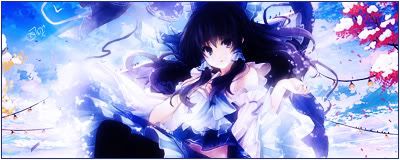
Have a ton of activities this past week and also this week so cooked this up in a hurry...probably won't change it much. We'll see.

C&C is welcome and appreciated

Edit: Character: Reimu(alternate color)
__________________
Ice Climbers is offline  
Old 2010-04-21, 02:15   Link #167
Marina
~La-la Land~
*Graphic Designer
 
 
Join Date: Jul 2007
Location: Seattle
Age: 37
Icy, your retired status doesn't harm your skills any Sig is looking good!
The dark blues around Reimu (hair, lower skirt) look a bit on the oversaturated side and I don't really have a sense of depth since everything in the sig is pretty clear and sharp all the way across. Gotta say though, the colors are gorgeous.
You going to have text in this sig? Would like to see what you'd have.
Not sure yet about the border, since right now it feels like it's closing in this small view of a grandiose setting. At most I might just border the top/bottom or just the sides.
__________________
My Anime Blog:
Anime B&B
Follow me on Twitter!
_________________

Co-host of Kaiseki Anime Podcast
Find us on Apple Podcasts and Google Play
_________________

AniList

Sig: HSxHoneycomb
Marina is offline  
Old 2010-04-21, 03:09   Link #168
Marcus H.
Princess or Plunderer?
 
 
Join Date: May 2009
Location: the Philippines
@Evil Rick's sig

Th-That's impossible! *wipes nosebleed* Sakuya doesn't have that gorgeous of a rack!
__________________
Continuing: White Sand Aquatope (6/24) and Vanitas S2 (0/12), The Vampire Dies in No Time S2 and Bofuri S2 (3/12).
2021: Restaurant to Another World S2 (3/12), takt Op. Destiny (1/12) and Taisho Maiden Fairy Tale (1/12).
2022: Yuusha Yamemasu (1/12), Kaguya-sama S3, Mob Psycho 100 III (Oct06), Bleach: 1000 Year Blood War (2/13) and Chainsaw Man (6/12).
Spring 2023: Yamada-kun to Lv999 no Koi wo Suru, Kuma Kuma Kuma Bear Punch! (4/12), Skip to Loafer, Tonikaku Kawaii S2 (1/12), Otonari ni Ginga (5/12) and Kimi wa Houkago Insomnia (3/13).


Contact me on Wikia and MyAnimeList.
Anime List Status ~ Watching: 33. Completed: 468. Plan to watch: 39.
Marcus H. is offline  
Old 2010-04-21, 04:12   Link #169
ganbaru
books-eater youkai
 
 
Join Date: Dec 2007
Location: Betweem wisdom and insanity
Quote:
Originally Posted by Marcus H. View Post
@Evil Rick's sig

Th-That's impossible! *wipes nosebleed* Sakuya doesn't have that gorgeous of a rack!
One word would be enough for explaining this : pad .
__________________
ganbaru is offline  
Old 2010-04-21, 08:56   Link #170
Mekdra
ImageM@ster
 
 
Join Date: Feb 2009
Location: Argentina
mekdra

hi hi it here my work

Final Entry

__________________
sincerely the Otaku / Gamer Mekdra
Mekdra is offline  
Old 2010-04-21, 11:21   Link #171
Evil Rick
Black Dragon
*Graphic Designer
 
 
Join Date: Dec 2007
Location: In the Netherrealm, thinking who to betray next...
Meh... I'm running out of time. D:

Final Entry

__________________
Evil Rick is offline  
Old 2010-04-21, 12:57   Link #172
felix
sleepyhead
*Author
 
 
Join Date: Dec 2005
Location: event horizon
Quote:
Originally Posted by Evil Rick View Post
Meh... I'm running out of time. D:

Final Entry

At 58 KB (59,392 bytes) your entry is over the size limit.

Quote:
Originally Posted by Mekdra View Post
hi hi it here my work

Final Entry

First of all saving it as GIF greatly reduces quality (GIFs only have 256 colors, JPEG accept around 16 million). Secondly your entry is 500~ bytes over the limit (note the limit is measured in bytes, for precision). I don't think that's actually a problem since its such a small difference, but its up to evil Solace to decide.
__________________
felix is offline  
Old 2010-04-21, 14:11   Link #173
Evil Rick
Black Dragon
*Graphic Designer
 
 
Join Date: Dec 2007
Location: In the Netherrealm, thinking who to betray next...
Oh, sorry.

Final Entry
__________________
Evil Rick is offline  
Old 2010-04-22, 03:02   Link #174
Marina
~La-la Land~
*Graphic Designer
 
 
Join Date: Jul 2007
Location: Seattle
Age: 37
Final entry
__________________
My Anime Blog:
Anime B&B
Follow me on Twitter!
_________________

Co-host of Kaiseki Anime Podcast
Find us on Apple Podcasts and Google Play
_________________

AniList

Sig: HSxHoneycomb
Marina is offline  
Old 2010-04-22, 03:23   Link #175
escimo
Paparazzi
 
 
Join Date: Mar 2008
Age: 41
Well... I'm out of ideas, so....

Final entry


escimo is offline  
Old 2010-04-22, 08:46   Link #176
Namiey
is busy...
*Artist
 
 
Join Date: Dec 2009
Location: Under the same sky that we watched
Age: 28
Send a message via Yahoo to Namiey
Quote:
Originally Posted by Namiey View Post
i realize that, so i made ver.2
this is my final entry then.
__________________
Namiey is offline  
Old 2010-04-22, 15:24   Link #177
Ice Climbers
Retired
*Graphic Designer
 
 
Join Date: Mar 2007
Location: Princeton University
Took Marina's suggestion and changed this a bit, made the bg less sharp against the character and changed the border,

barring any extreme circumstances, probably won't have time to change it so this will be my Final Entry

__________________
Ice Climbers is offline  
Old 2010-04-22, 17:32   Link #178
felix
sleepyhead
*Author
 
 
Join Date: Dec 2005
Location: event horizon
Looks great.
__________________
felix is offline  
Old 2010-04-22, 17:53   Link #179
mero
Member
 
 
Join Date: Apr 2010


Compressed from 120814 bytes to 37011 bytes. Took a long time to figure out how to get a png that small without losing too much quality. It only got a little bit grainy at parts so that's good enough in my opinion. Saving it as a jpg completely destroyed the colors so i didn't use it.

Final entry.
__________________
mero is offline  
Old 2010-04-22, 18:26   Link #180
felix
sleepyhead
*Author
 
 
Join Date: Dec 2005
Location: event horizon
Quote:
Originally Posted by mero View Post
Saving it as a jpg completely destroyed the colors so i didn't use it.
The red tones?
__________________
felix is offline  
Closed Thread

Tags
contest, signature of the month, sotm


Posting Rules
You may not post new threads
You may not post replies
You may not post attachments
You may not edit your posts

BB code is On
Smilies are On
[IMG] code is On
HTML code is Off

Forum Jump


All times are GMT -5. The time now is 12:09.


Powered by vBulletin® Version 3.8.11
Copyright ©2000 - 2024, vBulletin Solutions Inc.
We use Silk.