2012-05-31, 10:24
|
Link #19864 |
|
this is how its done
Join Date: Mar 2012
|
Godlike1889 9.2/10 http://www.youtube.com/watch?v=SASEEuL1xXM
ganbaru 9.0/10 how lovely koominator 8.9/10 really good quality silvance- 9.0/10 I'm loving it kaihan 9.4/10 I like the color
__________________
|

|

|
|
2012-05-31, 13:25
|
Link #19866 |
|
Still Alive
Join Date: Aug 2010
Location: Somewhere far far away
Age: 30
|
@Godlike 1889 - ........Ahem, nice loop
 And great depth as well - 8.8 And great depth as well - 8.8@Ganbaru - Wow its quite different from the your previous sigs I have seen. Very nice - 8.9 @Koominator - You like that C4D quite a lot  - 8.5 - 8.5@Silvance - Very cool - 8.6 @Rennir - She's quite beautiful  But her hand is...... distracting But her hand is...... distracting  (not from an signature point of view) (not from an signature point of view)
__________________
|
|
|
|
|
2012-05-31, 13:32
|
Link #19867 |
|
Koomi-kun~
 Graphic Designer Graphic DesignerJoin Date: Oct 2011
Location: In the distortion of space and time..
|
tolido17: 8/10 agreeing with ganbaru but I think you might want to work on the text a bit!
@Eragon I don't use any C4Ds! I rarely use them! This one doesn't have them ^^
__________________
|
|
|
|
|
2012-05-31, 13:35
|
Link #19868 |
|
Still Alive
Join Date: Aug 2010
Location: Somewhere far far away
Age: 30
|
^ Really?................Hmm, seems like I have still a ways to go
A really quick one I came up with. Not too much detail but still your thoughts... 
__________________
Last edited by Eragon; 2012-05-31 at 14:54. |
|
|
|
|
2012-06-02, 00:41
|
Link #19871 |
|
Storm Vanguard
Graphic DesignerJoin Date: Mar 2008
Location: Type-00
|
Kaihan - 8.3/10. Looks really nice except for the lower part, and the text that doesn't blend. Love the art though.
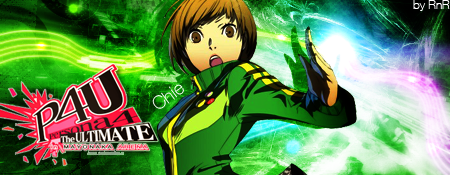
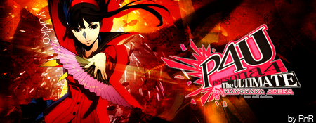
Koominator - 8.5/10. Cool sig. Makes me want to pick up the anime. At any rate, it'd look better without the light effects near the guy, but that's just my two cents. :3 ganbaru - 9.5/10. Simply beautiful. <3 Godlike1889 - 9/10. Amusing loop. It will catch anyones attention, that's for sure. XD tolido17 - - 9.5/10. I love it! I really love the desing of his suit. Eragon - 8.5/10. Nice effects. Deikan - 10/10 for P4 Protagonist. So cool and the effects used emphasizes that even more. 9/10 for Chie, and 9.5/10 for Yukiko. All of them are very stylish. Last edited by Silvance; 2012-06-03 at 00:14. Reason: typo |
|
|
|
|
2012-06-02, 06:41
|
Link #19872 | |
|
Barrel!
Graphic DesignerJoin Date: Jul 2011
Location: still under a rock
Age: 34
|
Silvance: Nice Background, like how the text goes well with it. 8.9/10
Deikan: Great effect matching the charcters. MC 9.3/10, Yukiko 9.2/10, Chie 9.0/10. ganbaru: Again Great work. 9.0/10 Eragon: Nice effect and that character pose. 8.9/10 Koominator: Nice Signature, glow effect works better here. 8.8/10 tolido17: Amazing work.  9.5/10 9.5/10Quote:
__________________
|
|
|
|
|
|
2012-06-02, 07:26
|
Link #19873 |
|
books-eater youkai
Join Date: Dec 2007
Location: Betweem wisdom and insanity
|
Deikan ( used one ) 8,5/10 gif. should be used only for animation, it screw up quality
(posted one) 8,8/10 I do prefer the Chie one but both have great effects. Silvance 8,7/10 great background Kaiban 8,6/10 the effect on the background seem to have some issue
__________________
|
|
|
|
|
2012-06-02, 15:30
|
Link #19874 |
|
Koomi-kun~
Graphic DesignerJoin Date: Oct 2011
Location: In the distortion of space and time..
|
Silvance: 9/10 very catchy and cool effects!
Kaihan: 8.5/10 I like the idea of the no border, but the bottom bit is different due to the AS sig setup!  But it is very creative! But it is very creative! Eragon: 8.5/10 Nice glow effects and good focus! You are getting better!
__________________
|
|
|
|
|
2012-06-03, 04:27
|
Link #19876 |
|
ヒットハード&高速
Join Date: Jul 2010
Location: Scanning...
Age: 37
|
Silvance: 9/10 the Hayase feels a bit blurred but otherwise nice sig XD, she was a great character in Alternative, i liked her personality
.Kaihan: 8.5/10 nice fade effect rather then borders but to bad it gets cut out at the end. ganbaru: 9/10 simply love the colors. Koominator:9.5/10 nice effects and nice render of Miku used, great work.
__________________
|
|
|
|
|
2012-06-03, 12:11
|
Link #19878 |
|
Enjoying Snack Time!
Join Date: Oct 2011
Location: Where It's Legal to Marry Clara and Alice
Age: 35
  |
As some of you may know, I'm a huge ClariS fan because their music is great, plus I fell in love with their anime portrayal designs!
 These are sigs of them I've collected not to long ago.   So what do you think? Cool right?
__________________
|
|
|
|
|
2012-06-04, 00:49
|
Link #19880 |
|
ヒットハード&高速
Join Date: Jul 2010
Location: Scanning...
Age: 37
|
Kirito: first one 8.2/10 dunno the elements don't seem to go that well together imho.
second one: 8.5/10 as its been said the background is good but i'm not so sure about the border. @ganbaru: actually there's a reason for them, she keeps her left hand bound to her back since she is quite strong those straps are for keeping it in place.
__________________
|
|
|
|
 |
| Tags |
| rate, signature |
| Thread Tools | |
|
|