2008-11-12, 16:17
|
Link #743 | ||
|
Thinking outside the box
 Graphic Designer Graphic DesignerJoin Date: May 2007
Location: The Netherlands
Age: 37
|
Quote:
Quote:

__________________
|
||

|

|
|
2008-11-12, 22:55
|
Link #745 |
|
Hopeless Dreamer
Join Date: Nov 2007
Location: On bended knee asking Belldandy to marry me
|
Looking through your collection for the first time and I'm impressed. I need to venture into the use of brushes and blending, etc. My attempts at sigs seem so mundane.
 But then, I'm more of a digital doodler than an artist. But then, I'm more of a digital doodler than an artist.  Anyhow, I was just wondering about one of your renders. Who is this girl? 
__________________
|
|
|
|
|
2008-11-12, 23:12
|
Link #746 | |
|
Rated P.G. Superstar
Join Date: Aug 2006
Location: Boracay, PH
 |
I'm always a fan of sephi's work~
 Quote:
|
|
|
|
|
|
2008-11-13, 10:29
|
Link #748 | |||
|
Thinking outside the box
Graphic DesignerJoin Date: May 2007
Location: The Netherlands
Age: 37
|
Quote:
And nothing to update. I think i only made some Windows icons to customize my own Vista. Might post them if people are interested. But cba fixing the dead links.Quote:
I started out with brushes, and the last of my work was mostly stocks images and C4D combined and layer options to make them blend. Quote:
And some day i will return again, I want to. I haven't lost my liking for photoshop. But these days I've been very busy with other things. I just don't have the time to make a signature anymore. As well as my interest shifting to some other things. But i still lurk around from time to time here. The FC community has matured/improved a lot. I don't think i have anything useful to add to it anymore. Edit: to think of. I did do this one. But it's been more than 16 weeks ago. Guess this was my last work before i went in to a long hibernation. 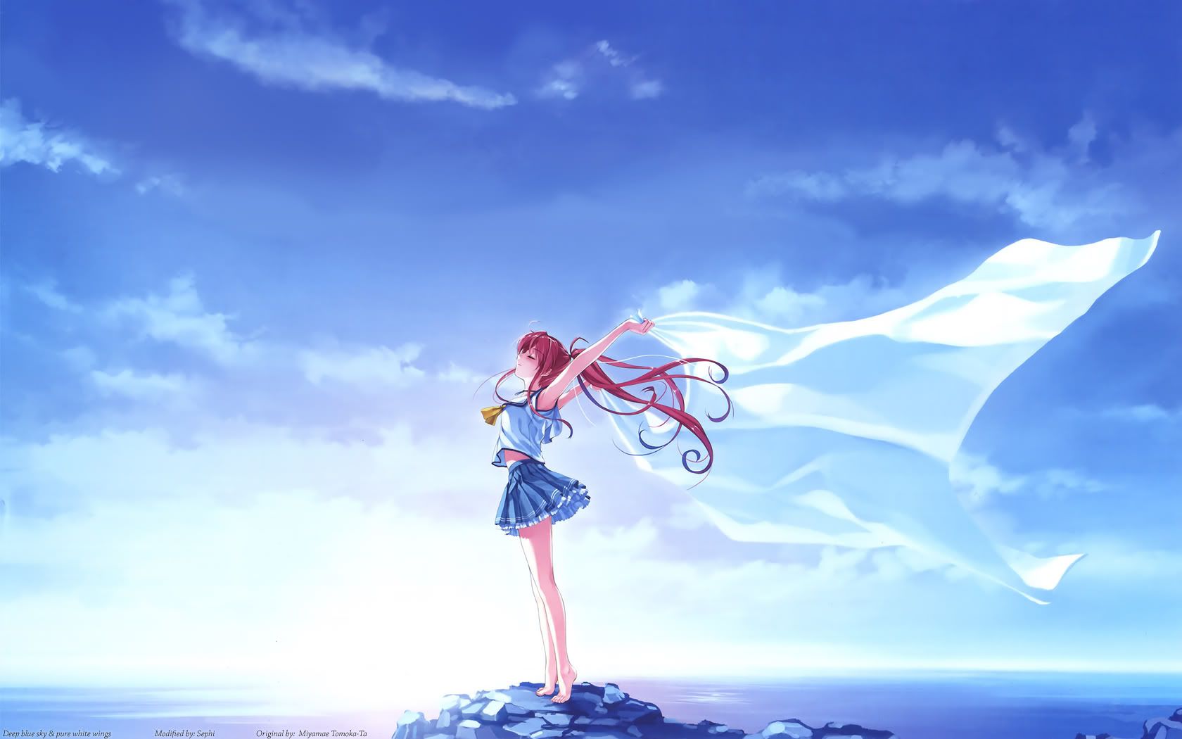 Aoie_Emesai linked this image in his thread back than, and i thought it would make a nice wallpaper. Original is from Miyamae Tomoka-Ta. I only did the following: - Removed text - Recreate some clouds - Fixed quality - Vectored some outlines because the thickness on the original one wasn't to my liking. Widescreen 1680x1050 1920x1200 4:3 1600x1200
__________________
Last edited by Sephi; 2008-11-13 at 16:39. |
|||
|
|
|
|
2008-11-16, 03:54
|
Link #749 |
|
Rated P.G. Superstar
Join Date: Aug 2006
Location: Boracay, PH
|
spams at thread*
saves papers* actually I really got deep in love w/ the two of your sigs(wth graham aker~?), well I think three Spoiler for san:
I keep on reading your thread in AR about the 1st two. Man I think there's a problem w/ me since I still can't get your quality, I mean, like your sigs. & still don't know to do that lighting effect at the 1st one, how'dya do that~?  ~need to practice more on c4ds like the 3rd one.
|
|
|
|
|
2008-11-16, 05:38
|
Link #751 | ||
|
Thinking outside the box
Graphic DesignerJoin Date: May 2007
Location: The Netherlands
Age: 37
|
Quote:
The smaller magic sparks on the Suigintou sig is a small soft brush and a a even smaller one. One brushed with light color and one with darker color. I can't remember which order anymore. But just experiment around Look up tutorials from dedicated GFX sites. AR has some very good sig makers, but last time i checked the overall quality still isn't as good as some other more dedicated to signatures/gfx forum. Quote:
__________________
|
||
|
|
|
|
2009-02-10, 00:40
|
Link #753 |
|
its a boy :o
Join Date: Jan 2009
Age: 32
|
Your sigs are well designed with good balance while not over using contrast (not my style, but certainly you've mastered it to the point of gaining my appreciation). Your use of sharpen and blur is also balanced and depicts your focal points very well. You also have very good control over your scenes and its simply marvelous =o
lol, I haven't been serious, in fact I have sporadic seasons of making sigs and then stopping for awhile, but I've been doing sigs for about as long as you have (2006) =D I rarely ever made anime sigs because of how hard it was to use them in my style. (I picked most of mine up from sotw.com and planetrenders.net, both of which were never really fond of anime because you couldn't easily use effects and stuff that were part of a quick, eye catching sig with them). Your sigs have the balancing details that aren't "quick to catch the eye" but forces the viewer to look at it a bit to take it all in. It's a more traditional yet true artistry I might try to learn some things from your style to incorporate in mine 
Last edited by Ehko; 2009-02-10 at 00:55. |
|
|
|
|
2009-02-10, 00:56
|
Link #754 |
|
Senior Member
Join Date: Jan 2006
Age: 35
|
i didnt know that you were the one that did all the banners for AS they are all great and i wish they could stay up there forever but they must come down for something new. i hope you joined in on the contest for the new banners. i really like all of your sigs and especially the fmp caught my eye, but too bad you didnt have a tessa one
. i hope your taking request lol
__________________
|
|
|
|
|
2009-02-10, 07:37
|
Link #756 | |||
|
Thinking outside the box
Graphic DesignerJoin Date: May 2007
Location: The Netherlands
Age: 37
|
Quote:
Quote:
I was hoping to join this Banner contest, but due to my apprenticeship/internship and WoW i don't have any time left for GFX. Was hoping to see some Aria above. As for request, i don't take request anymore. It's been far to busy for me lately. I've got to work from 8:30 till 17:30. Perhaps when i got more time. Though it won't be until my apprenticeship/internship is over, which is 10 more weeks to go. Quote:
And yes the evil that goes by the name World of Warcraft is devouring the little bit of free time that i got left. As for Dota. You just happened to be on the wrong lane Didn't even knew it was you anyway. Next time run to the lane that is the farest away from me or go woods. Though i checked woods a few time too that game Time of posting is 13:37
__________________
|
|||
|
|
|
 |
|
|