 2008-07-02, 15:33
|
Link #901 |
|
Busy busy busy
 Graphic Designer Graphic DesignerJoin Date: Mar 2008
Location: Slovenia
Age: 36
|
Weapon flash part II: Reflection
--- Difficulty: medium (you should have read Weapon flash part I: Render ) Time: several minutes --- This is what we'll be doing in this part:  You will be able to do a unique reflection using the flash tehnique from part I. --- Step 1: Open your previous flash weapon animation document. Find a suitable image to put on the weapon. Like my chibby Suigintou who faces Stinku  Step 2: Make a new layer for the new image. Select the weapon again, but this time we will be pasting the new image in it, instead of the gradient found in part I. You should get something like this:   Step 3: Duplicate the new image the number of times for each flash frame. Each frame now has the new image (Stinku) but set them to invisible until the flash reaches the new image. At that point, grab the eraser and erase everything on the right side of the flash (save one original for the second part). You will get something like this:  Step 4: You should have the idea what we're going to do. So on to the next layer. Again, erase everything on the right side of the flash. Continue this to the end. Once the flash is pass the image point, leave one image visible:   Step 5: Half way done. On the second part, duplicate all of the frames till now. Before I mentioned to save one original image of Stinku, move that image and set it as the last layer. Duplicate it a number of times and repeat step 3 and 4 but this time we will erase everything on the left side.  Step 6: Complete the this side - what you did in step 4, but again on the left side. Step 7: Now animate both sides where we erased the image and we should get something like this: Step 8: Next your imagination and spice up the sig as you want. This was my finished product: Shinku! En garde!  --- And we're done ^_^
__________________
|

|

|
|
2008-07-04, 12:27
|
Link #906 | |
|
it's animal, unbelievable
Graphic DesignerJoin Date: Nov 2006
Location: U.S.A
|
Quote:
On my web browser, it's transparent.
If you're using Internet Explorer, I have no advice for you. Almost every transparent image I see on Fire Fox will have a black BG for the transparent areas in IE. You may want to switch to Fire Fox if you want the transparency. EDIT: Eps, you have amazing tutorials and signatures. x.x
__________________
|
|
|
|
|
|
2008-07-04, 18:37
|
Link #908 | |
|
~Nanchatte Renai
ScanlatorJoin Date: Mar 2006
Location: Australia
Age: 30
|
Quote:
   In slices it is like this -14Kb -19Kb -11KbEach of the three pieces add up to excatly 44Kb. So in easy way when you save the slices just highlight them all and the detail window on the left should tell you what it is in Kb either just over 50Kb or just under it. I hope this helps you out crazyhorse.
__________________
|
|
|
|
|
|
2008-07-04, 18:38
|
Link #909 | |
|
Busy busy busy
Graphic DesignerJoin Date: Mar 2008
Location: Slovenia
Age: 36
|
Quote:

__________________
|
|
|
|
|
|
2008-07-04, 18:41
|
Link #910 | |
|
Procrastinator
Join Date: Jul 2007
Location: California
Age: 33
|
Quote:
 I just realized your sig was animated. Nice! I just realized your sig was animated. Nice! 
__________________
|
|
|
|
|
|
2008-07-05, 15:30
|
Link #911 |
|
Paparazzi
Join Date: Mar 2008
Age: 41
|
Old photograph look.
It's tutorial time.
Making a picture look like an old photograph in Photoshop. First of all you'll need 2 brush-sets for photoshop. I used these two. Grunge Scratches by *ro-stock Coffee Stains Photoshop Brush by ~Divinity-bliss Any similar will do. This is what we're after.  First select an image, desaturate it and adjust levels to your liking. Make sure that the layer is not locked and create a new layer below the picture layer and fill it with very light gray. It will be used for the border of the image.  Create oval selection in the middle of the picture. Width of the selection should be about the width of the image and height about one and half times larger. Feather the selection by approximately 15-25 pixels and invert it. Then adjust levels so that the edges of the picture darken significantly.  Select all, contract the selection by about 5-10 pixels depending on how wide border you want to create, feather the selection by about 3-4 pixels, invert selection and delete this selection from the picture layer.  Add noise to the picture layer with Filter->Noise->Add Noise. Make sure that it's monochromatic. Then just use options to your liking.  Tint the shadows bluish. I did this with variations tool by adding blue to shadows.  Now create an adjustment layer for levels. Adjust levels so that shades become very bleached.  Mask the adjustment layer to your liking. If you want authenticity concentrate the lightened areas on lighter areas near the edges.  Now add an adjustment layer for hue and saturation. Select colorize and make the image yellowish brown.  Mask the hue and saturation adjustment layer to your liking. If authenticity is what you're after mask around darker areas of the picture so that they're more bluish than the lighter areas.  Create a new layer and add some scratches to it using brushes mentioned earlier. I used very light gray for the scratches, overlay blending mode for the layer and 50% layer opacity.  Now the jagged edges. Select the border layer. Create selection that's sightly smaller than the layer. I first selected all and then contracted it by 5 pixels. Now add Layer mask to the layer. Doing this masks out 5 pixel border of the image. You can also just create the layer mask and then add 5 pixel black stroke to the mask if you don't want to play around with selections. Then use Filter->Pixelate->Crystallize filter to the mask. I used cell size 3.  Create a new layer and add some brown coffee stains using a brush. Load selection out of the border layer, add stroke to the border layer to make the border more visible. I used the same brown color than with the coffee stain and 50% opacity. Invert selection and delete selection form the scratch-layer and the coffee stain layer and you're done.
Last edited by escimo; 2008-07-10 at 16:07. Reason: Problems with images, host changed. |
|
|
|
|
2008-07-06, 14:13
|
Link #914 | |
|
Paparazzi
Join Date: Mar 2008
Age: 41
|
Quote:
|
|
|
|
|
|
2008-07-06, 18:09
|
Link #915 |
|
Busy busy busy
Graphic DesignerJoin Date: Mar 2008
Location: Slovenia
Age: 36
|
Creating a beach
--- Difficulty: easy Time: 1-5 minutes --- Since it's summer time - and this SotM is about seasons, I thought why not showing people how to make an easy and good looking beach. I found a familiar tutorial some time ago, but it was so poorly written that I didn't understand the most imporant part so now I decided to write one myself - an easy one Here's what we'll have at the end:  --- Step 1: Make a new document, prefered semi large because you can always cut it later. I'll be using 500 × 500 px. Step 2: Use a light blue foreground and darker blue background colours. My foreground was #4372aa and background #1c3a8b. Now go to filter > render > clouds Spoiler for step2:
Step 3: Now we will make the sea. Go to filter > render > fibers. Adjust the Variance to 14,0 and Strength to 7,0 Spoiler for step3:
Step 4: Duplicate the layer and set the blending mode to Screen. You can also play around with opacity to get the colour you want. Step 5: At this point we already have the sea done. So if you wan't to use the sea alone, you can do it. But we want more! Now comes the tricky part which at first I didn't understand. Choose your gradient tool and from the Gradient Picker, select the Chrome preset. Next edit this gradient (click on the gradient itself) Spoiler for step 5:
Step 6: In the Editor delete the Colour Stop #52%, adjust the Colour Stop #64 to a lighter colour (I used #F9E2A3) and then move the #64% Colour Stop to a higher position, to #78%. Click the bellow image if you have trouble with it. Spoiler for step 6:
Step 7: Now use this gradient on the layer and drag it from around center to bottom. Spoiler for step 7:
Step 8: Mess with the opacity and we're done! Our result should look something like seen at the top: Spoiler for step 8:
--- Now grab some renders and make a beach signature
__________________
|
|
|
|
|
2008-07-07, 04:58
|
Link #917 | |
|
The Interstellar Medium
AuthorJoin Date: May 2008
Location: [SWE]
Age: 34
|
Quote:
__________________
|
|
|
|
|
|
2008-07-07, 05:22
|
Link #918 |
|
Thinking outside the box
Graphic DesignerJoin Date: May 2007
Location: The Netherlands
Age: 37
|
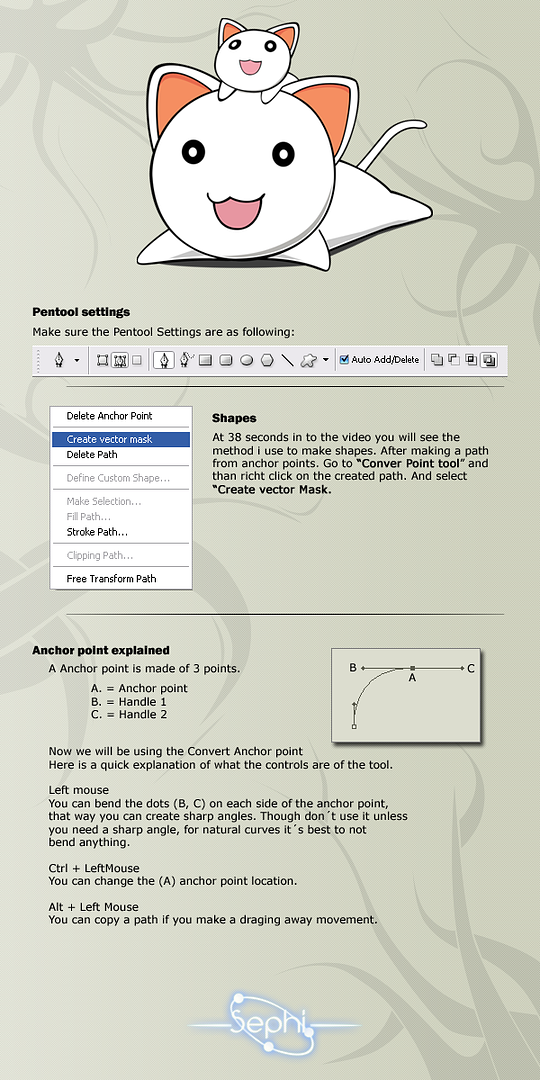
Video Vector tutorial with PSD
I made this about a week or two ago for a other place. And finally got around fixing some minor things and bothered posting it.
Added shadow and right ear shading, which i forgot in the video, but added it after in the psd. This is a rough version of how to vector, you will need more time to make the thickness of the outlines more consistent, as well as choosing the right colors. I didn't do that in the tutorial seeing it would take to much time. The video is 200% of original speed. So the vector took me 40 min, the video is only 20min. You should understand it from just watching the video. But if you don't the additional info here should be enough. After watching the tutorial you should be able to make any kind of vectors. Video info: Video: MP4 encoded with h.264. 15fps, 235 Kbps. Total size video: 63MB Remember this is one of the ways to make a vector. There are many more ways, and some might be more effective than this. Also i would like to thank innominate who helped me a lot when i was doing my first vector.
__________________
|
|
|
|
|
2008-07-07, 05:30
|
Link #920 |
|
~Nanchatte Renai
ScanlatorJoin Date: Mar 2006
Location: Australia
Age: 30
|
Just dropping by to expand on what I said about slices. Basically you should read Riker's tut on what way to slice and what way to not.
Okay so take this sig for example I animated the text. Save all of it as a gif.  55Kb and only little animation? Of course most people then seek to lower the colours in the sig or re-size it lets see what we get at 128 colours.  45Kb not bad but look having a closer look at it the colours have already started killing the images. This is where the slicing comes in. Grab the slice tool (K) and make a part around the animated part/s. It should look like this now  Then to select the format you wantfor each part. Photoshop users Go to file-save for web and devices & select the parts you want to be. Eg top and bottom are set on PNG-8, 100 colours. The middle part is set of Gif 100 colours.  Image Ready Users Go on the optimize panel and select the Slice Select Tool and click on the slices and optimize them in the panel till you satisied.  Then of course you have to make sure the slices are all AS safe and will connect properly without gaps. I usually just highlight them all and the details window will tell me the size.  ----> 12.4Kb ----> 12.4Kb ----> 18.7Kb ----> 18.7Kb ----> 9.74Kb ----> 9.74KbWhich is a total of 41Kb. Now remove the gaps between the slices and you should have something like this And there you have it a nice & hopefully clear tut on using the slice tool
__________________
|
|
|
|
 |
| Tags |
| avatar, graphic, photoshop, signature |
|
|


 Good job.
