2008-05-01, 20:05
|
Link #141 | |
|
I'm a commin'
 Graphic Designer Graphic DesignerJoin Date: Dec 2007
|
Quote:
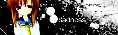
 Make the bg a more darker, less contrasted purple. It's a little too bright in my opnion. Also (I know I should be the last one to say this but) try to change the font to a less blockier one. This is just me but they both don't look every sad/depressing to me. |
|

|
|
2008-05-01, 20:20
|
Link #142 | |
|
One PUNCH!
 Administrator AdministratorJoin Date: Dec 2005
|
Quote:
 
|
|
|
|
|
2008-05-01, 20:23
|
Link #143 | |
|
Klutz
Join Date: Jun 2007
Location: California
Age: 32
|
Quote:
They're tiny though...so maybe it's just me. xD
__________________
|
|
|
|
|
2008-05-02, 00:13
|
Link #148 | ||
|
(ノಠ益ಠ)ノ彡┻━┻
 Moderator ModeratorJoin Date: Mar 2006
|
Quote:
Quote:
 But, I tweaked it a little bit. I also added more blending. I wasn't really satisfied with how she blended in so I made it look more like she was blending with the dark area...something like that. I'm still not set on the text, I changed it again. But honestly, I think I'm preferring the no text version more. Here's the new versions: But, I tweaked it a little bit. I also added more blending. I wasn't really satisfied with how she blended in so I made it look more like she was blending with the dark area...something like that. I'm still not set on the text, I changed it again. But honestly, I think I'm preferring the no text version more. Here's the new versions:No text:  Text: 
__________________
|
||
|
|
|
2008-05-02, 00:29
|
Link #149 |
|
I'm a commin'
Graphic DesignerJoin Date: Dec 2007
|
@Solace, I suggest smudging the black onto the girl instead of smudging the girl onto the black. If that didn't make sense, I'll try to explain again. Also erase the line over her finger.
Blargh. Something like This:   Instead of this:  
|
|
|
|
2008-05-02, 01:06
|
Link #151 | |
|
Lost in my dreams...
Join Date: Jun 2006
Age: 37
|
Quote:
 Well thats just my take on it, i guess people might disagree  Edit: Just wanted to share this image ... i think it fits nicely with the theme, and perhaps someone would find it useful. Or it might prove useless  
__________________
|
|
|
|
|
2008-05-02, 01:54
|
Link #152 |
|
Lord of all Lurkers
Join Date: Apr 2006
Location: Malaysia
Age: 32
|
Mm... My 3rd post after registering for 2 years.
 Simple. Nothing special. Might still tweak it, if I actually have the time to do so. It seems that there are already a few lovely entries. Makes me feel like I'm completely out of the league. Good luck everyone. I'll be watching from somewhere, as usual.
|
|
|
|
2008-05-02, 02:13
|
Link #153 | |
|
ISML Technical Staff
Graphic DesignerJoin Date: Dec 2006
Location: Phoenix, AZ
Age: 35
  |
Quote:
Is that Kyou? Overall I like the rain and background, but since we have a theme that could be interpreted in different ways, I'm not sure if I feel the sorrow from that sig. In this case, the text can make a big difference. I think the rain is pretty obvious, so you could try for a more emotional text.
__________________
|
|
|
|
|
2008-05-02, 02:25
|
Link #155 |
|
ISML Technical Staff
Graphic DesignerJoin Date: Dec 2006
Location: Phoenix, AZ
Age: 35
|
Lol, yeah she got a surprise buttsecks from one of those demons chasing after Mai.
") EDIT: Actually, does my current sig convey despair/sorrow? Lmao.
__________________
Last edited by KholdStare; 2008-05-02 at 02:49. |
|
|
|
2008-05-02, 02:47
|
Link #156 |
|
Falling for Ginsama ^3^
Graphic DesignerJoin Date: Feb 2007
Location: Airantou
|
Kina + khold>> LMAO XD
She really does look like she being buttsecked over and over O.o;; well here my entry its in its UGLY stage thats before it transforms miraculously to an awesome sig =O 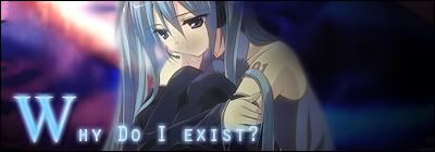
__________________
|
|
|
|
2008-05-02, 06:44
|
Link #157 | |
|
阿賀野型3番艦、矢矧 Lv180
Graphic DesignerModeratorJoin Date: Mar 2006
Location: Belgium, Brussels
Age: 37
|
Quote:
Basically, the signature itself (not the character) must provide the mood and such by itself, and not by the voters knowledge. I will agree with skyfall: suigintou hardly match the theme in this instance, it looks rather flustered or "tsundereish" than anything. I will also remind people that relying too much on the characters won't be an advantage at all. I see many people using suigintou, as it is a well known tragic character, but that alone won't do anything to the theme at all. It is too much relative and way too dependant of knowledge etc, which is defying the purpose of mood and atmosphere required for the theme. KiNA gin's signature is working as intended considering it doesn't rely on it, but I'm afraid to say that Deathkillz's and Crowkenobi are just too obscure and don't convey the mood at all. If the signature relies on the character backstory or explanations, it is missing the intended purpose of the contest.
__________________
|
|
|
|
 |
| Tags |
| sotm |
| Thread Tools | |
|
|