2007-05-15, 13:12
|
Link #3161 |
|
Desu Desu Desu!!!
 Graphic Designer Graphic DesignerJoin Date: Mar 2007
Location: Texas
Age: 41
   |
RedFrame: er.... um.... kinda freaky, imo, not bad though... 6.5/10 CXC: mmmm, loved the xenosaga game... nice sig layout, though don't much like the flare... 7.2/10 bigdave: its very.... uh... very... pink... aside from the pinkness, nicely done though... 7.8/10 Cyz: yet another cute sig from the cyzmeister.. could have chose better text though.. imo... 7.1/10 @my new sig - alrighty.... so i broke down, and made mysyelf a cutsie girly sig...   though wasn't too happy with the results myself, so i'll prolly change it again soon... so rate it while u can...  k thxs.... ::EDIT:: Well i changed my sig again... so here's my old sig, the one u've been rating that is... ::EDIT:: Spoiler for last sig rated:
Last edited by darkjester; 2007-05-18 at 02:56. |

|

|
|
2007-05-15, 18:06
|
Link #3163 |
|
~ You're dead ^__^* ~
Graphic DesignerJoin Date: Apr 2006
Location: uk, England
Age: 34
|
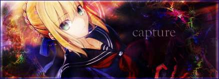
capture ~ thumbs up for the animation
 and yes doing it the hard way...sounds hard @_@ 10/10 and yes doing it the hard way...sounds hard @_@ 10/10cyz ~ matsuri is soo cute ^__^ nice simple and effective sig...though im not too sure about the white stroke on the text ~ 8.5/10 Darkjester ~ like cyz ~ but this time its the 3D shape 8.5/10
__________________
|
|
|
|
|
2007-05-15, 18:51
|
Link #3164 |
|
Ha ha ha ha ha...
Graphic DesignerJoin Date: Apr 2006
Location: Right behind you.
Age: 35
|
Cyz: Her smile makes me feel happy.
8/10bigdave: Nice, but maybe too much pink?  7.5/10 7.5/10Uchikatsu: lol, don't ya just hate it when that happens?  (not rated) (not rated)Tatsumiko: Very cool oval-shaped siggy. I like the mini angel wings. ^_^ 9/10 darkjester: "Cutsie girly sig", indeed! Too much cuteness! (j/k) 9/10 capture: Sweet cursive animation for the name. Must have been quite challenging, eh? 10/10
__________________
|
|
|
|
|
2007-05-15, 20:28
|
Link #3165 |
|
"Show it to me"
Join Date: Dec 2005
Location: In solitude, where we are least alone
|
@ darkjester: Nice Nodoka sig. The light blue BG is really nice and it compliments the pic. 9/10
@ capture: Saber!!! The brick like BG is a little....strange though. Still, points for the smooth name animation 8/10 @ Spectacular Insanity: Genma....I remember him but haven't seen him at all anymore 7/10
__________________
|
|
|
|
|
2007-05-16, 00:47
|
Link #3166 |
|
Falling for Ginsama ^3^
Graphic DesignerJoin Date: Feb 2007
Location: Airantou
|
Cyz>> yea Im trying to revise that one right now! XD Lol
Well here is my most recent Sig I made! ^_____^ Spec> Hmmm very interesting arrangment. ^^ 6.8/10 DKZ>> hahaha Man ur's looks really nice and a little  lol 7.8/10 lol 7.8/10Capture>> OOOoo SABER!! X3 IT looks so cute! and the writing animation makes it so good! 8.5/10 Dark>> Yay Nodoka! I should start trying to make more negima sigs. ^__^ this one was very cute and simple. Nice job! 7.4/10
__________________
|
|
|
|
|
2007-05-16, 20:53
|
Link #3170 |
|
♥Sebastian's new wife♥
ArtistJoin Date: Aug 2006
Location: USA
Age: 31
|
CYZ: 10/10 for kawaiiness *gives hugs*. Well I'm not done with my jpop singers, just the avatar for now because Miichan from JPHIP just did an awsome witht eh avatar
 capture: 9.5/10 for kawaiiness, but the text was kinda blurry Spectacular: 9/10 for the rendering ^^
__________________
|
|
|
|
|
2007-05-16, 21:26
|
Link #3171 |
|
Ha ha ha ha ha...
Graphic DesignerJoin Date: Apr 2006
Location: Right behind you.
Age: 35
|
bigdave: The blurring on the right side doesn't match either the blurring on the left or the style of the sig. Still pretty, tho. 8/10
mimi_girl: You need a bigger pic, smaller font. You can't even see their faces. 6/10
__________________
|
|
|
|
|
2007-05-17, 00:00
|
Link #3172 |
|
LOVELY☆COMPLEX
Join Date: Dec 2005
Location: Ontario, Canada
|
Spectacular, clean cut. cool background. I like the Konoha sign
the image and the background don't really match though..mimi_girl, I agree with Spec about the bigger image  but I think the font is the right size. but I think the font is the right size.Cyz, cute ! I like the faded hint of a butterfly behind your name, nice touch ps. HBD KiNa I just had to say it !
|
|
|
|
|
2007-05-17, 07:33
|
Link #3173 |
|
Thinking outside the box
Graphic DesignerJoin Date: May 2007
Location: The Netherlands
Age: 37
|
@kira_lucusxx. Nothing special. But 8.5/10 for the artistic value.
@Spectacular_Insanity. Quite unique style 7.5/10 @cyz. Cute. Mmm the text doesnt seem to fit in the sig very well. But that's just my opinion. 7.5/10 @bigdave. Such a small world uh :P 7.5/10. The background is nice. But at the same time the dissort or whatever it is is a bit weird. @Deathkillz. Rated i think @capture. Background isn't to impressive but the animation is really nice and smooth. 7.5 would be to low... and arr just not a 8 either... mmm 7.8/8 @darkjester Looks good overall. 8/10 @CXC love what you did with the text. And really like the background. mmm 8.5 would be to low for the awesome sig. Mmm 9/10! @KeiKei-chan Ayu ftw :P but the bg and the cutout of ayu seems to have some jagged edges. 7.5/10 @Redframe. Those eyes.... oO Cute and somewhat scary at the same time. Another one of those where i find 7.5 to low and just not a 8. Mmmmm 7.8/10 @mimi_girl. Mmm that's a suprising sig between all the anime sigs ^^ 7/10 Can't really see what it is.
__________________
|
|
|
|
|
2007-05-17, 09:32
|
Link #3174 |
|
Starlight StarBright~
FansubberJoin Date: Dec 2005
Location: Canada
|
Sephi - 8/10 yay for chibi arf
nice text, good background~BigDave - 5/10 well the rendered image is good but the background is in chaos, the text is kinda hard to see~ other than that I would have given you a higher score T_T P.S. - this is from Nanatsuiro Drops ^_^ Spoiler:
Last edited by Wandy; 2007-05-17 at 16:42. |
|
|
|
|
2007-05-17, 10:59
|
Link #3176 |
|
"Show it to me"
Join Date: Dec 2005
Location: In solitude, where we are least alone
|
@ Azami: Very nice. You seem to have a liking with glittering things no? 8/10
@ Tatsumiko: I think your last one is better IMO. Anyway, nothing much has changed except the main pic. 7/10
__________________
|
|
|
|
|
2007-05-17, 14:47
|
Link #3177 |
|
Desu Desu Desu!!!
Graphic DesignerJoin Date: Mar 2007
Location: Texas
Age: 41
|
capture: i love it! could of done w/o the shadow on the left though, but still really good job... 9/10
Spectacular_Insanity: its unique... i like it... nicely done... 8/10 kira_lacusXX: cute... and very childlike artsy... 7/10 Sephi: its cute, creative, and clean... good job... 8.1/10 k thxs ::EDIT:: Well i changed my sig again... so here's my old sig, the one u've been rating that is... ::EDIT:: Spoiler for last sig rated:
Last edited by darkjester; 2007-05-18 at 02:56. |
|
|
|
|
2007-05-17, 16:23
|
Link #3178 |
|
Thinking outside the box
Graphic DesignerJoin Date: May 2007
Location: The Netherlands
Age: 37
|
@Tatsumiko Mm still same rating as before. Ps i didn't even recognized the previous version being from Disgaea. Who was that girl?
@Azami. Wow which one do you want me to rate? Might as well do both hehe Your current one. 8.5/10 I love the effect you create. A magical/Fantasy like feeling. Though i think it's a bit to bright. But it might not be able to create the feeling if it's less bright. So really don't know. Your sig in spoiler tag. And another one with a magical fantasy like feeling. Mmm Text seems a bit to simple compare to all the cool effects from the sig. 8/10 Overall love the fantasy/magic theme/feeling of your sigs
__________________
|
|
|
|
|
2007-05-17, 23:38
|
Link #3180 |
|
Ha ha ha ha ha...
Graphic DesignerJoin Date: Apr 2006
Location: Right behind you.
Age: 35
|
Sephi: Very cute. *ARF* ^_^ 9/10
Pro Gamer: You don't see many darker colored sigs around here. Nice change of pace. What does the kanji say? 8/10 Edit: Darkjester: Nyu! *nosebleed* 10/10
__________________
Last edited by Spectacular_Insanity; 2007-05-18 at 09:05. |
|
|
|
 |
| Tags |
| rate, signature |
| Thread Tools | |
|
|