2010-03-03, 14:56
|
Link #221 |
|
Strangely dependable...
Join Date: Nov 2006
Location: some random place out there...
|
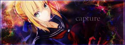
Love that sig, Bun! Drrr! I'm beginning to catch on to some of that DRRR fever.
 I've already gotten a load of pics of two of the characters in there (whom of which I still have yet to learn their names I've already gotten a load of pics of two of the characters in there (whom of which I still have yet to learn their names  ). ).I read the first couple of chapters of DRRR and it looks really interesting. I want to catch a few episodes of the anime but I haven't had time to watch any anime since the beginning of this year.  Using the elliptical marquee for something like this never crossed my mind. O_o Thanks for the tip MB! (new nick for yeah :P)
__________________
|

|

|
|
2010-03-03, 17:43
|
Link #222 | ||
|
Anxious bookseller
 Author AuthorJoin Date: Aug 2006
Location: Shibuya Psychic Research
|
Quote:
Quote:
__________________
|
||
|
|
|
|
2010-04-05, 16:16
|
Link #224 | |
|
Anxious bookseller
AuthorJoin Date: Aug 2006
Location: Shibuya Psychic Research
|
Quote:
 Hmmm never put this here. My SOTM Mar entry, used the same Shinra render since I had it available. I got some "urban" brushes as they were called on DA and I really liked how it came out considering I was jut messing around.  Current sig: Simple crop of the cover of Dragons of the Hourglass Mage cuz ummm yeah Im obsessed with Raistlin <_< Have been for 15 years... 
__________________
|
|
|
|
|
|
2010-04-08, 18:05
|
Link #226 | |
|
Anxious bookseller
AuthorJoin Date: Aug 2006
Location: Shibuya Psychic Research
|
Quote:
Final entry for SOTM April, I debated on entering since I know nothing about Touhou but found an image I liked. Wanted to do transparency but it wasnt working so did this instead. Kinda Q&D but I like the background, I wanted to keep the style of her clothing in the bg. 
__________________
|
|
|
|
|
|
2010-05-14, 15:48
|
Link #227 |
|
Anxious bookseller
AuthorJoin Date: Aug 2006
Location: Shibuya Psychic Research
|
Ok SOTM time again, both these are posted to the thread but would like C&C here too.
Yuuki and Zero from VK which is funny since most people who know me know I hate this pairing But the one I tried with Kaname-sama didnt work well.Regular  Animated    Im gonna fix the animation, it was very quick and dirty since I was in a rush to do it. Really you can barely see it... Also does the left side look to plain?
__________________
|
|
|
|
|
2010-05-14, 15:57
|
Link #228 |
|
Senior Member
Join Date: Nov 2006
Location: Virginia, USA
Age: 62
|
I left my comment about the smoke on the SOTM thread. About the left side, I tend to prefer some empty space in sigs. I think most sigs are too busy. So I would say "no" it's not too plain. I suspect though others will tell you differently.
If you want to add something there, how about extending the yellow star spots father into that area? Something like what you did in the lower right corner coming down from the upper left corner to add some balance? Or take the spots that are near Yuki's hair and move them farther to the left so that they're more in that area?
__________________
|
|
|
|
|
2010-05-15, 08:20
|
Link #229 |
|
Strangely dependable...
Join Date: Nov 2006
Location: some random place out there...
|
Bun...doing animation...and a Zero sig? What has she been smoking this month, Sage wonders?
Sig is nice. I don't mind the left side - don't think it's empty at all since you have text there to fill it. I agree with Sensei that some empty space is nice to balance things out. Have the smoke or not having the smoke, is your choice. Although it took me a while to find where your animation is, after you told me. As for the animation, as the top part of your smoke goes up, the lower part should start to gradually fade in the same direction. Also, I think you have a repeat of a frame that doesn't flow well with the others. *cookies for Bun for going into animation...although Sage still wonders what she's smoking... *
__________________
|
|
|
|
|
2010-05-15, 08:54
|
Link #230 | |
|
sleepyhead
AuthorJoin Date: Dec 2005
Location: event horizon
|
Quote:
__________________
|
|
|
|
|
|
2010-05-19, 11:11
|
Link #231 |
|
Anxious bookseller
AuthorJoin Date: Aug 2006
Location: Shibuya Psychic Research
|
Thanks for the help guys
 Vers 3 since vers 2 posted in the SOTM I wasnt really happy with  Took out the yellow dots, did red instead, I think it blends better with the bg, extended them a bit around the text, darked the right side a bit more. Obviously too out the animation since I still cant get decent quality no matter how I slice. Made a smaller vers for my sig space (I cant believe I actually have a ZeroYuuki sig...shoot me) since I do like how it turned out. More then likely will be my final entry.
__________________
|
|
|
|
|
2010-06-08, 12:10
|
Link #240 | ||||||||
|
Anxious bookseller
AuthorJoin Date: Aug 2006
Location: Shibuya Psychic Research
|
Late replies are late
Quote:
Quote:
Quote:
Quote:
Quote:
Quote:
Quote:
Quote:
__________________
|
||||||||
|
|
|
 |
| Tags |
| avatar, signatures |
|
|


 :|::|
:|::|
 You know me too well.