|
|||||||
| Community Links |
| Social Groups |
| Pictures & Albums |
| Members List |
| Search Forums |
| Tag Search |
| Advanced Search |
| Go to Page... |
Conversation Between Kinematics and revan5
Showing Visitor Messages 1 to 6 of 6
-
2011-08-21 13:15revan5
-
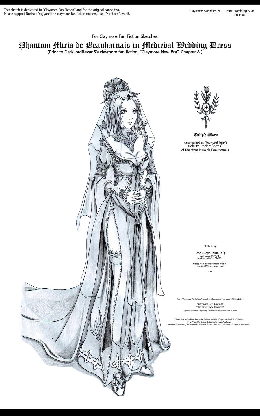
2011-07-23 01:29revan5It seems your advice was rather appreciated.Quote:Originally Posted by Royal Blue NaziThanks and to Kinematics, I have now a more better guideline on how to draw things out for the fan fiction. It's just really funny how Kinematics apply mathematical coordinates in the art, because I never used to draw sketches with very intense mathematical perspective. But in art dimensions Kinematic is right and now I am trying to improve myself. Now with Kinematic's advices I see the flaws to be improved!! Esp. the veil, the eyes, and the splayed cuff.
Actually, I make two sketches of Miria in wedding dress. The first one I trashed out because I made a mistake in her face. The second one is this. I have to admit it is challenging to make Miria in the mode of happiness, since she is portrayed a lot as a serious type woman, and Yagi rarely feature her smiling or becoming happy. Good thing I survived the dilemna and come out with a happy Miria for this sketch
Kind me regards to Kinematics for his/her helpful advices.
-
2011-07-20 01:59Kinematics

First, I have to say the picture is beautifully drawn. Fantastic amount of detail (even if it does seem rather racy for a wedding dress). Various minor things that could only barely be considered 'flaws':
The veil on the right side of her face, the edge of it dips down to match the top end of her dress. The line (at image coordinate 419,511) doesn't extend upwards past her face, but only shows up against the skin above her breast. Because the bottom of the veil matches the line of the dress, it appears to be part of the dress's structure, but at the same time is confusing because it doesn't make sense for there to be anything there.
Further, it extends into a line drawn across her breasts, which looks like something that really shouldn't be there. If that line across her breasts wasn't there, I think the line marking the veil would look more natural.
The splayed cuff on her left wrist has a slight problem with perspective. The one on her right wrist indicates that the 'petals' on the cuff should be angled more closely parallel to her arm, but the ones on the left wrist look like they're spread out closer to perpendicular.
Miria's eyes: Ok, I've had to go back and check my manga, across several different arcs, just to be sure. The eyes are slightly off. Her eyebrows should be slightly sharper, and where your pic has her eyes angling out in teardrops towards the outer edges, they should really have greater width towards the outer portion, rather than lesser. This is more for her left eye (right side of pic) than her right eye, which isn't too far off. -
2011-07-17 18:55revan5

Alright Mr. Critic ( ), try to not drool and critique Royal Blue Nazi's latest!

-
2011-06-20 15:28KinematicsAh, I missed this message, sorry for the delay (and hope this reply gets to you, as I don't use these much).
Critique...
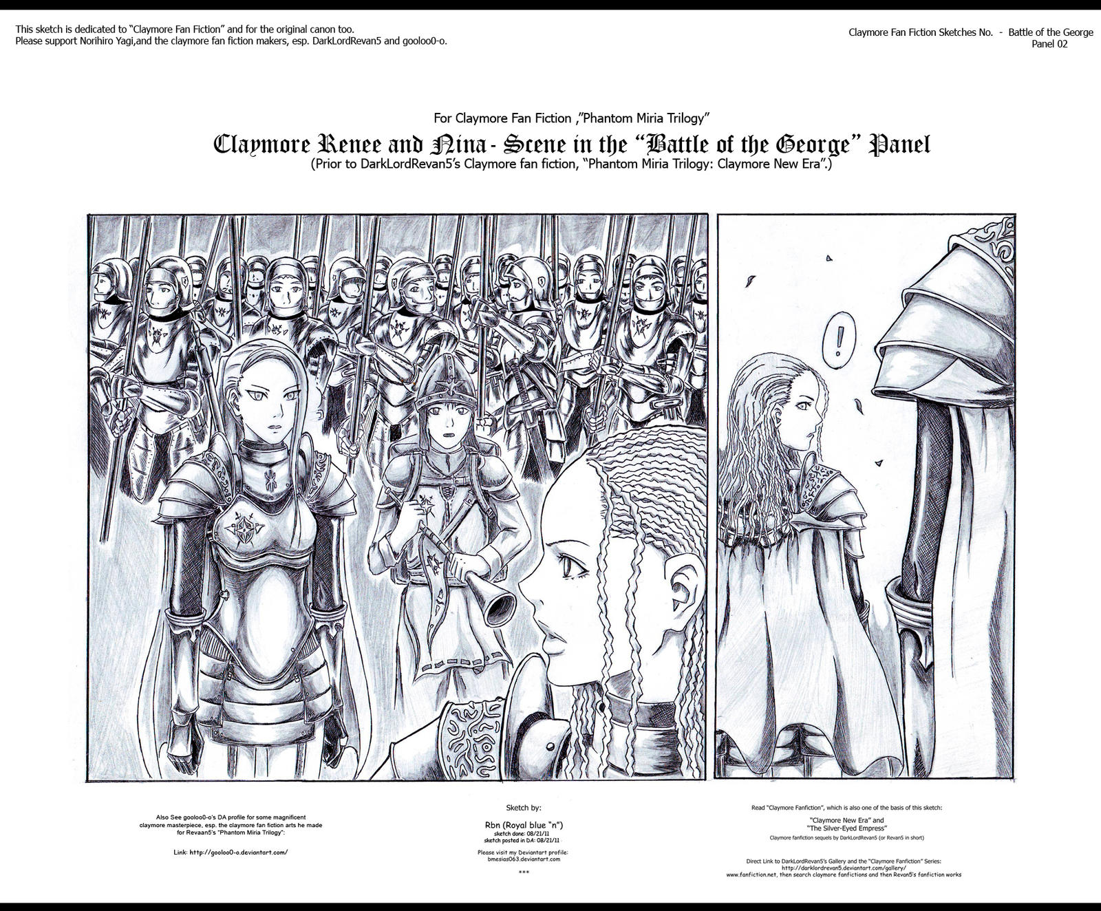
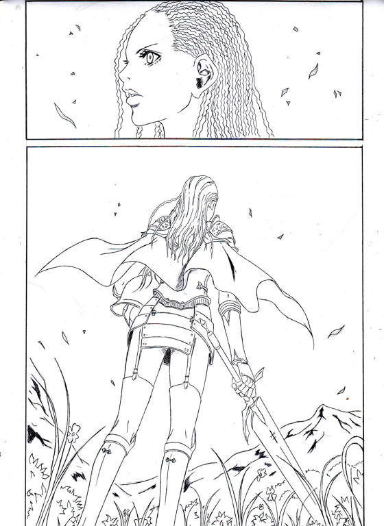
First picture: I must say, he's beautifully captured a lot of the essence of Yagi's artwork. Unfortunately I don't have my manga copies on hand, so I can't be absolutely certain on some of the finer detail, but it definitely feels like I remember Renee feeling. Yagi uses a lot of subtle details to make each warrior unique, in a world where none of them can use the casual differentiator of hair color, and I'm getting that sense here. The eyes, eye angle, eyelashes, eyebrows, nose, mouth and ears, along with the more easily noticeable hair dreads.
Nice perspective on the bottom frame, with the blooms in the grass being a nice touch.
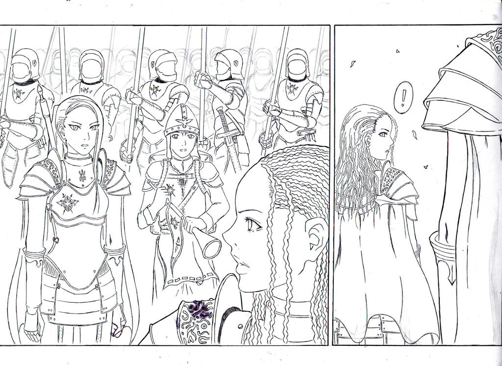
Second picture: Weaker. Nina, unfortunately, I only vaguely remember, but the eyes don't feel right. Renee's eyebrows also look 'off', slightly. The second frame especially looks like it's of a different character, not Renee. The eye looks more like some sort of glam-girl, as the angles aren't quite right.
I must applaud the detailing on the armor, though. Very well done. -
2011-06-10 18:08revan5
All times are GMT -5. The time now is 23:52.


