k i took your advice and added a border...its was kinda thick though b/c the 1 px black border didnt show up...

so i did 2. it didnt looks so good anymore so im sticking to my no border...or does anyone want to help me add a border to mine?
Streetor: i like it! i like the text written under it too haha. its simple but i cant really make out who the characters are. 8/10
Winter&Summer: i like the colours but the left image looks like a floating head. maybe a bigger font size would make it better, and the border is cut off on the left. just fixx it up abit and it will look much better! 7/10
Mr.Hawq: i like the red one a lot. i really like the colours and your current one is nice too i like the border but your name doesnt really stand out.
red one:8.5/10 current one:8/10
mxg: i like the text colour and the design but the two black strips are kinda thick imo. it covers part of some of the ppls heads but overall good! 8/10
KiNa: I like the images and the font of your name. the back ground is cool too and the design is awesome. i would give you 10/10 again but purple is really really not my colour sorry
9.5/10
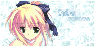
cyz: i like the border and colour but its abit hard to read the name saber in the corner. 8/10
Sakura-chan: i love that sig. i love the shape, the colour, the image, everything! *thumbs up* 10/10
ForeverGoNe: i love this sig too! the colour blends in with the imae so well. for this case it doesnt seem so bad for it to blend so much. the back ground is awesome and the test is cool. *thumbs up for the second time* 10/10
heres another sig i made out of my spare time. can you give me comments? anything i should fix?