Quote:
Originally Posted by JRendell

Draft #2

Any better? |
Still too dark, it's hard to "understand"
Quote:
Originally Posted by Haladflire65
My ver. 2:
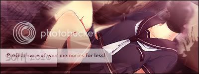 |
lol, okay, I think it looks nice this way

Quote:
Originally Posted by imbehindyou

C&C much appreciated!  |
Really cute, cute style and cute choose of colors, really good job.
Quote:
Originally Posted by Ichigo-Sora
My attempt at the theme ^^
 |
It's nice but the ight is too bright.
Quote:
Originally Posted by CMHerrera
Heres my try dont know if i am happy with it or go with someone else..

|
Overall it's really good, I'm a bit yes/no about the yellow plant ontop, it looks good but at the same time a bit distracting, perhaps placing it undere the render....
Quote:
Originally Posted by Naoto
My try this month I made 2 vers because i can't transparent this sign 

|
I don't see the school uniform