Quote:
Originally Posted by Haladflire65

Thanks for the suggestion  I also got feedback saying that the style of the font didn't fit the sig so I tried another combo.
 |
lol, yeah, better the Halo font didn't feet with the sig very well,.

Quote:
Originally Posted by Cyz
Oookay, version 2:

^ Changed the font
|
Yeah, a lot better, I like it!

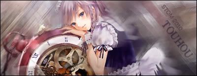
Quote:
Originally Posted by Endrance
Another try with Patchouli... text as soon as i figure something out
 |
Ah, well, it's an animated one in the end.
Hmmm... the animation looks a bit forced, it doesn't seem to have enough frames to have a realistic enough, we could help this out bu slicing the sig.
