Oh right, I've yet to comment on this one too... Anyway, looks like we've been both busy making our own threads, have we?
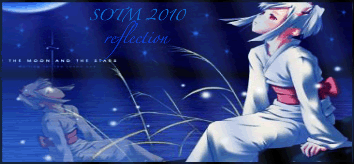
I remember this one. While I didn't vote for it, I do think it looks very nice. The fact that this is realistically and geometrically impossible for a reflection aside, it has a serenity to it... I will agree with Star-Wing, it's a tad squished. As are some of your other signatures, though sometimes it can be a bit hard to correct...
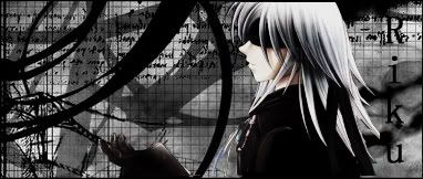
IMO, your best sig you've got here. The look of it, the black and white, the designs... fantastic. Something I don't even think I could do. I personally will disagree with Star-Wing on this one, I think that even without blending it looks very nice.
Well, looks like we've got threads to update and check back to regularly. Keep up the good work, Sworn to Believe.