Quote:
Originally Posted by Star-Wing

It's ok ^.^ Good luck on your quest to enhance your skills 
Thank you 
And thank you for describing that in so much detail O_O I am going to try it ASAP! Thanks a lot <3 And I hope it comes as great as yours And if it doesn't....I'll have to rely on your psd  Thanks for that too ^-^ That's nice of you. I'll let you know how my sig turns out.
Btw, wow, so many steps No wonder the sig is so amazing :3 I still can't give you cookies >_>
Do you have topaz vivacity?
And your Iron Man sig looks great *.* The font looks amazing (which, may I ask  ) and I like its placement. Plus the size is nice too, and yea, if you like making bigger sigs, then go for it ^.^ This one looks really good Even the c4ds placement is good and the lighting goes well with it....I just feel that the lightning on the extreme top right should be a bit towards his head...it just seem like that to me ^^;
Oh btw, is there a colored version of this...I am just curious, I want to see how it looks. |
Haha thank you
If you think that one took a lot of steps, wait til you see my other psds
And yeah, I do have Topaz.
The font is called Planet Kosmos. It's pretty cool, the only drawback is that when you try to add a stroke, it's really jagged -_- And thanks for the tip! I moved it a bit
There isn't a colored version. The colors were too hard to blend together so I just did a B/W adjustment layer and voila, everything blended well!
That's pretty much the only reason I use black and white, because I usually like color more. I'd show you the psds, but I can't upload anything from my computer atm or else Chrome crashes

Quote:
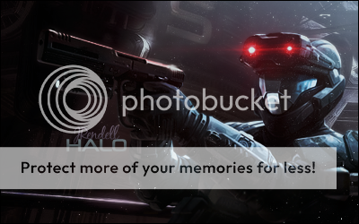
Originally Posted by zebra
That looks really cool! All shiny and ready to attack. Great work!
|
Thank you zebra-chan

Two new ones: