2007-09-19, 22:44
|
Link #3981 | |
|
♪♫ Maya Iincho ♩♬
 Artist ArtistJoin Date: May 2004
Location: Unnecessary
Age: 38
 |
Quote:
Sephi - love it, even though it's rather bright at places. 9.5/10
__________________
|
|

|

|
|
2007-09-20, 00:33
|
Link #3982 | |
|
Procrastinator
Join Date: Jul 2007
Location: California
Age: 33
|
Quote:
 bigdave: For your current sig I give 8/10. I like the effects and background but I always miss Dizzy's dark wing whenever I first see it. For your Miria sig 8.5/10. I really like the color scheme you used for it and the 3D-ish background is just awesome. Only fault I see is the text. It doesn't seem to fit with the rest of the sig. matradley: 7/10 - Like someone else said, I think it would look a lot better without Saber in the pic. And stretch/skew on Saber looks a little off. I do like the background and it's a very nice pic of Rin. l3lueMage: 8/10 - I like the colors and background and of course that classic picture of Haruhi Ai suzuki: 9/10 - I really like how its kinda simple and the colors just fit with the mood of the overall pic perfectly. Very nice, pretty and calming. Deathkillz: For the new one I give 8/10. Nice effects and colors, but the elbow is kinda too blended in with the background. For your current sig 9/10. I just love the simplicity of it and the animated text is awesome. Sephi: 9.5/10 - I like overall feel of it and I really like the borderless effect you gave. Makes it feel like it's blended into the page. Only thing I can nickpick on is that it's a tad bright, but it's not a big deal. Great job as usual. Shana: 7.5/10 - Nice sig, but the colors don't really appeal to me. I think it's the left side; it's kinda dull. And the outer glow (?) effect on Shana's hair on the left side is bothering me somewhat. I think it's because it doesn't make it blend into the bg as much as it should be... Ok on to the good things. I really like what you did with the text and the glowy effects. Good job! GunBladeKid09: 8/10 - A bit plain but I like the pop out/ glass effect it gives. I think you should make the text show a bit more though. Your current one - 8.5/10 - I like the smokey effect and mystical effect it gives. Cyz: 8/10 - Nice shade of green and I like the effects used on the bg. Aoi Emesai: 8.5/10 - I like that effect used on the border and nice text style. And I wuv clouds~  Wow that took a long time to type out 
__________________
|
|
|
|
|
|
2007-09-20, 20:20
|
Link #3986 |
|
♪♫ Maya Iincho ♩♬
ArtistJoin Date: May 2004
Location: Unnecessary
Age: 38
|
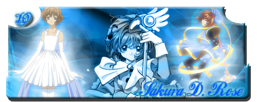
Mr.Incest - me love it too ^_^. 8.5/10 I wish I can have 160x500 but I use 2 space for texts
 update: Finally after so long another change . Didn't put too much effort into this one, but I think it turned out ok. I didn't extract the image as well as I wanted since the background in which I did was mostly whiteish so i just added the outer glow effect to hide some of my mistakes but it seems to go well with the rest so... you know the rest. (see my ghost hiding ^_^)
__________________
Last edited by Aoie_Emesai; 2007-09-21 at 01:17. |
|
|
|
|
2007-09-21, 01:17
|
Link #3988 |
|
Junior Member
Join Date: Sep 2007
Location: Dominican Republic
 |
@GunBladeKid09 i luv both sigs 9/10 for both
@Mr.Incest looks real cute! 10/10 for me xD ive got a couple sigs too, i think they're too big but anyways lemme see if i can upload em :P Spoiler for sigs:
most of em hav names on em cuz that specific person told me to do it :P |
|
|
|
|
2007-09-21, 01:25
|
Link #3989 | |
|
♪♫ Maya Iincho ♩♬
ArtistJoin Date: May 2004
Location: Unnecessary
Age: 38
|
Quote:
__________________
|
|
|
|
|
|
2007-09-21, 06:27
|
Link #3990 |
|
Mew Member
IT SupportJoin Date: Aug 2007
Location: Ontario, Canada
Age: 39
|
@Aoie_Emesai: I love your signature. The soft pastel-like colours. The font does not seem to go with it though. 9/10
@tensec: I really cannot rate them all, but I would go with a range of 7-8/10 for each. I like the effects - each sig is so shiny.
|
|
|
|
|
2007-09-21, 10:38
|
Link #3992 | |
|
♪♫ Maya Iincho ♩♬
ArtistJoin Date: May 2004
Location: Unnecessary
Age: 38
|
Quote:
Deathkillz - Hehehe, cute Rozen Maiden sig. 8/10 updated now with better font and a water effect Maple Leaf above the ears. I've made a version of it with a water effect too, but i'm not too sure if it compliment it was well as it was without it. Spoiler:
__________________
|
|
|
|
|
|
2007-09-21, 10:54
|
Link #3993 | |
|
Haro Pwned U!!!!
Join Date: Dec 2005
|
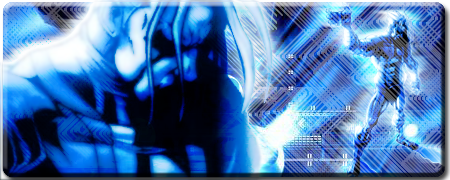
8/10,try to make (lights?) cyan color to purple and see how.
Quote:
__________________
|
|
|
|
|
|
2007-09-21, 14:19
|
Link #3994 |
|
I'm so moe I kill myself
ArtistJoin Date: Jun 2007
Location: your basement
|
justice knight cool sig, although it took me a minute to recall who is it. 8.5/10
as for my sig, it's my second one and i don't think the whole nice boat business is cool any more TAT i'm always one step behind |
|
|
|
|
2007-09-21, 15:33
|
Link #3996 |
|
~ You're dead ^__^* ~
Graphic DesignerJoin Date: Apr 2006
Location: uk, England
Age: 34
|
cicido ~ HAHA!! NICE BOAT!
11/10 for epixness :3justice knight ~ cool crop  but rather plain imo 6/10 but rather plain imo 6/10Aoie_Emesai ~ i love the way you always make your "tear" edges ^_^ but it feels a bit too empty due to the size 8/10 me ~ fate chan up next 
__________________
|
|
|
|
|
2007-09-21, 18:40
|
Link #3998 |
|
Reisen FTW!
Graphic DesignerJoin Date: Aug 2006
Location: Chicago,IL, USA!!!!
Age: 31
|
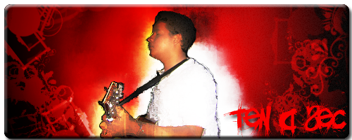
@Kyero Fox: 8/10 freaky. Also you suppose to rte peoples stuff first before you say anything.
@Deathkillz: 9/10 I like alot.^^ New siggy. Not for here but maybe at other forums 
__________________
|
|
|
|
 |
| Tags |
| rate, signature |
|
|