2009-02-05, 04:25
|
Link #1 |
|
(ノಠ益ಠ)ノ彡┻━┻
 Moderator ModeratorJoin Date: Mar 2006
|
SOTM 2009 - February (Dancing) - Entry Thread
 !!!Welcome to the SOTM!!! ~Congratulations to Riker for winning the January Contest!~ The theme chosen for February is - Dancing. What is that? See here for details. About the SOTM: The Signature Of The Month contest is open to all members of the Animesuki Forums. The goal of the contest is to provide a fun and competitive way of showing off and improving the signatures and personal skills of contestants. The winner of each months contest is given the privilege of choosing the theme for the next month. About the SOTM Theme: Each month prospective contestants are given a theme to base their entries on. This theme is decided by the winner of the previous contest. The theme can be anything, as long as it does not break forum rules regarding inappropriate material. At the end of the month, voters choose which entries they liked best out of all submitted entries and a new winner is decided. Themes cannot be used twice in a row. The Rules of the SOTM:
About the SOTM Entry Process: Every month, a new entry thread is created. Each month's entry thread is a central spot meant to give contestants a chance to create and improve their entries as well as their skills, in addition to providing them a place to post their official submissions. The thread is solely about helping contestants with entries, and as such these things will not be tolerated:Anyone disrupting the thread will be asked to take it privately, to the SOTM Generic Discussion Thread, or if the offense is severe enough - reported to the moderators.1. Nonconstructive and negative criticism (if you truly dislike something about an entry, be polite and helpful) This Month's Entry Period:: This months entry period officially starts Sunday, February 1st, 2009 and lasts until Friday, February 20th, 2009. Entries will be gathered and put up for voting on Sunday, February 22nd, 2009. Voting will end on the following Sunday. The due date ends at 11:59 (midnight basically) UTC/GMT. The polling will be up one day later after 11:59 (again, midnight). I will try to be as lenient as I can with last minute submissions but only slightly. It is up to you as a contestant to know what your time zone is in relation to UTC/GMT. I cannot do this for you. Here is a site that can help you figure that out: http://www.worldtimeserver.com/convert_time_in_UTC.aspx Good luck to all contestants, and most importantly, have fun!!! Last edited by Solace; 2009-02-12 at 05:25. |

|
|
2009-02-05, 16:56
|
Link #9 | |||
|
(ノಠ益ಠ)ノ彡┻━┻
ModeratorJoin Date: Mar 2006
|
Quote:
 Quote:

__________________
|
|||
|
|
|
2009-02-06, 14:19
|
Link #12 | ||||
|
Black Dragon
 Graphic Designer Graphic DesignerJoin Date: Dec 2007
Location: In the Netherrealm, thinking who to betray next...
|
Quote:
....  Quote:
Quote:
Mayabe if you focus more body of the dancers it would catch more the theme 
__________________
|
||||
|
|
|
2009-02-06, 18:17
|
Link #13 |
|
Constellation
Graphic DesignerJoin Date: Jan 2008
Location: Pearl of the Orient Seas
Age: 31
|
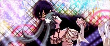
well, this was the stock I used
 the hands were cut but I've watched this already and they were dancing thought it was noticeable that they were dancing, I was wrong maybe I'll find another stock
__________________
|
|
|
|
2009-02-07, 03:18
|
Link #15 | |
|
Hobby Artist
Join Date: Mar 2008
Location: Sweden
|
Quote:
__________________
Last edited by Delitesco; 2009-02-07 at 05:40. Reason: grammar -_-' |
|
|
|
|
2009-02-07, 10:20
|
Link #17 | |||
|
its a boy :o
Join Date: Jan 2009
Age: 33
|
Quote:
 and because its nice and simple (stock+brush+gradient mask = doen  ) I actually have nothing to criticize about it. (lol) ) I actually have nothing to criticize about it. (lol)If I did say anything it would be that the brushes you used first hit me as a semi light source. If you really want, you can try to adjust them to match the stocks shadows,or other way around using something simple like dodge and burn brushes (brush on right is overlaying guys left side shadow). Though it also looks good the way it is because it flows. Quote:
The shadow/dark glow around the man might be too spread out. It actually looks like a feathered (brushed?) erase job thing but the problem is it came out rly wide (easiest way to fix would be to erase just a tiny bit off the edges of the dark areas to make them more contrasting and sharp in comparison to the background). Also your render looks like it came out of a dark image while your signature looks to be bright. On the layer with you render (or just make a mask overlay if you can't do that) just adjust the exposure and saturation a little bit, even contrast and brightness might help with the touch up. Its a good sig but the render has a rly dark theme to it that doesn't match the rest of your sig. Quote:
ReGARDLESS new entry  theres also alot of spots I see that I know I can fix, but I'll take care of them later. cc can nvr hurt :3 Last edited by Ehko; 2009-02-07 at 10:46. |
|||
|
|
|
2009-02-07, 12:46
|
Link #18 | ||
|
Black Dragon
Graphic DesignerJoin Date: Dec 2007
Location: In the Netherrealm, thinking who to betray next...
|
Quote:
Quote:
__________________
|
||
|
|
|
2009-02-08, 01:26
|
Link #19 | |
|
Star Designer
Graphic DesignerJoin Date: Aug 2008
Location: Europe
Age: 39
|
Quote:
For one thing, it looks a bit empty though I understand it's a work in progress
__________________
|
|
|
|
 |
| Tags |
| contest, signature of the month, sotm |
|
|


 .. which better ???