2010-07-03, 20:35
|
Link #15224 |
|
Quietly Lurking
 Graphic Designer Graphic DesignerJoin Date: Mar 2010
Location: Beneath the prodigious sky...
|
Halad- Awesome royai, but I think there's too much white in the top left corner 8.8/10
________ JAILBROKEN Last edited by Rennir; 2011-04-19 at 06:10. |

|

|
|
2010-07-04, 05:48
|
Link #15228 |
|
Onani Master
Join Date: Jan 2009
Location: The girl's bathroom
Age: 35
 |
Rennir: Get out of here, STALKER! 8/10
If it were I, I would have darkened the image slightly with the overlay. ganbaru: Risqué, mate, risqué! Really like how the red has been used. 9/10 CaptnAwesomee: Ah, cuteness overlord. <3 Yui & Ui. 9/10 ReinZwei: Very nice. There's a lot going on in the image but it doesn't overpower the girl's presence, rather it enhances it. Love it. 9.5/10 Haladflire65: Don't look but I think he's flipping me off... 8/10
__________________
|
|
|
|
|
2010-07-04, 10:53
|
Link #15232 |
|
Quietly Lurking
Graphic DesignerJoin Date: Mar 2010
Location: Beneath the prodigious sky...
|
Reinzwei- nice 8.6/10
Oujirou-8.2 right side feels a bit blank btw I know it's not Altair, but the name ezio just sounds lame  ________ Lovely Wendie Last edited by Rennir; 2011-04-19 at 06:10. |
|
|
|
|
2010-07-04, 15:00
|
Link #15233 |
|
「Darkly Charismatic 」
ArtistJoin Date: May 2008
Location: The Lounge
|
Haladflire65: Breathtaking effects, red suits it perfectly, also an awesome scene! 8.3/10
ganbaru:Sensational, just from a cute romance scene, it might also be because I can read french, one of your better sigs! 7.8/10Rennir: Awesome game, awesome effect, awesome sig, nuff said 8/10 PS: You could also use "Auditore" 
__________________
|
|
|
|
|
2010-07-04, 15:37
|
Link #15234 |
|
Disabled By Request
Join Date: Jan 2009
Location: Beach shores!
|
@ganbaru. 9/10. Naughty sig you got there....
@Emerald Emblem. 9/10. Azusa looks great in pink. @CaptnAwesomee. 9/10. Hey, they're like a couple lol. @Rennir. 9/10. Assassins are cool. Na-mu.... @Oujirou. 8/10. Awwww, Lacus and Kira should get a room. @fallschirmjager. 10/10 Genderbender couple Kyon and Itsuki from Sos brigade looks surprisingly hot (no homo). Although, I feel so awkward saying something like that. |
|
|
|
|
2010-07-04, 15:45
|
Link #15235 | |
|
books-eater youkai
Join Date: Dec 2007
Location: Betweem wisdom and insanity
|
Kaze 8,5/10 interesting
NamuSkull 8,6/10 good artwork Quote:
...
__________________
|
|
|
|
|
|
2010-07-04, 18:35
|
Link #15237 |
|
Quietly Lurking
Graphic DesignerJoin Date: Mar 2010
Location: Beneath the prodigious sky...
|
Kaze- I like the blue in the sig. Text is a nice touch as well 8.6/10
________ Volcano digital vaporizer Last edited by Rennir; 2011-04-19 at 06:10. |
|
|
|
|
2010-07-05, 01:34
|
Link #15240 |
|
Constellation
Graphic DesignerJoin Date: Jan 2008
Location: Pearl of the Orient Seas
Age: 31
|
abet17: 8/10 the use of the star brush is weird, but the lighting and text is good
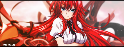
Haladflire65: 10/10 because I miss FMA... ;_; Rennir: 9/10 too bright, you should've deleted some parts of the light where the focal is MetalCookie: 9/10 weird but amusing sig ganbaru: 7/10 the text next to the sig is... a little off? You used a render of Tony Taka's work which is one of my favorite artists :3 NamuSkull: 5/10 too simple, but it's yoshimitsu (my main on tekken) but of Soul Calibur Kaze: 8/10 good text, a little simple yet there's an emotional feel I'm getting which is a plus
__________________
|
|
|
|
 |
| Tags |
| rate, signature |
|
|


 (effect looks...over-exposed maybe? Is that the right term?)