2010-12-03, 12:12
|
Link #181 | |
|
Senior Member
 Author AuthorJoin Date: Jan 2008
Location: Newfoundland, Canada
Age: 43
 |
Quote:
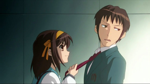
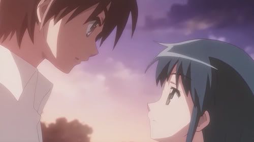
Since you want specifics, though, I'll list some now: 1. The way smiles are drawn are very similar. 2. The way hair is drawn is almost identical. 3. The way eyebrows are drawn are very similar. 4. The way profile shots are handled is almost identical (the very sharp slope on the nose is true for both True Tears characters, as well as Haruhi; Kyon's face-forward nose has a long, solid line too). 5. Foreheads seem somewhat pronounced to me in both pictures. 6. Both use similar lighting and shading affects on hair and clothes and skin. 7. Both have good, solid line work. 8. Both have pretty realistic anatomy and body proportions (other than the eyes of course) Not every anime puts this sort of detail into their artistic work. Many animes don't aim for realistic anatomy or body proportions at all. These two animes do, in my assessment of them. That shows, in my view, that there are similarities in the overall approach and style of the two animation studios under discussion here.
__________________
|
|

|
|
2010-12-03, 14:15
|
Link #182 | ||
|
<em style="color:#808080;">Disabled By Request</em>
Join Date: Jul 2009
Location: Australia
 |
Quote:
Spoiler for JC Staff Shakugan no Shana Example:
Note that Shakugan no Shana started before KyoAni's popularity started, and JC was a studio that existed long before KyoAni was born. The Shana pic possesses all or most of the traits you mentioned: Quote:
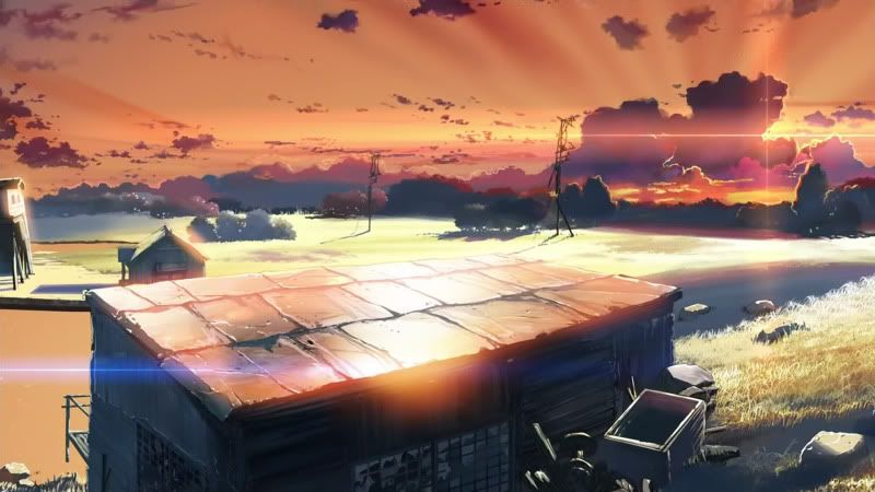
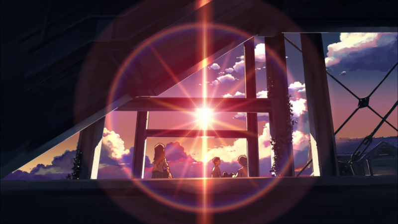
Attention to background detail is not exclusive to KyoAni either, a lot of studios have done this prior to KyoAni, though KyoAni does do it well. In addition, KyoAni is far from having the best background art (not saying you said KyoAni had the best background art, just trying to illustrate a point). In my opinion, if you want the "King" of background art, look no further than Comix Wave (most famously known for Makoto Shinkai works). Examples: Spoiler for Place Promised in Our Early Days Background Art:
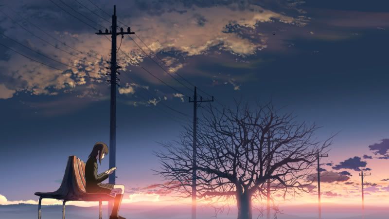
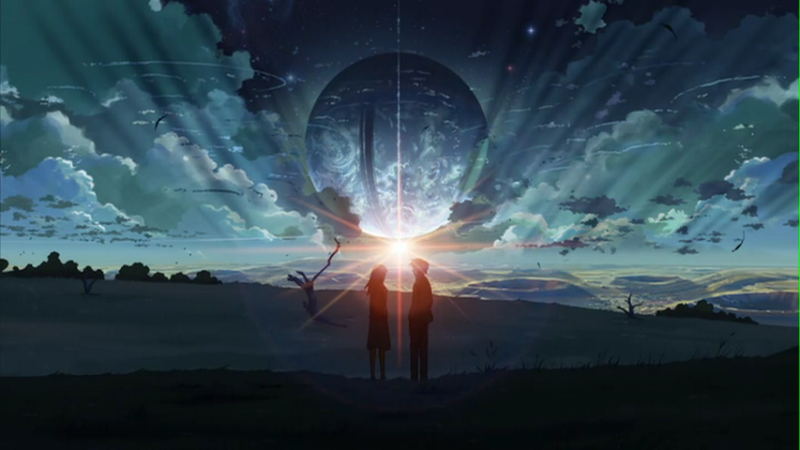
Spoiler for 5 Centimeters Per Second Background Art:
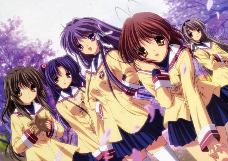
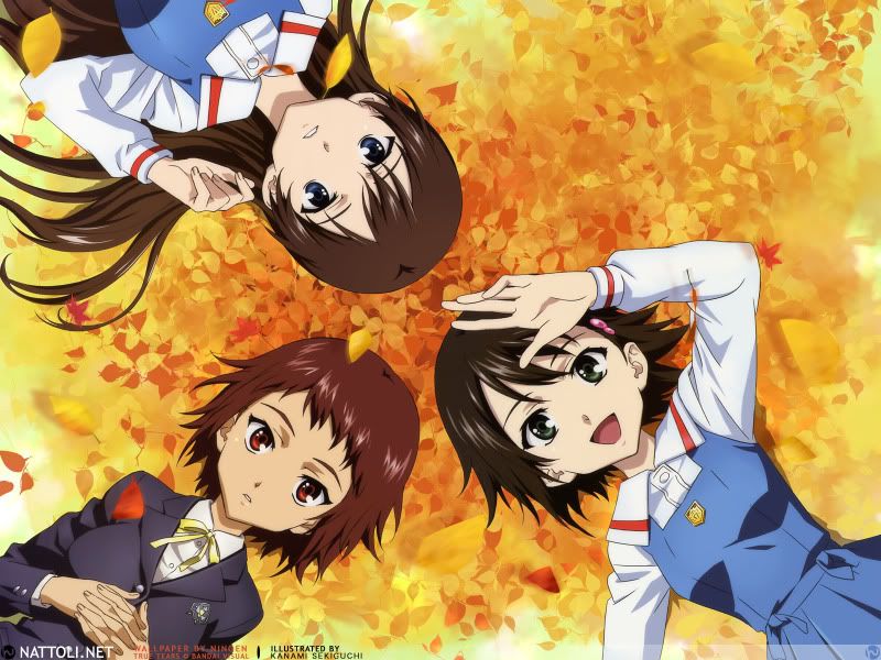
Aside from background comparisons, which I find are usually similar in high budget animes, the character designs in KyoAni vs P.A. Works differ significantly - particularly Key adaptations. Example: Spoiler for Clannad vs True Tears comparison:
If I had to summarize the difference in character designs between the two, the Clannad girls have bigger eyes, less sharpness, darker shade and are more "cute/moe" looking. Don't get me wrong, I like both artstyles, though if I had to choose personally, True Tears one will edge out a little bit. Here's also a promotional art piece for P.A. Work's upcoming work: Spoiler for Hanasaku Iroha art:
I see similarities between this and True Tears but once again not much between this and the Clannad/Haruhi one. Like I said before, the only series that P.A. Works looks similar to KyoAni is Angel Beats. That I will not deny. Last edited by Pocari_Sweat; 2010-12-03 at 14:32. |
||
|
|
|
2010-12-03, 14:22
|
Link #183 | |
|
Not an expert on things
Join Date: Jun 2007
|
Quote:
1. This is something every anime has in common. If you want to be nitpicky, Haruhi has more of a pronounced lip. 2. Not really. Haruhi has the more pronounced separation between the bangs and the rest of the hair that's more characteristic of older anime [in my opinion]. 3. Not really. True Tears has thicker eyebrows. 4. Many anime have the sharp, pronounced nose. 5. See above. 6. Not necessarily. Again, Haruhi demonstrates what was more popular earlier on: a large, solid line for hair highlights. True Tears demonstrates what's more popular now: broken highlights for the clumps of hair. 7. See 5. 8. See 7. Haruhi's style, using your criteria, is comparable to many Bones works [Eureka Seven, Fullmetal Alchemist], many Sunrise works [Gundam 00, Code Geass], and the Nanoha movie. They might not have all of them [the foreheads in Nanoha aren't as large, for example, and a lot of them have different facial construction], but the point is that you see those things everywhere. |
|
|
|
|
2010-12-03, 15:07
|
Link #184 | |
|
Senior Member
Join Date: May 2007
|
Quote:
2. not really, the presence of shadow shapes, at the least in the screenshots, is minimal in True Tears; whereas it occupies 3/4 of Haruhi's hair. I cannot remember if that was the case for the rest of the series, but I think it was. That should count for a difference, too. 6. not really, I think it's pretty obvious that the first one follows a light logic: the spotlight on the lower right indicates that light moves to the left. The clothing and the skin address this light logic---shadows to the left, light to the right---and this is further accentuated by the gradation and the strong dark on the left. In the second picture, however, it's not very clear where the light is coming from, and thus, light logic is missing. I think it counts for a major difference about how light and shadows are handled in the two pictures. 7. which does not necessarily apply only to these works. 8. I'm not sure if you can tell whether or not they have "realistic" body proportions if you can only see the upper half of the body, or just the faces... =_= (just saying) I'm not sure if we can speak of a comparison or similarity taking those details into account, they are not precisely distinctively similar in my view. and so, the point you are trying to make is that Kyoani and PA Works address "realistic proportions", and that's why they are similar in approach and style. I don't really agree with it, when it comes to the artwork and character designs there's a lot more involved in their creation. Kyoani's style is very distinctive and interpretative when it comes to the visual presentation of the characters; there's a certain emphasis on addressing the gesture of the movement through shapes and lines. I have never thought of the figures as stiff; you can sort of feel the dynamics of their bodies, how the limbs twist in space. This I believe is part of their style, which sincerely speaking, I haven't quite seen in PA Works. The closest may be Yamakan's Kannagi, but even that has its differences as well. On the other hand, if I have to say something about Kyoani's artistic style is the way they address light and create a mood in the process, which has been a constant trait in all their works. By this I mean how they depict a particular scene: the time of the day, the lighting (fireplace, artificial, sunlight, moonlight, etc) the season they are in; and whether it's indoor or exterior, there's a great level of detail put into the background, but not only that, they develop a mood, an atmosphere as well, which is very difficult to achieve. Episode 18 of Kanon comes to mind, how, during the fountain scene, the lighting constantly changes to reflect the emotions of the characters; or how the moonlight seeps into the corridors of the school, creating a mysterious place where Mai is waiting for the main character. if we take an example of their most recent work, I think it's interesting to see how they continue to perfect this style, how they can create a warm afternoon in the K-on clubroom, again, playing with the lighting to create a soothing atmosphere. |
|
|
|
|
2010-12-03, 17:02
|
Link #185 |
|
Gamilas Falls
Join Date: Feb 2008
Location: Republic of California
Age: 47
|
A different example of lighting and camera work would be from the Haruhi episode Adventures of Mikuru 00. The episode is basically a badly made, and badly scripted teen adventure movie made by Haruhi (as seen in a much later episode). If you take the episode as is it looks terrible. The acting is bad, and the only thing that seems to save it is the contant voice over narration by the unseen Kyon.
However, look at it again. The episode looks like it was filmed on a moderately cheap handheld camera. The lighting is horrible. The camera shakes and is often not quite in focus. But here is the catch. Look at the backgrounds and character designs. They are well made and consistent as if one took a bunch of high school students and a handheld camera out to make a film. The bad lighting and bad camera use, had to be animated in that way, and was. Take a comedian that plays a musical instrament on stage badly. Repeatedly badly. Consistantly badly. (Jack Benny). You have to be really good at playing the instrament before you can intentionally play it badly on demand. The example, Jack Benny, could play the violin quite well in fact. He just butchered it on stage for his comedy act. KyoAni does the same for this particular episode. They learned how to do everything correctly first (with FMP, Munto, and AIR), then made an episode that looks horrible intentionally because it fits the plot perfectly. You have to have some skill to make the lighting correctly bad and get the motion of the camera on something animated without it looking like you just took a still frame and jerked the camera around over it (or moved the cell under it like a lot of action anime use to do).
__________________
|
|
|
|
2010-12-03, 17:36
|
Link #186 | ||||||||||
|
Senior Member
AuthorJoin Date: Jan 2008
Location: Newfoundland, Canada
Age: 43
|
Quote:
Now, I'm getting the impression that you thought I was saying that PA Works was ripping off KyoAni's art style, and if so, let me be very clear that this is not the intent behind what I said at all. So if you took that implicit argument from what I wrote, then I apologize for it. Keep in mind that I don't see anything wrong with Yurippe from Angel Beats! looking a fair bit like Haruhi. If a particular character design base is appealing, I don't see the problem with it being re-used for different characters, as long as you add enough distinguishing touches to each new use of it (and I definitely think Yurippe has this, to the credit of PA Works). A lot of prominent western animation shows are famous for making extensive use of the same character bases. I definitely think that PA Works does have a certain distinctiveness to its art style, to be sure, and you have done an excellent job of pointing that out. What I was mainly saying is that it shares certain general artistic strengths (strengths from my perspective and taste in artwork, anyway) with Kyoto Animation (and some other animation studios as well). To really simplify it, and to put it in a nutshell, both animation studios notably excel at artwork that has attention to detail, character designs that look fairly realistic (making exceptions for the big eyes/small nose predominant style of anime), and tend to have artwork that is appealing to moe fans, including myself. That's pretty much all I meant. Maybe the similarities I noticed aren't that big of a deal, and are more common than what I think, but they do tend to be important to me. Quote:
Quote:
I mean, you wouldn't expect the special effects of sci-fi TV shows to match up to the special effects of sci-fi movies. And generally speaking, they don't. That being said, thanks for sharing those gorgeous pics.  Quote:
Also, this new PA Works anime, Hanasaku Iroha, makes me think a bit of K-On!!, to be completely honest. But the differences are significant enough that I wouldn't say that K-On!! influenced it, necessarily. Quote:
Quote:
Quote:
Quote:
Quote:
Plus, if your "many animes" amount to, say, 20-to-25% of all animes, that's still a small enough group relative to all animes that similarities can stand out to me. Falkor - You raise some good points. Your appreciation and understanding of art appears to be at a certain level of true expertise, whereas I am seeing it with an untrained eye. I'm not an artist myself. Perhaps I'm seeing more similarity here than what is really there.
__________________
|
||||||||||
|
|
|
2010-12-03, 18:01
|
Link #187 | |
|
Lets be reality
Join Date: May 2007
|
Quote:
|
|
|
|
|
2010-12-03, 18:16
|
Link #188 | |
|
Senior Member
AuthorJoin Date: Jan 2008
Location: Newfoundland, Canada
Age: 43
|
Quote:
Also, this new P.A. Works anime looks very moe to me.
__________________
|
|
|
|
|
2010-12-03, 18:24
|
Link #189 | |
|
Pretentious moe scholar
Join Date: Oct 2006
Location: Vancouver, Canada
Age: 37
|
Quote:
-I'm not sure "moeified" is the right term, since the original designs for many of the characters are also very moe. -Sora no Woto's character designs also bare a striking resemblance to A-1 Pictures' own Kannagi. K-On! is just the best known example of that style. I do agree that A-1 didn't preserve the original design's uniqueness though.
__________________
|
|
|
|
|
2010-12-04, 03:58
|
Link #190 | ||
|
Banned
Join Date: May 2004
Location: Neither Here nor There
Age: 40
|
Quote:
Quote:
They could really use a collaboration again though if they ever wish to try and branch out from the moe demographic. |
||
|
|
|
2010-12-10, 19:29
|
Link #191 | |
|
North American Haruhiist
Join Date: Oct 2010
Age: 43
|
Quote:
A KyoAni/Bones team up on Full Metal Panic for instance might help it get more exposure on American TV, which I don't think shows any KyoAni stuff. |
|
|
|
|
2010-12-10, 19:59
|
Link #192 |
|
Senior Member
Join Date: Nov 2010
|
oh, and if you want to see a new FMP series, please WRITE LOTS AND LOTS OF LETTERS!
Band together and demand new series of FMPs. Write countless letters. Keep on writing until they get sick of it and they will be forced to make a new FMP series. It's the only to get KyoAni to do a new FMP series. They won't make it until you have to hit e'm on the head to make them realize that there is a demand for FMP animes next to Haruhi. And if they want to keep the Moe elements of the shows they're making, then they could do lots of potentials with characters like Tessa, and even Kaname can be considered Moe by Minori Kushieda/Mio Akiyama standards. There are lots of arguments for a new FMP series, especially with the popularity of Gurren Lagann and Star Driver. Convince them by contacting them and writing to them lots of times. It worked for Dollhouse to get Season 2 and Family Guy to return. it can work for FMP.
__________________
|
|
|
|
2010-12-22, 18:35
|
Link #193 |
|
Unspecified
ScanlatorJoin Date: May 2010
Location: Unspecified
|
is that just me or it seem Kyoani seem going down hill
i mean before K on their animation is good and i really like their art style. then after k on, even if they still maintain the good quality on their own. its seem production value look lower than before. probably because the art style is easier to animate than previous thank to being smoother and rounded. it also to cover off model since basically they like squishy doll and hard to notice. what i FOREVER hate is how it effect haruhi animation (yes even the movie is bit influence by them albeit less slightly than s2) consider they make another slice of life anime after this. it seem they cannot back to old art style ( even thought the art seem going to azumanga style) this even make me worried if they still willing to create little buster! if they did will it comparable to past key work |
|
|
|
2010-12-22, 18:50
|
Link #194 |
|
Gamilas Falls
Join Date: Feb 2008
Location: Republic of California
Age: 47
|
I'd point out there Haruhi movie and move on.
They topped themselves. After that, no one knows what project they will take on that will be based on a more realistic art scource as oppose to a less detailed source.
__________________
|
|
|
|
2010-12-22, 19:03
|
Link #195 | |
|
Unspecified
ScanlatorJoin Date: May 2010
Location: Unspecified
|
Quote:
but i have problem with the ART style i mean it feel like cheap when they use K on art style either way i still impresses their background art. it always top notch both on haruhi and k on but only the character art style that really get me mad. |
|
|
|
|
2010-12-22, 19:07
|
Link #196 | |
|
Senior Member
Join Date: Nov 2010
|
Quote:
The entire team who worked on Haruhi S1 worked in Disappaearance.
__________________
|
|
|
|
|
2010-12-22, 19:24
|
Link #197 | |
|
Unspecified
ScanlatorJoin Date: May 2010
Location: Unspecified
|
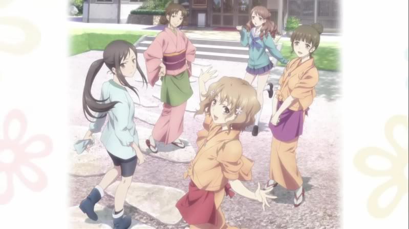
Quote:
Spoiler for pic:
it seem in the movie they try to go back and forward between s1 art to s2 art and leaning to s1 obviously it not greatly different form original design but you can feel k on vibe form it |
|
|
|
|
2010-12-22, 19:39
|
Link #199 | |
|
Unspecified
ScanlatorJoin Date: May 2010
Location: Unspecified
|
Quote:
and like i said the movie is going go back and forward between S1 and s2 artstlyle Spoiler for pic:
Last edited by RRW; 2010-12-22 at 19:51. |
|
|
|
|
2010-12-22, 22:19
|
Link #200 | |
|
Senior Member
AuthorJoin Date: Jan 2008
Location: Newfoundland, Canada
Age: 43
|
Quote:
The more dark and/or serious the mood, the more like Haruhi 2006. The more happy and/or lighthearted the mood, the more like Haruhi 2009. While I much prefer the Haruhi 2006 style overall (for Haruhi's anime), I'm fine with this back-and-forth approach, as this artistic back-and-forth can actually add a lot to the overall atmosphere of all the scenes that way. The K-On! artistic style is actually fairly fitting for lighthearted moments, but for more dramatic moments, the Haruhi 2006 artistic style definitely works best, imo.
__________________
|
|
|
|
 |
| Tags |
| studios |
|
|