 2007-06-05, 20:53
|
Link #61 |
|
Falling for Ginsama ^3^
 Graphic Designer Graphic DesignerJoin Date: Feb 2007
Location: Airantou
 |
Okay I haven't been putting up works in awhile!
  anyways this is my first sig that I have done after REINSTALLING my OS =___= So im getting back into it  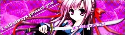 I welcome critiques and stuff.  edit: Oh and this is the first time I have done this but I made a matiching avy for it too. xD lol 
__________________
Last edited by bigdave; 2007-06-05 at 21:06. |

|

|
|
2007-06-06, 00:35
|
Link #62 |
|
One PUNCH!
 Administrator AdministratorJoin Date: Dec 2005
|
Reinstalling your OS?! I feel for you, man! (I've done that once or twice myself)
As to the sig and avy, I like them! The color balance is good, the background crazy (but fits), but imho, if I have to squint to see any details of the subject, I consider that a fail. If you can ratchet back the contrast so that we can at least see her mouth, then you've got a winner! btw, who is she?   countdown to post #1000: 1 |
|
|
|
|
2007-06-06, 22:48
|
Link #63 |
|
Desu Desu Desu!!!
Graphic DesignerJoin Date: Mar 2007
Location: Texas
Age: 41
  |
not bad there... though, have i mentioned me no likey pink? also, not a fan of of the checkerd transparent bg blended look.... and yea, i agree with crowkenobi... u need to mess around with the brightness/contrast a bit more...
still... nicely done... k thxs |
|
|
|
|
2007-06-07, 09:41
|
Link #65 |
|
Hail pork!
Graphic DesignerJoin Date: May 2007
Location: Silicon Valley
|
What up BD, I see you're at it again and sorry to hear about your OS. Get a Mac! Just playing so this is your first sig fresh off the new OS... well first of all, presentation. It's not up to par due to the quality of your render. Even if you balanced it with levels or contrast/brightness features, the quality is not there. This is easily seen when compared to your bg. 2nd, the text on the sword. It's probably just me, but I would use the bevel and emboss feature to engrave the text and give it some metalic look to blend well with the sword. At the moment, the text looks like the sword was tagged on by some anime gangsters. Angled text in the bg is very plain but still doesn't hold a crisp look. Change the text option to crsip or strong and hopefully that will help it out. Bg looks cool and graphical but not really complimenting the render at all. A total revision of this sig should be made. I don't mean to sound like a dick or anything, I'm just looking out for you bro.
__________________
|
|
|
|
|
2007-06-08, 13:54
|
Link #66 |
|
Falling for Ginsama ^3^
Graphic DesignerJoin Date: Feb 2007
Location: Airantou
|
Dark>> yea after a second look at it I don't really like it that much, I guess I got rusty at making sigs since I didn't make one in a little while ^^:;
Shana>> hahah yup it does look a little @___@ xD lol Wing>> nah ur not being a dick ur just helping me out, and yea that one was a dud so i think I will just move on since I can't really do much for it anyways. :/ SO here is some new sigs I made of My new favorite game!!! ^o^   
__________________
|
|
|
|
|
2007-06-08, 22:47
|
Link #70 |
|
Hail pork!
Graphic DesignerJoin Date: May 2007
Location: Silicon Valley
|
Your last three pieces of work are better than your previous. +1 on a great job. I like the 2nd one because it has a vector look. Nice job on that. The first one has a nice quality render with sharp looking bg. It's clean, simple, and presentable. Your last one would probably be my choice. I would work a bit on the big O, and the rest of the text. You have too much drop shadow on it. Reduce the distance to 2 and size to 1 or 2. Make the shadow a bit tighter than it is now. On top of that I would change the color of the black lines to complmenting colors such as a dark purple or dark blue... black really stands out. Quality of the render isn't to sharp, but it does compliment the bg.... so good job on that. Keep up the great work, can't wait to see more work. Oh yeah, so what kind of request is it?
__________________
|
|
|
|
|
2007-06-08, 22:55
|
Link #72 |
|
Falling for Ginsama ^3^
Graphic DesignerJoin Date: Feb 2007
Location: Airantou
|
thx Nate!! xD
if u put up ur sigs here I think u would get a whole lot more pointers cuz animesuki has a lot of sig makers. ^___^ like Wing there he critiques ur sigs and tells u some advice. Edit: Wing>> O right the request I its basically for a sig of Velvet from the same game as my current Odin Sphere sigs. but I don't know if I can find much pics for her >,< I know I have two but thats bout it. ^^;;
__________________
|
|
|
|
|
2007-06-08, 23:12
|
Link #74 |
|
Falling for Ginsama ^3^
Graphic DesignerJoin Date: Feb 2007
Location: Airantou
|
yea when I first came here I didn't know bout the sites pretty strict policies on the size of the sigs and the amount of bytes.
just to let u know it has to be lower then 50,000 bytes. and the max size is 500x160 and if u want to have text under ur sig or something then the height can't be higher then 120
__________________
|
|
|
|
 |
| Tags |
| signature |
|
|


 ^___^
^___^

