2006-12-21, 15:32
|
Link #81 | |||
|
~ You're dead ^__^* ~
 Graphic Designer Graphic DesignerJoin Date: Apr 2006
Location: uk, England
Age: 34
 |
Quote:
 to answer your question from the sig thread...if you use IE and look at your sigs you can see a white box around the pics where it is ment to be transparent ~ that is why i said fake transparency but then looking back at your sig in firefox makes them look fine  just the headache png files cause just the headache png files cause well the sigs are reall nice...a bit plain but look unique without a background...now if you can just make them larger one small detail is that the photos on the 2nd sig has bad quality edges >.< Quote:
Quote:
but your right about the font...imo its too strong for gin...must change
__________________
|
|||

|

|
|
2006-12-21, 22:00
|
Link #82 | |
|
Senior Member
Join Date: Jul 2006
Location: Australia
Age: 36
|
Quote:
As for what you said about the photo edges, KiNa also said the same thing, but I currently have no idea on how to make it look better ><. I'm doing alot of trial and error but it isnt working lol.
__________________
|
|
|
|
|
|
2006-12-22, 06:04
|
Link #83 |
|
Kira_Naruto, the ecchi
Graphic DesignerJoin Date: Dec 2005
Location: http://www.exciting-tits.com/
|
Both last 2 signature have been covered their critic.. saying it again would be like rubbing salt to wound =x
So have this instead of my current signature.. the Iroha sig is more like a promo to Iroha ^^. That and I'm just afraid of the slaughter  Oh btw saphrye, dont worry about the lots of trial and error and still not working part lol .. We all must pass tru it .. heck, I think I'm still in that phase as well ^^
__________________
|
|
|
|
|
2006-12-22, 20:58
|
Link #84 |
|
I want dreads...
ArtistJoin Date: Sep 2006
Location: a cardboard box
Age: 34
|
Need some help, totally stumped on what I should put on the background for this siggy. If you guys can, please post some nice bg's for me to try out with this, doesn't need to be fancy, I'm just looking for something that fits the theme for this character.
__________________
|
|
|
|
|
2006-12-23, 07:24
|
Link #85 | |
|
Senior Member
Join Date: Jul 2006
Location: Australia
Age: 36
|
Quote:
__________________
|
|
|
|
|
|
2006-12-23, 09:39
|
Link #86 |
|
I want dreads...
ArtistJoin Date: Sep 2006
Location: a cardboard box
Age: 34
|
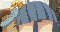
Obviously I would have but the pic that its from has other characters and things which kind looks ugly. Anyways I think I got a good bg, tell me what you think. Btw I'm probably gonna change the text, its a little to out of place to me.
__________________
|
|
|
|
|
2006-12-23, 10:26
|
Link #87 |
|
sleepyhead
AuthorJoin Date: Dec 2005
Location: event horizon
|
Cool..
The hand-grip of the sword looks a lil' uhh eaten off.. The bottom part of the character.. uhh.. shouldn't I be able to see thru it.. The charcter overal looks good.. it, maybe could use just a tady bit softening to make it feel more into the BG.. but it's nice.  Just one lil' complint it's not AS friendly.. why?! 
__________________
|
|
|
|
|
2006-12-23, 12:53
|
Link #88 |
|
I want dreads...
ArtistJoin Date: Sep 2006
Location: a cardboard box
Age: 34
|
Are you sure softening it will make it blend in more? I used the dodge tool a little bit on it but it didn't look very good. As for the sword, I don't know what to do with that, I must of screwed up when I was cutting the pic out. I'm a newbie in adobe photoshop so if there's a quick and easy way to fix please tell. I did make the bottom part a little more transparent though.
__________________
Last edited by Crystal_Method; 2006-12-23 at 16:13. |
|
|
|
|
2006-12-25, 20:38
|
Link #90 | |
|
♪♫ Maya Iincho ♩♬
ArtistJoin Date: May 2004
Location: Unnecessary
Age: 38
 |
Quote:

__________________
|
|
|
|
|
|
2006-12-26, 02:06
|
Link #91 |
|
Kira_Naruto, the ecchi
Graphic DesignerJoin Date: Dec 2005
Location: http://www.exciting-tits.com/
|
That would make a nice BG =3
 @ slvr .. hmm, for a 1st sig, you've did an excellent job.. but then again, you following tutorial -.- .. If I have to comment then, you color choice for BG is kinda weird, where is the blue coming from? Also the text style really contrast the sig feel a bit too much IMO.. its kinda too strong, sort of >.< .. Also your smudging work need more refinement .. but very good job overall ^^b=====  .. I couldn't help but to include the full pic of the mikuru on the right .. but lower opac (only the leg kinda visible) .. or Ojisan gonna gives me holiday ^^v .. Lame font for my name, but warping makes most of the fonts i have unreadable .. I couldn't help but to include the full pic of the mikuru on the right .. but lower opac (only the leg kinda visible) .. or Ojisan gonna gives me holiday ^^v .. Lame font for my name, but warping makes most of the fonts i have unreadable 
__________________
|
|
|
|
|
2006-12-28, 06:22
|
Link #95 | |||
|
~ You're dead ^__^* ~
Graphic DesignerJoin Date: Apr 2006
Location: uk, England
Age: 34
|
holy ~ guys need backup >.<
Quote:
~ normally a static background wont go well with most things but this gives it a darker feel well not much fault to point out but...the image on the right should be blended more into the BG imo and i duno...the proportions seem kinda off...maybe if you make it a little smaller ~ the text is nice but kinda small and together with the colour makes it hard to read ~ oh and change the font for the bottom line...it doesnt suit the sig >.< Quote:
only fault is that youve left the right side too empty ~ how bout moving your second line of text over there? and it would be better to make the text stand out more also you need a border! Quote:
problem is that due to the small size of the sig its kinda hard feel for anything other than the girl which leaves it kinda bland and it eye catches everything ~ i think you should make your name bigger and move it to the right side of the sig so that it will have 2 point in which it eye catches ~ love the frame tho ^_^
__________________
|
|||
|
|
|
|
2006-12-29, 00:08
|
Link #96 |
|
♪♫ Maya Iincho ♩♬
ArtistJoin Date: May 2004
Location: Unnecessary
Age: 38
|
I always add my name to the image before i shrink it to appropriate size for AS, but unfortunetely this time cause of the color of the image the size too, the name was distorted. I'll go back and change it again later.
__________________
|
|
|
|
|
2007-01-02, 03:22
|
Link #97 |
|
of Porsche
Join Date: Jul 2006
Location: Pasadena, California
Age: 40
 |
If I can add onto Deathkillz' comments on the three discussed signatures...
Ichy: Your signature is trying to portray a dark mood, right? If so, the first thing I would recommend that you should do is change the border color from red to black. Red glows. Too much red and everything just lights up for the eyes. When I can see everything, I don't get a hint of mystery or ominous as noir settings should elicit. There's nothing wrong with the text and character in the foreground. The problem is the static background. Again, there's too much red and some pixels blend with the font, causing difficulty to read as Deathkillz pointed out. I suggest reducing the opacity of the background layer, add a black layer behind it to make it darker, and changing the effects of the image to something like a motion blur at 0 degrees. Blur everything around the eye but leave the eye untouched. That's what I feel would improve the sig. Veg: I pretty much agree with everything Deathkillz said here. A full border may not be necessary (can go for the widescreen border like I have in mine), but a border nonetheless would help. But instead of moving a line of text to the other side, just move the entire image and leave the text hanging around the middle of the remaining space. Have you heard of the rule of thirds? If you have, totally apply it. It'll help. Aoie_Emesai: Blonde is best as it is the one color that helps push your subject foward from the background behind her compared to the other ones you got. Personally, text is the last thing I worry about when creating a sig and I only insert it after I've done any form of canvas resizing. Font sizes in the decimals never really worked for me. It's much clearer if font is left untouched. -------------------------------------------------------------- This sig is my "Thanks 2006" sig. I've only seen three anime titles that were released in 2006: Utawarerumono, Kanon, and The Melancholy of Haruhi Suzumiya (in that order). To say thanks for the year I got back into anime, I wanted to incorperate three female protagonists (one from each series) together into a single image like what you would find on an CD album cover.  My first attempt obviously gets the point across. However, common problems people sited were: - Unusual lighting on the characters' faces (their shadows are pointing a different direction) - Background sun gives off an unrealistic light source - White glowing text indicating series names difficult to read So I retouched it to give a better lighting effect and a time of day that would best evoke that kind of lighting on their faces and bodies. Unfortunately, placing the women where they are now leaves very little room for additional text short of my name. As a result, a lot of people are telling me how Eruruu (girl on the far right, suppose to be the most distant of the three girls) is looking wierd or not fitting with the scene. Can someone/you guys or girls help me figure out what's wrong with Eruruu, if she has a problem? >_> Other than that, feel free to give me additional suggestions too. This took me half the day on Dec. 30th and two additional hours on the 31st for retouching. EDIT: Yes, after browsing hundreds of pictures on my HDD, I can confirm that Haruhi's skin is darker than Nayuki's by a few shades. I have their skin tones to match as close as it could get (even adjusted for perspective and height accuracy. If Yuuichi was the same height as Kyon, then Haruhi is freaking short!). But Eruruu, surprisingly, has the most pale skin of them all! I'm not kidding! Go browse the pictures. Last edited by Zaris; 2007-01-02 at 03:32. Reason: Additional Information Added to Provide Better Analysis |
|
|
|
|
2007-01-03, 03:40
|
Link #98 | ||||
|
Kira_Naruto, the ecchi
Graphic DesignerJoin Date: Dec 2005
Location: http://www.exciting-tits.com/
|
hmmmmm... Sorry, kinda bz lately
 Quote:
Quote:
Quote:
 I didnt watch the other series to consider the other girl Ok on to the sig itself... good job on the lighting edit, seeing the original sig I can say that ^^ .. I still say Eruruu wears too many makeup .. kinda like having a chinese opera character there =x. In all honestly, in sig I feel that you dont have to conform to the original skin color tone. Especially when you have several characters from different series.. the edit would be necessary IMO. Lose that thanks 2006 .. Or snuck it somewhere in the corner. hmm on 2nd thought, how about in mid bottom between Nayuki and Haruhi and on top of Eruruu chest area? o_O  Also, is the kanji stuff necessary? Also, is the kanji stuff necessary?=======  Question, you guys interested for a tutorial to animate the text like i'm been using currently ?
__________________
|
||||
|
|
|
|
2007-01-03, 14:17
|
Link #99 |
|
of Porsche
Join Date: Jul 2006
Location: Pasadena, California
Age: 40
|
What the...!? You're judging an older version of my signature! Judge the new one! /slap!
Well, I think we all kinda know how to make .gifs. There are tutorials around this particular forum subsection. I'd be more interested to hear how you got the first frame to display on all frames, as this tutorial forgot to cover that. I can imagine that was how you were able to reduce the file size of your signature. I want to be able to do that too. But if you had another technique, share share. To be honest, I'm not liking the color that's running across your name. It's become much more of a stretch to read your name since it's as sepia-toned as the rest of the background. And if it's not highlighted, it's black, and that's all the same. The font's okay. The smoke is much better. When you say I don't have to conform to the original skin tone, I dunno... if that was true, you wouldn't be so ambivalent about Eruruu's look. I tried to give them the same lighting condition as best as I could, color balancing, adjusting the black/white levels, even changing the background to suit something similar to where I originally extracted Nayuki's. Nayuki is the most unforgiving lighting condition of them all. Since her shadows are really hard all over her clothes, it would take a lot more work to get her fitted to a neutral lighting situation. Again, I spent the better half of a day working on the signature below (and I think I have carpel tunnel too lol). Well, these are the original images I worked from. Maybe this'll give you a better idea of what I had to put up with.    That's not a ghost! It's just what Eruruu wears! 
|
|
|
|
|
2007-01-03, 23:05
|
Link #100 | |
|
Kira_Naruto, the ecchi
Graphic DesignerJoin Date: Dec 2005
Location: http://www.exciting-tits.com/
|
Ehehehehe.. gomen gomen .. what I mean that you dont have to conformed to the original color tone is if your creation needed it to be, just change their color tone to match each other girls..Take Eruruu, you say she's whitish originally, so when putting it beside the other girls, her whitish stood up .. thats the problem.. which is why I suggested you to changed her color tone
and to be honest, I prefer to keep Haruhi skin tone .. and changed the other girls to matched hers ^^. Oh btw, I knew that you have a newer version that you send tru pm.. but what you present here is the old 1 ^^, so .. btw, Quote:
 === @ my sig comment.. Anyway, the original name was intended to be black .. and the gold color is changed to match the BG.. and personally, between the black/ white combi in the older verion and this current 1, I kinda like this 1 better. Thanks on the comment for the smoke tho.. that smoke alone took a lot more time then the other stuff ^^ .. smudging and dodging and burning and dodging again ;_; .. and its just 3 frames only too ;_;.. would love to have more but filesize a burden >.> And thanks for the pic.. Carrier 
__________________
|
|
|
|
|
 |
| Tags |
| discussion, signature |
|
|