2006-01-01, 23:05
|
Link #81 |
|
Inflammation
Join Date: Sep 2004
Location: Cardboard Box
Age: 40
|
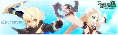
Sasurai, I love your background. Did you use a brush to create those as well?
Only thing to fix IMO is the blurred shadow of your character. It doesn't fit in too well with the sig so just remove that blur completely, and you have a perfect sig. I love the colouring. 9/10 Last edited by ForeverGoNe; 2006-01-01 at 23:39. |

|

|
|
2006-01-02, 00:27
|
Link #82 |
|
Kira_Naruto, the ecchi
 Graphic Designer Graphic DesignerJoin Date: Dec 2005
Location: http://www.exciting-tits.com/
|
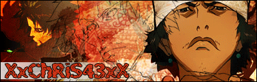
@ XxChris43xX .. Nice complete set of Bleach Captains .. all 13 of them ^-^ . Where's your name? 75%.. Add another 10% after you slap your name on it
 @ ForeverGoNe .. Cool. Nice style .. like it very much. 98%. Can I copy the style  @ KiNa .. My skills (If I ever have any to begin with ) have rusted >.< . Too busy to play much these days + I'm still sulking over my lost rep point =_=
__________________
|
|
|
|
|
2006-01-02, 12:36
|
Link #86 | |
|
Not Enough Sleep
Join Date: Nov 2003
Location: R'lyeh
Age: 48
|
Quote:
 (except whips (except whips  )who is the girl and where is she form? )who is the girl and where is she form?
__________________
|
|
|
|
|
|
2006-01-02, 13:45
|
Link #87 |
|
I am mowing clowns
Join Date: Dec 2005
|
Signature Sizes
Hey all...
 Please watch your signature image sizes. If you haven't already done so, please read our signature size limits. It's part of our Forum Rules. An image without 1-2 lines of ASCII text above or below can be 50,000 bytes or less, and a maximum of 500 pixels wide x 160 pixels tall. You can find your image size properties either by looking at the files when its on your computer or after you've uploaded it. Right Click on the image and choose "Properties...". Example:  An image with 1-2 lines of ASCII text above it or below it can be 50,000 bytes or less and a maximum of 500 pixels wide x 120 pixels tall. Example:  If you need help with file size reduction, I suggest posting a question in this thread -- Workshop for Avatars, Signatures, etc. or send me a private message and I'll be glad to help you out. -- Also...some of you may want to re-read the first post in this thread. Rule #1 especially. Thanks. Kira_Naruto Love the long blue hair and your choice of Font is interesting - 8/10 Shay Excellent design, licentious, good use of AS user-name, nice choice of stock images, pink. - 9.7/10 
|
|
|
|
|
2006-01-03, 07:58
|
Link #92 |
|
Kira_Naruto, the ecchi
Graphic DesignerJoin Date: Dec 2005
Location: http://www.exciting-tits.com/
|
You have to rate =_= .. Its ROD Rate. Or. Die! ... =_=
@ 107 .. Seldom see a black and white siggy. The BG is quite .. urm .. nice? but feels a bit kinda empty near KB's forehead A 72% . And throw a border around it will ya .. As I almost sure that Catgirls will strike out your post later on like he did twice in this page alone  here's the sig for others should they want to rate it here's the sig for others should they want to rate it And why the h### is it called pink.jpg? And why the h### is it called pink.jpg? 
__________________
|
|
|
|
|
2006-01-03, 12:50
|
Link #93 |
|
Inflammation
Join Date: Sep 2004
Location: Cardboard Box
Age: 40
|
107 - Lose the black outline around the figure of your character. Either Apply it to the whole border or just leave it out. Never have an incomplete border unless it actually looks appealing. 6.5/10
Don't get discouraged, fix that little outline problem and come back to get a new rating =). For a first attempt, it's good. The background's focus blends well with the character though .Lina Inverse - Not bad. I liked your previous signatures though. The first thing that comes to mind is the background really doesn't go well with the picture of... (I don't watch Shuffle so I don't know -_-). I like the angling of the shot, it creates perspective but the fact that the edges look pixelated, I hate it. Overall, 6.8/10 |
|
|
|
|
2006-01-04, 02:37
|
Link #94 |
|
Kira_Naruto, the ecchi
Graphic DesignerJoin Date: Dec 2005
Location: http://www.exciting-tits.com/
|
@ Lina .. You remind me of my old self before.. used the max possible allowable dimension available for signature
Kinda look pixelated a bit tho and the rotation is a big minus .. you've improved a bit from the last sig KUTGW 74% @ KiNa .. Much better then my last quick attempt IMO.. I so love my .. BG. and of course the lovely Tamaki The camouflage name is intended so do you think its a bad decision?
__________________
|
|
|
|
|
2006-01-04, 12:51
|
Link #96 |
|
Senior Member
Join Date: Dec 2005
Location: Desert, USA
Age: 37
|
It's been a while since I've posted here and I think it should be time I brush up on Photoshop. This is from before the storm.
ForeverGoNe, Very well done. Such a compact signature and yet it is able to evoke so much. I especially like the dotted line border. 9.8/10 Kira_Naruto, Beautiful background with a nice personal grungy touch to it. The only thing that I really feel may take away from the sig is the coloring of the text. 9.6/10 Vulkanito, Simple and gets the job done. Funny also. 9.6/10 |
|
|
|
|
2006-01-04, 17:17
|
Link #98 |
|
dn ʎɐʍ sıɥʇ
Graphic DesignerJoin Date: Dec 2005
Location: Northern Ireland
|
Hey hey hey Drakeys back <^o^>
and with a new siggy and everthing !!! anyway to rating ForeverGoNe looks very cool and the image goes nice with the backround however the text could be better its quite small and looks kinda odd the way it curves down..... other than that goodjob Kira_Naruto oh oh some1s been slacking while i was away ! =p change the text color and try to tidy the edges of her hair and it'll look real nice. n.n
__________________
|
|
|
|
|
2006-01-04, 22:47
|
Link #99 |
|
"Show it to me"
Join Date: Dec 2005
Location: In solitude, where we are least alone
|
Kira Naruto: As always it still looks good as ever 9/10
i0td: it's Misuzu very nice, i like the sky bg but it looks a little bland 9/10Drake: very innovative, matching it to kill bill 9/10
__________________
|
|
|
|
|
2006-01-04, 23:30
|
Link #100 |
|
Kira_Naruto, the ecchi
Graphic DesignerJoin Date: Dec 2005
Location: http://www.exciting-tits.com/
|
@ Cyz .. I always mistook you with the gifmaker at the bleach forum >.< .. That one is Cybuster -.- . Yours : I would say that the main Tsubomi image is rather pixelated since the source is quite tiny. The BG, while simple are quite nice as well. Still anything with Tsubomi and Kareha owns
.. So .. 72% . Try to find a bigger source :/ hard, when it comes to Tsubomi, I know. :/ @ KiNa .. so my camo name was not an instant hit  .. Redid my sig.. but I think I have to do it once again I fear.. the name placement looks a bit out of place .. Redid my sig.. but I think I have to do it once again I fear.. the name placement looks a bit out of place 
__________________
|
|
|
|
 |
| Tags |
| rate, signature |
|
|