 2009-11-12, 12:23
|
Link #82 |
|
Senior Member
Join Date: Nov 2006
Location: Virginia, USA
Age: 62
|
@ Manju: I would start the glint running up the blade at the place where the static white glare hits rather than lower at the hilt of the sword. The other option is to start the glint at the static glare location and run both up and down from that point. As it is now, it doesn't look natural to me. The sides look at little empty to me. Congrats on getting slices to work for you!
__________________
|

|
|
2009-11-12, 22:03
|
Link #86 | |
|
The Shadow of Twilight
 Graphic Designer Graphic DesignerJoin Date: Sep 2008
Location: Cursed land.
  |
Quote:
Or the link doesn't work with you?  |
|
|
|
|
2009-11-12, 23:28
|
Link #87 | |||
|
Black Dragon
Graphic DesignerJoin Date: Dec 2007
Location: In the Netherrealm, thinking who to betray next...
|
Quote:
Quote:
Quote:

__________________
|
|||
|
|
|
2009-11-13, 20:47
|
Link #90 | |
|
Chrome.o23
Graphic DesignerJoin Date: Aug 2009
Location: Animanga Empire
Age: 28
|
Quote:

__________________
|
|
|
|
|
2009-11-14, 04:54
|
Link #91 |
|
time waits for no one <3
Graphic DesignerJoin Date: Aug 2008
Location: Portugal, Lisbon
Age: 33
|
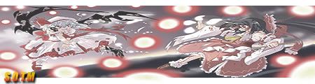
hmm ok got it... somehow I erased the original layer before merging with the blurry part so I couldn't fix it very well but let me know if this works better:
v2 
__________________
|
|
|
|
2009-11-14, 05:58
|
Link #92 | |
|
The Shadow of Twilight
Graphic DesignerJoin Date: Sep 2008
Location: Cursed land.
|
Quote:
|
|
|
|
|
2009-11-14, 14:24
|
Link #94 | |
|
time waits for no one <3
Graphic DesignerJoin Date: Aug 2008
Location: Portugal, Lisbon
Age: 33
|
Quote:
 i had to change reimu's location or else she wouldn't fit the sig i had to change reimu's location or else she wouldn't fit the sig @Miko Miko - love the sig but keiichi is a bit too blurred out... and the text needs serious changes D:
__________________
|
|
|
|
|
2009-11-14, 16:19
|
Link #96 |
|
Strangely dependable...
Join Date: Nov 2006
Location: some random place out there...
|
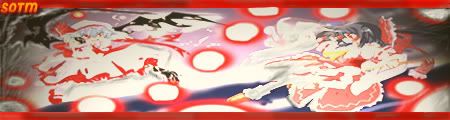
I wasn't too sure whether I would enter this but a friend said to throw it in anyway.
So here it is, my first version.  I feel that it needs something more but can't figure out what.  It was already suggested to tone down the aura a bit, which I haven't done yet, but any other C&C?? Much appreciated as always. It was already suggested to tone down the aura a bit, which I haven't done yet, but any other C&C?? Much appreciated as always. 
__________________
|
|
|
|
2009-11-14, 18:56
|
Link #97 | ||
|
Chrome.o23
Graphic DesignerJoin Date: Aug 2009
Location: Animanga Empire
Age: 28
|
Quote:
 Quote:
__________________
|
||
|
|
|
2009-11-14, 21:07
|
Link #98 | |
|
✘˵╹◡╹˶✘
Join Date: Nov 2006
Location: Australia
|
Quote:
... but the picture in the center is a little bit small IMO @sayinterry: I agree that it looks deformed, squished and without proportion 
__________________
|
|
|
|
|
2009-11-14, 22:18
|
Link #100 | |||||
|
Black Dragon
Graphic DesignerJoin Date: Dec 2007
Location: In the Netherrealm, thinking who to betray next...
|
Quote:
I presume the answewr is yes, well, the image is well merged with this cut but it makes it a bit confusing. It looks as if the lower girl had ripped apart the leg of the upper girl. XP Quote:
Quote:
Quote:
 Quote:
__________________
|
|||||
|
|
 |
| Tags |
| contest, sotm |
|
|


 :|::|
:|::|
