2010-09-28, 18:53
|
Link #16405 |
|
ゴリゴリ!
 Graphic Designer Graphic DesignerJoin Date: Jan 2009
Location: Vancouver, British Columbia
Age: 32
 |
Some small changes to the sig~
Haladflire65: 9/10 Nice effects, and nice guitar ^o^ ganbaru: 9/10 Has your signature been changed since I last voted for you? If not, it gave off a different feeling this time (a better one^^)
__________________
|

|

|
|
2010-09-28, 23:14
|
Link #16413 |
|
ヒットハード&高速
Join Date: Jul 2010
Location: Scanning...
Age: 37
|
Halad: 9/10 not my taste but awesomely done.
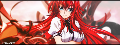
Arbitres: 9/10 but would have great if you could have gotten the tip of the sword in the sig as well :P. papermario13689: 8/10 quality is kind of low. MetalCookie: 8.6/10 nice but could use a darker border :P.
__________________
|
|
|
|
|
2010-09-29, 03:01
|
Link #16415 |
|
Covered in Darkness
Graphic DesignerJoin Date: Jul 2010
Location: Missing~
 |
@Delorean 8.3/10 I find the dimensions to be a bit weird
@MetalCookie 8.5/10 Nicely one. Could use a li'l bit more blending. @Halad 9.2/10 Don't know why, but I love the darkness in this with the selective lightning <3 Great job. Which reminds me, I need to start again with sigs -.- @Ganbaru O_O Is that Aurora what-you-call-its? Great one 8.9/10 The poem, is it the continuation of the last one? @Arbitres Lovely one~ Just the focus is a bit hard to see. 8.8/10
__________________
|
|
|
|
|
2010-09-29, 05:00
|
Link #16416 |
|
books-eater youkai
Join Date: Dec 2007
Location: Betweem wisdom and insanity
|
papermario13689 8,3/10 still, too much elements
MetalCookie 8,8/10 good artwork @Star-Wing: yes, it's the continuation of the previous sigs. But what are you talking about Aurora?
__________________
|
|
|
|
 |
| Tags |
| rate, signature |
|
|


 . Nice sig!