2008-12-04, 04:56
|
Link #23 | ||
|
~La-la Land~
 Graphic Designer Graphic DesignerJoin Date: Jul 2007
Location: Seattle
Age: 37
|
Quote:
 j/k, but honestly, I like it a lot. My only advice would be to lessen the overly saturated black areas. Quote:

__________________
|
||

|

|
|
2008-12-04, 05:11
|
Link #24 | |||
|
♪ ~ ♫
ArtistJoin Date: May 2008
Location: Europe
Age: 35
  |
Quote:
 Absent-minded, lost, thoughtless, psychotic, insane; strangely, those were the first things that came to my mind when I saw that look on her face. (try imagining a knife in her hand and you know what I mean  ) )Maybe I'm just overly influenced with the Azumanga-Osaka-knife-scene.  Quote:
+Update Added one AMV to the first post. Yay!  +Update 2 And yet another signature done! 
__________________
Last edited by Larthak; 2008-12-04 at 12:57. |
|||
|
|
|
|
2008-12-04, 15:54
|
Link #26 | |
|
The Interstellar Medium
AuthorJoin Date: May 2008
Location: [SWE]
Age: 34
|
Quote:
Also, good thing with the text, as putting that without a underlayer might have been hard without distorting the structure of it.
__________________
|
|
|
|
|
|
2008-12-05, 12:44
|
Link #27 | ||
|
♪ ~ ♫
ArtistJoin Date: May 2008
Location: Europe
Age: 35
|
Quote:
Quote:
Bah, second crop siggie I've ever done. One of the best pics I've seen on the net. Beautiful, simply beautiful. [×] - Original picture  Just a quick question regarding the above; would the sig be better without the seven virtues of Bushidō (on the right), or the way it is now?
__________________
|
||
|
|
|
|
2008-12-06, 05:08
|
Link #29 |
|
The Interstellar Medium
AuthorJoin Date: May 2008
Location: [SWE]
Age: 34
|
Wondeful sig, even though it's a crop. The text in the middle would be annoying, if it wasn't for the way it's bent. Good job there.
As for the text on the right, I think you can let it be as it is. It compliments the fact that it's a cropsig, and doesn't intrude on the general area. It also cuts of the sig in a nice way.
__________________
Last edited by NorthernFallout; 2008-12-06 at 10:16. |
|
|
|
|
2008-12-06, 10:11
|
Link #30 | ||
|
♪ ~ ♫
ArtistJoin Date: May 2008
Location: Europe
Age: 35
|
Quote:
But I know what you mean; I can keep staring at that Kona sig for ages. As far as my feelings tell me, it's propably my personal "Best of 2008" (partially influenced by my obsession with that character). Quote:
 __________________ Here's my newest CS4-experimentation. There's a whole new animation tab (almost looks like an exported Adobe Flash timetable), so I gave it a try. I must say it's a very nice improvement, enabling users to fine-tune their animations to the smallest details. Result of today's experiment below. 
__________________
Last edited by Larthak; 2008-12-07 at 10:43. |
||
|
|
|
|
2008-12-06, 23:39
|
Link #31 | ||
|
Banned
Join Date: Jun 2008
Location: Currently stalking, Evil Rick, Larthak, Malin, Kholdstare, lv23, as always Endrance.anafewothrs
|
Quote:
Quote:
 *A wee bit sig obsessed* Larthak...your sigs own!
|
||
|
|
|
|
2008-12-06, 23:53
|
Link #32 |
|
Junior Member
Join Date: Nov 2008
|
haha "Sama." In light of your latest signatures I think it is me who should be training under Larthak-dono. Your current signature with the animated text is just... it's just... Wow. I've watched it loop 6 times now. Larthak-dono? No... Kami-sama!
Edit: Wow I'm an idiot. This is LV23. This is a friends account I use to store my signatures on since I already filled my primary. |
|
|
|
|
2008-12-07, 05:46
|
Link #33 | |
|
♪ ~ ♫
ArtistJoin Date: May 2008
Location: Europe
Age: 35
|
Quote:
*peeks at Laice's profile galleries* Spoiler for Laice's transparency awesomeness:
You're good at this...So simple, yet simply beautiful. Makes me want to do a transparent too. __________________ Tried to do something different for a change; a real photo used as a render.  +New one 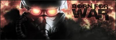
__________________
Last edited by Larthak; 2008-12-08 at 04:36. |
|
|
|
|
|
2008-12-07, 12:54
|
Link #34 | |
|
Banned
Join Date: Jun 2008
Location: Currently stalking, Evil Rick, Larthak, Malin, Kholdstare, lv23, as always Endrance.anafewothrs
|
Quote:
|
|
|
|
|
|
2008-12-09, 18:15
|
Link #35 |
|
Senior Member
Join Date: Apr 2008
Age: 36
 |
Ah! When you quote it the Candy Boy signature looks so horrible. lol I had to soften the background transition into transparency. Thank you though.
Your "BORN FOR WAR" signature is freaking sweet! I really like the background on it. Well, I actually love the background on both of them, but for some reason I'm strangely attracted to the "BORN FOR WAR" one.
|
|
|
|
|
2008-12-13, 12:55
|
Link #37 |
|
The Interstellar Medium
AuthorJoin Date: May 2008
Location: [SWE]
Age: 34
|
Now this is a very interesting concept. Don't have much to say, other than that it is a new way of doing a pop-out. Good quality of it too, I especially like the tech-feeling.
And the text is just too fitting.
__________________
|
|
|
|
|
2008-12-13, 14:15
|
Link #38 | |
|
ǾΝΈ ΡЇΈÇΈ is the Best !!

Join Date: Apr 2007
Location: away from you
Age: 35
|
Quote:
Nice Work on it Larthak-San ^_^
__________________
|
|
|
|
|
|
2008-12-13, 16:49
|
Link #39 | ||
|
♪ ~ ♫
ArtistJoin Date: May 2008
Location: Europe
Age: 35
|
Quote:
Quote:
God, I can't wait for the third series... ") __________________ While working on another project (scraped), I was being constantly spammed by friends via IM, which gave me an idea. For all who watched Clannad:  Just for fun, not considered a real signature. "Puhi puhi!" +Fixed a few pixels in the Kana sig (a slight unwanted glow around her hand).
__________________
Last edited by Larthak; 2008-12-13 at 17:18. |
||
|
|
|
 |
| Tags |
| avatars, signatures |
|
|