2006-11-16, 19:35
|
Link #401 |
|
Ruler of the Universe
Join Date: Jul 2006
|
okay! here's my third entry, which needs... suggestions, please, if anyone has any...
 AND, here's my revised second entry... dimmer colors like Klashikari suggested... as compared to the original...   and of course, the monochrome one...  opinions are always welcome! ....especially because i've gotten mixed responses to all three versions... *keff*
__________________
|

|
|
2006-11-16, 20:13
|
Link #402 | |
|
Sae's Lover
 Graphic Designer Graphic DesignerJoin Date: Apr 2006
Location: Oshawa, Ontario Canada
Age: 37
 |
Quote:
 . .
__________________
|
|
|
|
|
2006-11-16, 20:26
|
Link #403 | |
|
Junior Member

Join Date: Sep 2006
Location: Brooklyn, NY
Age: 44
 |
Quote:
|
|
|
|
|
2006-11-17, 11:06
|
Link #406 |
|
sleepyhead
AuthorJoin Date: Dec 2005
Location: event horizon
|
I think levian's banners are good and that (s)he should leave them as they are.. ;)
My fav is the first one.. while Kairin seems to fit better in there she doesn't seem to blend well with the background, from a technical standpoint..
__________________
|
|
|
|
2006-11-18, 00:58
|
Link #409 | |
|
One PUNCH!
 Administrator AdministratorJoin Date: Dec 2005
|
Quote:
 So anyway... I'd like to say that your banners all look great and my only suggestion is that if the Mai and Natsu pics are separate elements, move Mai to the left a little bit so it doesn't look like she's groping Natsuki!   
|
|
|
|
|
2006-11-18, 01:00
|
Link #410 | |
|
Junior Member
Join Date: Nov 2006
|
Quote:

|
|
|
|
|
2006-11-18, 04:13
|
Link #411 | |
|
Junior Member
Join Date: Sep 2006
Location: Brooklyn, NY
Age: 44
|
Quote:
|
|
|
|
|
2006-11-18, 20:21
|
Link #413 | |
|
Junior Member
Join Date: Sep 2006
Location: Brooklyn, NY
Age: 44
|
Quote:
|
|
|
|
|
2006-11-18, 23:16
|
Link #414 | |
|
Senior Member
ArtistJoin Date: Nov 2003
Location: Montreal
Age: 43
|
Quote:
 Okay so following Hellychan's suggestion to remove the second animesuki, I didn't revoved it completly but just made it less opaque. 
__________________
|
|
|
|
|
2006-11-19, 15:04
|
Link #417 | |
|
AniMexican!
Join Date: Dec 2005
Location: Monterrey N.L. Mexico
|
Quote:
Although I really have to wonder about the font on the first one.  Also, if you are set on using the same characters on the first two banners, you should try a different placement on each one; Or so I think.
__________________
|
|
|
|
|
2006-11-19, 15:10
|
Link #418 |
|
阿賀野型3番艦、矢矧 Lv180
Graphic Designer Moderator ModeratorJoin Date: Mar 2006
Location: Belgium, Brussels
Age: 37
|
here are my third Entry (2 versions)
  before you say anything : yes, i'm aware that Misuzu is more like a "summer character" however, her character and her dramatic story remind me a lot about the snow : ephemeral beauty, with some melancholic tone. also, the picture is not wasted with appropriate BG and surrounding i think ^^ i just can't decide between the monochrome or the slight coloured one >_>
__________________
|
|
|
|
2006-11-19, 15:45
|
Link #419 | |
|
Polarbears in sweden?
Join Date: Nov 2006
Location: Sweden
Age: 35
|
Quote:
|
|
|
|
|
2006-11-19, 21:19
|
Link #420 |
|
Junior Member
Join Date: Nov 2006
|
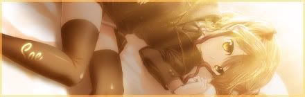
waii~ a lot of the other entries are so pretty! ^__^
here's my 1st entry(mm, i don't know if i'm going to submit any other entries yet)  hope you guys like. made it from scratch from sketch to opencanvas to photoshop7 the fullsize version of this pic is here on my DA |
|
|
 |
| Tags |
| banner contest, contest |
|
|