AnimeSuki Forums

Register Forum Rules FAQ Community Today's Posts Search

Go Back   AnimeSuki Forum > General > General Chat

Notices

Reply
 
Thread Tools
Old 2012-04-13, 09:42   Link #19741
Marina
~La-la Land~
*Graphic Designer
 
 
Join Date: Jul 2007
Location: Seattle
Age: 37
ganbaru 7/10
Interesting saturation effect with the reds and yellows. The text is a bit hard to read though since its size and color blend in with the background. Simple border works fine, though the bright red kind of draws my attention away from the focal point.
__________________
My Anime Blog:
Anime B&B
Follow me on Twitter!
_________________

Co-host of Kaiseki Anime Podcast
Find us on Apple Podcasts and Google Play
_________________

AniList

Sig: HSxHoneycomb
Marina is offline   Reply With Quote
Old 2012-04-13, 09:43   Link #19742
Krytonis
Koomi-kun~
*Graphic Designer
 
 
Join Date: Oct 2011
Location: In the distortion of space and time..
ganbaru: 8.5/10 beautiful. but the bottom border is missing!
__________________
Krytonis is offline   Reply With Quote
Old 2012-04-13, 11:10   Link #19743
Eragon
Still Alive
 
 
Join Date: Aug 2010
Location: Somewhere far far away
Age: 30
Koominator - 9. The colors compliment each other very well.
Marina - 10. Simply exquisite.
Ganbaru - 9. Colourful @__@. Not that your other avatars and sigs aren't but this color really stands out
Silvance - 9. Militaristic
__________________
Signature courtesy of rikikai
Eragon is offline   Reply With Quote
Old 2012-04-13, 14:54   Link #19744
ganbaru
books-eater youkai
 
 
Join Date: Dec 2007
Location: Betweem wisdom and insanity
Marina 9/10 seconding Eragon
Eragon 8,3/10 somehow the background don't fit well with the render.
__________________
ganbaru is offline   Reply With Quote
Old 2012-04-13, 18:34   Link #19745
Rennir
Quietly Lurking
*Graphic Designer
 
 
Join Date: Mar 2010
Location: Beneath the prodigious sky...
Marina-8.7/10 Bit more blending of the colors in the fg and bg would help. Also, try sharpening just a bit Great job otherwise
__________________
Rennir is offline   Reply With Quote
Old 2012-04-16, 17:49   Link #19746
Haladflire65
Senior Member
*Artist
 
 
Join Date: Mar 2009
Location: Normandy SR-2
Age: 29
Quote:
Originally Posted by Koominator View Post
ganbaru: 8.5/10 beautiful. but the bottom border is missing!
It seems to happen to any sig that uses the table and is over 154px, if I remember correctly. It's the same for Rennir's above me too.

Silvance: Cool stuff. 8.7/10
Marina: Agreeing on the sharpening and blending. Very pretty 8.8/10
Koominator: Nice one, 8.5/10
Eragon: A bit low-q and the render's stretched (sorry, one of my pet peeves) 8/10
ganbaru: Pretty good, I like the subdued colour scheme. 8.6/10
Renn-kun: Nice image, 8.7/10

I finally got around to making a new one
__________________
Haladflire65 is offline   Reply With Quote
Old 2012-04-16, 18:04   Link #19747
Eragon
Still Alive
 
 
Join Date: Aug 2010
Location: Somewhere far far away
Age: 30
^ Haha, its my first try at making signature and using photoshop!!
__________________
Signature courtesy of rikikai
Eragon is offline   Reply With Quote
Old 2012-04-16, 18:40   Link #19748
Rennir
Quietly Lurking
*Graphic Designer
 
 
Join Date: Mar 2010
Location: Beneath the prodigious sky...
Halad-8.6/10 Nice job with the blending! And it's 154px? Really? That kind of sucks.
__________________
Rennir is offline   Reply With Quote
Old 2012-04-16, 18:53   Link #19749
ganbaru
books-eater youkai
 
 
Join Date: Dec 2007
Location: Betweem wisdom and insanity
Haladflire65 8,9/10 great background
Eragon 8,3/10 not bad for a first attempt
__________________
ganbaru is offline   Reply With Quote
Old 2012-04-17, 01:02   Link #19750
HasuMasu
Senior Member
*Artist
 
 
Join Date: Apr 2011
Location: The Middle Way
Haladflire65: Great effect. - 9/10
__________________
HasuMasu is offline   Reply With Quote
Old 2012-04-17, 01:06   Link #19751
Rennir
Quietly Lurking
*Graphic Designer
 
 
Join Date: Mar 2010
Location: Beneath the prodigious sky...
Eragon-7/10 Hold shift when you resize your renders from now on in order to maintain proportions and not make it look stretched (As a side note, I don't weight my scores, but it's a good sig for your first try! ^^)
__________________
Rennir is offline   Reply With Quote
Old 2012-04-17, 06:25   Link #19752
Merilyn Mensola
I am a Boxer
 
 
Join Date: Apr 2011
Location: Where hot girls are fighting!
Haladflire65 : 9/10 nice effect

ganbaru: 10/10..i like the style..really nice sign.
__________________
Merilyn Mensola is offline   Reply With Quote
Old 2012-04-17, 06:30   Link #19753
thevil1
Adventure ∀logger
 
 
Join Date: Jun 2010
Location: Looking for Reason to hear it's voice
Age: 13
Send a message via AIM to thevil1
Rennir - Pretty background. I like how it appears 3Dish. 8/10
Merilyn Mensola - Hot, I like the fading of her hair with the background. 8.5/10
__________________
A hero is an ordinary individual who finds the strength to persevere and endure in spite of overwhelming obstacles - Christopher Reeve
thevil1 is offline   Reply With Quote
Old 2012-04-17, 06:58   Link #19754
Krytonis
Koomi-kun~
*Graphic Designer
 
 
Join Date: Oct 2011
Location: In the distortion of space and time..
theevil1: 7.6/10 good photo! very high altitude taken!
__________________
Krytonis is offline   Reply With Quote
Old 2012-04-17, 07:03   Link #19755
ganbaru
books-eater youkai
 
 
Join Date: Dec 2007
Location: Betweem wisdom and insanity
Merilyn Mensola 8,5/10 I can't remember if I rated this one before.
__________________
ganbaru is offline   Reply With Quote
Old 2012-04-17, 08:00   Link #19756
thevil1
Adventure ∀logger
 
 
Join Date: Jun 2010
Location: Looking for Reason to hear it's voice
Age: 13
Send a message via AIM to thevil1
Quote:
Originally Posted by Koominator View Post
theevil1: 7.6/10 good photo! very high altitude taken!
Haha, no actually on the contrary, it's very close to the lowest place on earth. The Dead Sea can be seen right below the horizon, it kind of blends in because it's hazy, but on a clear day even Amman can be seen in Jordan

Koominator - I like the coloring, makes me happy, same with the smooth edges. 10/10
ganbaru - I love how it's a zoomed out version of your avi, Shows the big picture of things. What does the poem mean?
__________________
A hero is an ordinary individual who finds the strength to persevere and endure in spite of overwhelming obstacles - Christopher Reeve
thevil1 is offline   Reply With Quote
Old 2012-04-17, 09:59   Link #19757
Krytonis
Koomi-kun~
*Graphic Designer
 
 
Join Date: Oct 2011
Location: In the distortion of space and time..
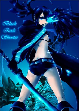
ganbaru: 9.4/10 paper,paper, books, paper, paper, paper and a girl sleeping

Well, after fixing the problem of image hosting, now I can do it!
Please rate these!


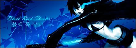
Spoiler for Vertical Signature:
__________________
Krytonis is offline   Reply With Quote
Old 2012-04-17, 11:11   Link #19758
Patchy
練紅玉
*Graphic Designer
 
 
Join Date: Apr 2010
Location: Magic Land
Playing with a render again, tried to experiment many bg's but I can't find a suitable one... ~_~

btw rating..

Ren-kun ~ lol it's been a while since I saw you with a new sig ^^, and btw that sig is kinda nice --- V.Good
Koomi-chan ~ First of all I'm a fan of Angel beats, I've created a 2 wallies of Abeats before and I'm kinda biased on this one ^^ "good" job

btw extra rating

Yuri one ~ I think it's better if you move Yuri on the left side a bit.. it looks like it been cut, still "good"
Brs 1st one ~ C4d signs are really hard if you don't know how to pick the right c4d's. "good"
Brs 2nd one ~ Good vert sign, the render is really cool and I think it's better than brs1, I think it's better if you use the c4d not a background but an effect for this, plus a ruins or a war background will make a good combi out of this. "good"

Thevil ~ rated before I think
Ganbaru-sempai ~ ^^ color is like your old signs before but the color of this one is really fitted for the sign, have a dramatic atmosphere in it "V.Good"
Halad-sempai ~ Wow this one have a nice effects in it... really a good one "V.Good"
Merilyn-chan ~ I think I rated this one before..

BTW still a not AS safe sign for me ^^ .... those feathers came from Index's arsenal (TO aru) so that it will kill the sign bunnies instantly.
__________________
My Workshop
-----------------------------
Featured Character
Hakurei Reimu
-----------------------------
EMDAS : Searching!
-----------------------------
Currently Doing:
<3 bye bye minna!

Patchy is offline   Reply With Quote
Old 2012-04-17, 11:40   Link #19759
Krytonis
Koomi-kun~
*Graphic Designer
 
 
Join Date: Oct 2011
Location: In the distortion of space and time..
Quote:
Originally Posted by Patchy View Post
Koomi-chan ~ First of all I'm a fan of Angel beats, I've created a 2 wallies of Abeats before and I'm kinda biased on this one ^^ "good" job
Haha thank you. I give you 10/10 for it! She looks beautiful Patchy-sama!
Also, I'm a boy! You can't call me "chan"!

__________________
Krytonis is offline   Reply With Quote
Old 2012-04-17, 17:18   Link #19760
Rennir
Quietly Lurking
*Graphic Designer
 
 
Join Date: Mar 2010
Location: Beneath the prodigious sky...
Pat-chan-9/10 Wait...how is your sig not cut off? O.o But anyways I like it! Not much to say except text is kind of overpowered by that lighting, other than that great job!

Oh, and yeah, it's basically a crop though so I didn't do much, just did some fine tuning
__________________
Rennir is offline   Reply With Quote
Reply

Tags
rate, signature


Posting Rules
You may not post new threads
You may not post replies
You may not post attachments
You may not edit your posts

BB code is On
Smilies are On
[IMG] code is On
HTML code is Off

Forum Jump


All times are GMT -5. The time now is 14:13.


Powered by vBulletin® Version 3.8.11
Copyright ©2000 - 2024, vBulletin Solutions Inc.
We use Silk.