2006-10-14, 11:45
|
Link #1881 |
|
~ You're dead ^__^* ~
 Graphic Designer Graphic DesignerJoin Date: Apr 2006
Location: uk, England
Age: 34
 |
cyz ~ nice one ^_^ feena looks really hot
 my only complaint is why are there lines on the left and right sides and the text shouldnt be highlighted...8/10 my only complaint is why are there lines on the left and right sides and the text shouldnt be highlighted...8/10shimi_gami ~ its good but the image is blurry and the sides are too empty...7.5/10
__________________
|

|

|
|
2006-10-14, 15:33
|
Link #1885 |
|
Sae's Lover
Graphic DesignerJoin Date: Apr 2006
Location: Oshawa, Ontario Canada
Age: 36
|
@~Tsukuyomi: Absolutely awsome sigs! Really love the abstract feel to them. Only thing I might have a problem is the font. Other than that they're awsome!
Cheers! -Jason-
__________________
|
|
|
|
|
2006-10-14, 16:35
|
Link #1886 |
|
阿賀野型3番艦、矢矧 Lv180
Graphic Designer Moderator ModeratorJoin Date: Mar 2006
Location: Belgium, Brussels
Age: 37
|
err, kinda late for some rating ~~
deathkillz : the bg is simple, and a little empty, however, you gave a nice impression of radiance for the 2 portraits, along the good font for the center text. nice sig, but i feel like the sig a little unbalanced because of the different head size (the imbalancing effect is worse since the heads are identical). nevertherless, this is good ! 8/10 Secca : simple and effective : some calm, melancholy and relief. (imo ^^") . maybe some effects on the BG could add more stress on shana and haruhi ^^. 7.5/10 ~tsukuyomi : 1) dark saber : i would say : the particles on the signature are badly blended, making them a bit "unnatural". yet, nice balance of light . 8/10 2) the best among the 4, imo. the effects around the girl and the sword are nicely blended. (it lacks of text however. i'm maybe too nitpicking XD) 9/10 3) the font seems a bit... "strange" (well, i have maybe some weird tastes XD). i'm not really sure about the effectfs around the center, it doesn't really seem to fit with the frail girl. 7/10 4) humm, to be honest, i feel that sig a bit contradictory (the effects don't suit the character style at all, imo). i dunno how to explain but well ~~ 6/10 K.Yamato : one thing : impressive. the colour scheme fits perfectly with nayuki and the BG ! ^^. however... i think the font could be something smoother, melancholic/sweet... but well, it's already damn nice like this. 9.5/10 here are mine, not really fresh from the oven (i should check here more often ~~) Spoiler for 2 signatures:
__________________
|
|
|
|
|
2006-10-14, 16:47
|
Link #1887 |
|
[- Caramelldansen Spam -]
Join Date: Aug 2006
|
@ Yamato
Siggy has a nice tone to it... Its nicely blend and the text is good... Though, I'm not sure who this Jayson is, so I should not be rating someone's siggy made by someone else... @Klashikari First siggy feels more like a couple images clumped together... Kinda hard to put your point across... But in your second siggy, your point goes into people's head... And hands and feets and heart and so forth... Better of the two... Spoiler for Rate this one:
Just made that one today after going into my siggy shop... This was suppose to be someone's request, but I liked it so much, I'm keeping... |
|
|
|
|
2006-10-14, 16:59
|
Link #1888 |
|
阿賀野型3番艦、矢矧 Lv180
Graphic DesignerModeratorJoin Date: Mar 2006
Location: Belgium, Brussels
Age: 37
|
~tsukuyomi : in fact, the first sig is based on an event, it surely won't be understood for most of people, i know XD.
for your sig, i feel it's bad the signature is a bit short, since it's really good ! i would say some blue could match better the calm of the picture ^^ ( in fact, i feel the mood from the signature is not that happy, so the joyfulness from pink is rather a second choice, but again, this is only my silly taste i guess XD) however, is it the original picture like that, or the hair became extremely dark because of some blending? anyway, a big 9/10 for this (i prefer the black and white, though under this colour scheme, the hair are kinda too dark from the rest)
__________________
|
|
|
|
|
2006-10-14, 17:40
|
Link #1889 | |
|
~ You're dead ^__^* ~
Graphic DesignerJoin Date: Apr 2006
Location: uk, England
Age: 34
|
Quote:
1) the effects are stunning...and i really love the texture... but the BG seems a bit odd with 2 "faces" and a somewat empty gap in between them...the font could have bee made to fit this type of sig more better but i do like how you duplicated the text for the effect ^__^ 8.5/10 2)same plus points as your first one but this time its a lot more smooth...i just cnt find any faults so its a perfect 10/10 
__________________
|
|
|
|
|
|
2006-10-14, 19:44
|
Link #1891 | |
|
Sae's Lover
Graphic DesignerJoin Date: Apr 2006
Location: Oshawa, Ontario Canada
Age: 36
|
Quote:
 my ACTUAL name is Jason but the Y came up as something so it didnt look so boring. If you havent seen my works check them out! http://jaysondesigns.net has anime wallpapers and other things =3 my ACTUAL name is Jason but the Y came up as something so it didnt look so boring. If you havent seen my works check them out! http://jaysondesigns.net has anime wallpapers and other things =3@Cyz: Haha love it that much huh? And thank you ^_^. -Jason-
__________________
|
|
|
|
|
|
2006-10-14, 20:39
|
Link #1892 | |
|
[- Caramelldansen Spam -]
Join Date: Aug 2006
|
Quote:
@Cyz Nicely flow siggy you got there... I could see that's from JaYson, so I'll give him a 8/10 Here is another new siggy I just made... It was suppose to make fun of a Beck siggy from another forumer in another forum...  ^ Please rate... |
|
|
|
|
|
2006-10-14, 21:31
|
Link #1893 |
|
Aspiring but lazy
Join Date: Dec 2005
Location: The Internet
|
Thanks for helping me make up my mind ^^
~Tsukuyomi: (Nagato Yuki) Veeeery nice blending~ and the composition is great as well. 9/10 (BW and Red) I like the one with the red hue more, but both are very nice. 9.5/10 K. Yamato: [Nayuki bias] The color is fitting for Nayuki, and it's also pleasing to the eyes. Soft colors are great~ 10/10 Klashikari: I think width can be reduced by about 1/3. The placing of some are somewhat weird, especially the "Cleaver of Insanity". Finally, I don't agree with the font you chose for Rena's name. 7/10 Secca: It matches well with your avatar color-wise. If you can add up an autumn BG as well, it'd be great. Haruhi and Shana in one sig is the awesomeness~ 8.5/10 |
|
|
|
|
2006-10-15, 15:17
|
Link #1895 |
|
Senior Member
Join Date: Jul 2003
Location: Netherlands, Maastricht
Age: 38
|
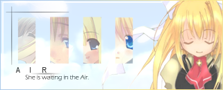
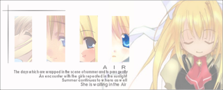
celcius - Nice air sig. I don't thinkt he small pieces really fit in though
 might look better with just the air background and the text. 7/10 might look better with just the air background and the text. 7/10Dragonfly <3 - Pinky  Border doesn't stand out (the only parts where you can see the border is where the girl touches it). A bit too plain for my tastes Border doesn't stand out (the only parts where you can see the border is where the girl touches it). A bit too plain for my tastes  5/10 5/10~Tsukuyomi - No border Even a simple border is nice, makes the sig stand out more from the forum. I like the idea behind it, never watched Beck, never will either so I have no idea what's it about (except that it's about music ^^ I think ) I don't like the silhouette of the girl behind the text. Can't say for sure if the character in the front is walking away from the silhouette, or that it's just part of the name/text. 6/10K. Yamato - Too dreamy for me ") I like the subtle text effect, but the Jayson Designs was very hard to read. Don't know if it's just me or if you made it that way ^^ 8/10 I like the subtle text effect, but the Jayson Designs was very hard to read. Don't know if it's just me or if you made it that way ^^ 8/10
|
|
|
|
|
2006-10-15, 19:39
|
Link #1896 |
|
"Show it to me"
Join Date: Dec 2005
Location: In solitude, where we are least alone
|
@ Tsukiyomi: Most of my sigs were made by K. Yamato. Yup, I owe it all to him
Dragonfly <3: I like it. The fact that her head is cut off and just showing half of her face is very very temptatious (is that even a word? ) Anyway, colors matches well and it makes the sig even more...uh...sexy. Your name seems a little blurry but who cares no? That's one good sig. 10/10- New sig made by a friend from another forum. This is Otonashi Saya from the anime Blood+...in case you're not paying attention the text above
__________________
Last edited by Cyz; 2006-10-15 at 19:59. Reason: New sig and change of font color |
|
|
|
|
2006-10-15, 23:49
|
Link #1898 |
|
[- Caramelldansen Spam -]
Join Date: Aug 2006
|
@dragonfly
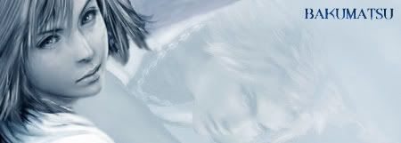
I don't approve of the perverted stuff... So I'll just not rate you... @Necrodeath Borders doesn't define the siggy much... Also, I hang out in a lot of forum... Most of them are very dark... Staying on subject, your siggy is to hard to see... Your text is to dark, you can't even see it... A random Death in the middle of the clash kinda ruins it... 3/10 @Cyz So another person made a siggy for you??? I kinda feel bad for this JaYson person because he has to put up with requests and later they just ditch his art *sigh*... Well, the siggy has an ohkay depth and text is great... How the color spreads kinda bothers me a bit... Image quality is kinda blur-ish... 8/10 @Bakumatsu Yep, you're a baka for making a new topic and not having an eye for things... As an artist, I command you to train your eyes next time... As for your siggy Final Fantasy X: Yuna, Tidus with lowered opacity, text, could be cloud filter background, either color balanced or gradient map... 2/10 Ouran HS Club: Image, possible soft brush on bottom right corner, text, color balance or gradient map... Another 2/10 My advice: Try to understand the functions of Photoshop... If you use GIMP or just plain MS Paint, I feel sorry for you... Well, here is a new siggy I made... Browsing through the Kanon Wall, Image, Gif., etc thread and found a nice picture of Ayu... Couldn't resist, so made something out of it...  Not the best work I've done, but sure is effective... |
|
|
|
|
2006-10-16, 04:30
|
Link #1900 |
|
YuI
Join Date: Apr 2006
Location: Australia, Sydney
Age: 32
|
~Tsukuyomi - you might consider having a 2 pixel white border and a 1 pixel black border and see how it turns out, the quality of the stock is kinda low i think, the background kinda doesnt suit it, but thats probably because you want to emphasis the loneliness ayu is having heh... 8/10
Bakumatsu - as tsukuyomi had stated.... the first one is too plain, 3/10... as for your second one, it kind of doesn't feel right, 3/10 tea_ser - Her hands are a bit blurry, you havnt rubbed out all the surroundings of your stock completely, it is still visible... overall quite good, 7/10 (p.s, I liked your avatar though ^^!) |
|
|
|
 |
| Tags |
| rate, signature |
|
|