2008-01-28, 16:24
|
Link #66 |
|
Ever Bright, Ever Blue
 Graphic Designer Graphic DesignerJoin Date: May 2007
Location: Ontario, Canada
Age: 34
|
^^ Thanks, it was a bit annoying to do, but worth it. I screwed up a lot on that football one, I'm a bit of a jersey buff so I feel bad at my inaccuracies. I did do a hockey one that is much better than the football one. See spoiler
Spoiler for trace:
|

|

|
|
2008-01-28, 17:56
|
Link #68 |
|
Ever Bright, Ever Blue
Graphic DesignerJoin Date: May 2007
Location: Ontario, Canada
Age: 34
|
thankies.
 It is nice because i can always swap the colours out and basically switch the team of the jersey if i want. i had ideas of making a wall paper with her in all 30 jerseys, but im not sure how much sanity i would have left by the end of that |
|
|
|
|
2008-01-29, 16:11
|
Link #69 |
|
Ever Bright, Ever Blue
Graphic DesignerJoin Date: May 2007
Location: Ontario, Canada
Age: 34
|
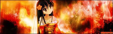
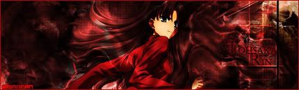
Wow, well I guess it kinda sucks to not be in the major graphic designer inside on this board. I need to get a bit better I guess. Well, at least The Chaos likes my work. Heres a new one.
|
|
|
|
|
2008-01-29, 16:20
|
Link #70 |
|
In Memories
Graphic DesignerJoin Date: Apr 2007
|
To me, your work is impressive, no wai i can do something like that. Im just out of words on what to type
Besides i dont think that there is anything wrong with your work, then again since im not very good in this matter maybe my word isnt the best to go after.That Nana sig looks so cute keep it up.
|
|
|
|
|
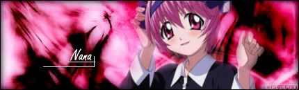
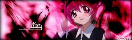
2008-01-30, 05:44
|
Link #71 |
|
noLife
ArtistJoin Date: Jul 2007
Age: 35
|
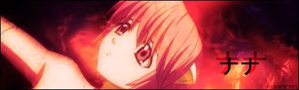
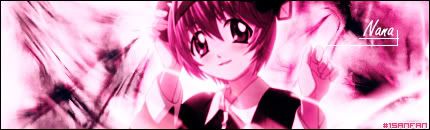
I think the last signature is a bit too bright pink. Either you let Nana to be in original colors or you make the pink a bit softer with some filters and stuff. Also I think it would have a better effect if you moved the render a bit to the right and the text 'Nana' to the left. ;3
|
|
|
|
|
2008-01-30, 10:42
|
Link #72 |
|
Ever Bright, Ever Blue
Graphic DesignerJoin Date: May 2007
Location: Ontario, Canada
Age: 34
|
@ Geki, yeah i see what you mean, whites gives me fits sometimes. I kinda tweaked it a bit, i dont mind Nana in regular colours, it is just that then she seems to stick out to me. I have render-blending issues. I havent been able to stumble upon a sure-fire method to use. But look at these and see if they are better.
|
|
|
|
|
2008-01-30, 11:48
|
Link #73 |
|
noLife
ArtistJoin Date: Jul 2007
Age: 35
|
Yes it looks better that way, and I like the first version more because on the second one she kinda disappears into the background.
A lil tip on how to blend. Take your render layer,take the eraser with a grunge brush (or some other that isn't with a precise shape) put it to ~30% opacity and slightly erase the edges of the render but be careful not to take too much away. Then duplicate the render layer (CTRL+J) and set the layer blending mode to what fits you the most. You can also play around with the opacity of the layer. That is, I think, a pretty easy way to make your renders blend with the bg. Just test is out and play with the settings until you find the outcome to be satisfying. ;3 |
|
|
|
|
2008-02-02, 16:37
|
Link #77 |
|
Ever Bright, Ever Blue
Graphic DesignerJoin Date: May 2007
Location: Ontario, Canada
Age: 34
|
@Geki, I see what you mean, I thought that the render was cut off there, but lo and behold it wasn't, so i shrunk it a bit to get the whole head in. I couldnt centre it more as the arm is cut off.
Here is the revised version 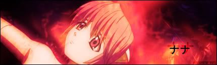
|
|
|
|
|
2008-02-06, 20:21
|
Link #78 |
|
Ever Bright, Ever Blue
Graphic DesignerJoin Date: May 2007
Location: Ontario, Canada
Age: 34
|
I did a new sig, Bleach themed. I like the result, but text is throwing me for a loop.
I want to add the lines "who is truer? You who are? Or you who are to be?" But i dont know about positioning. I was thinking of putting it in Japanese vertically to save space but maybe it looks fine how it is, thoughts? 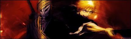
|
|
|
|
 |
| Thread Tools | |
|
|