2010-10-08, 21:40
|
Link #124 | |
|
Kaiba
Join Date: Jul 2010
Location: David Tennant's bedroom in the TARDIS
|
Quote:
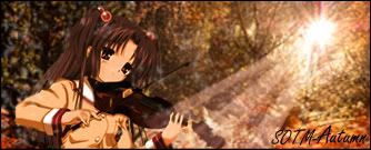
Hotter than Masha. Sorry, Halad. But I still love Masha never fearr! update: SOTM (autumn): 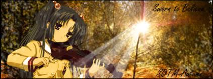
__________________
|
|

|

|
|
2010-10-08, 23:55
|
Link #125 |
|
~Official Slacker~
 Author AuthorJoin Date: Aug 2010
Location: Xanadu
Age: 29
|
Oh now thats a really good signature for the SOTM (autumn)
 (C&C: Kotomi and the violin really fit in the autumn breezing trees, and the color is absolutely gorgeous, I also like the light effect in the middle of the signature)
__________________
|
|
|
|
|
2010-10-09, 00:04
|
Link #126 | |
|
Kaiba
Join Date: Jul 2010
Location: David Tennant's bedroom in the TARDIS
|
Quote:
The light effect came with it, and I simply loved the render (predone renders FTW!) and the bg I found, so I just played with it some and voila!
__________________
|
|
|
|
|
|
2010-10-09, 00:06
|
Link #127 | |
|
~Official Slacker~
AuthorJoin Date: Aug 2010
Location: Xanadu
Age: 29
|
Quote:

__________________
|
|
|
|
|
|
2010-10-09, 20:25
|
Link #129 |
|
Covered in Darkness
Graphic DesignerJoin Date: Jul 2010
Location: Missing~
 |
Mmm....shall RnR your current sig for now ^^'
To begin with, great idea To point out the cons, Kotomi is too much towards the left (she should be more near the light beam) and the signature is too wide. And you blurred her too much >.< (the guitar and her arms...but I think since I am scrutinizing it soooo much, it must be only visible to me, so not a problem  ). ).A suggestion (or two). Can you make the beam slight orangish? Like coloring a stroke a bit orangish or so. Oh, and try clipping masks for the text here, you will learn it and I think your text needs clipping masks here  Now, the long awaited pros. As I said GREAT idea. Loved the sun-beam and it's position <3 Also, Kotomi does seem to go with this scene  You improved with lightning too. You improved with lightning too. A bit less orangish, so ask others if it fits autumn theme or not Ha, there ^^ And I didn't mean to offend you or anything  Anyways, what's up?
__________________
|
|
|
|
|
2010-10-09, 20:56
|
Link #130 | |
|
Kaiba
Join Date: Jul 2010
Location: David Tennant's bedroom in the TARDIS
|
Quote:
Coloring stroke? What? do you mean...like an orangey photo filter? and PSE does not have clipping masks TT_TT...I believe there is something called type masks but i don't know how that works or what it is... Thanks. The sun beam was a lightstick brush. And Kotomi...I literally googled/photobucketed "anime render" and found her and thought she went well with it... Lightning? eh?? well autumn is colros other than orange too...but there is a hint or orange...and I can try to make it a LITTLE more orange I guess.... and you didn't offend. C&C is lovely always. I'm terrible at giving criticism meself. What's up? That's the second sig I'd done in quite a while... I'm a little rusty...I've been nuts busy this week...with life... We have to talk on MSN.
__________________
|
|
|
|
|
|
2010-10-09, 21:15
|
Link #132 | |
|
Kaiba
Join Date: Jul 2010
Location: David Tennant's bedroom in the TARDIS
|
Quote:
__________________
|
|
|
|
|
|
2010-10-10, 00:54
|
Link #133 |
|
Star Designer
Graphic DesignerJoin Date: Aug 2008
Location: Europe
Age: 38
|
I really like the idea of sun beams shining through the trees. A lens flare would be nice as well
One complain I have is that the whole signature still looks a bit blurry, especially the background. It's not a major thing but it lessens the effect of being surrounded by a forest Also, thanks for the warm welcome I like what you are doing with your creations. You are trying new things and I really do love it when people do that.
__________________
|
|
|
|
|
2010-10-10, 14:01
|
Link #134 |
|
Kaiba
Join Date: Jul 2010
Location: David Tennant's bedroom in the TARDIS
|
Thank you, Urei. I try to learn with each new sig!
Here's my ver. 2. I hated messing with the gradient map on Kotomi and don't even like how it turned out really, but it's the closest I could get. Help etc appreciated. >.< 
__________________
|
|
|
|
|
2010-10-10, 14:49
|
Link #135 |
|
Star Designer
Graphic DesignerJoin Date: Aug 2008
Location: Europe
Age: 38
|
Haha, I really think that each time we make a signature, especially for this contest, we learn a whole lot. I know I've learned quite a bit and I'm certain others as well
About hmmmmm3-1, I think you could solve some problems resizng down the whole signature a bit as well as deleting a chunk in the upper parts just for it to look smaller. Resizing the graphic helps to gain more details without using sharpening tools. Nevertheless I think it would be nice to add a little bit of Smart Sharpening tool I always liked to have a proper 160 pixel limit in height since I love to put in as much as I can but I learned that sometimes smaller and more narrow things give a much better effect. 
__________________
|
|
|
|
|
2010-10-10, 15:11
|
Link #136 | |
|
Kaiba
Join Date: Jul 2010
Location: David Tennant's bedroom in the TARDIS
|
Quote:
and deleting a chunk of what? just///reducing the height?
__________________
|
|
|
|
|
|
2010-10-10, 15:21
|
Link #137 | |
|
~Official Slacker~
AuthorJoin Date: Aug 2010
Location: Xanadu
Age: 29
|
Quote:
__________________
|
|
|
|
|
|
2010-10-10, 15:33
|
Link #138 |
|
Star Designer
Graphic DesignerJoin Date: Aug 2008
Location: Europe
Age: 38
|
What I meant was to down-scale the whole signature a bit and then remove a few pixels off the top, like for example, 10-15 pixels of height. This would make the whole signature smaller and yup, Kotomi would lose her hair beads
Anyway, that's my proposition. I think it's worth a try, to at least see how that effect suits your taste
__________________
|
|
|
|
|
2010-10-10, 16:06
|
Link #140 |
|
Star Designer
Graphic DesignerJoin Date: Aug 2008
Location: Europe
Age: 38
|
*scratch, scratch* Ahh, you resized the whole graphic but at the same time you removed a part of it on the right and also scaled down the character. If it isn't too bold, let me show what I was proposing
 --> -->  I scaled down the graphic to 90% of it's original size and then after that I took off a few pixels of height off the top of the signature. As you can see, the character has a little bit less hair inside the frame because of me cutting the top of the signature off. Hope it helps
__________________
|
|
|
|
 |
|
|


 and I like the pink version better