 2009-10-03, 17:32
|
Link #83 | |
|
Black Dragon
 Graphic Designer Graphic DesignerJoin Date: Dec 2007
Location: In the Netherrealm, thinking who to betray next...
|
Quote:
 I think I like more V2, the adds on V3 and V4 are no-needed.
__________________
|
|

|
|
2009-10-04, 09:13
|
Link #87 | |
|
toptoptoptoptoptoptoptopt
Graphic DesignerJoin Date: Jun 2008
Location: Behind you >:)
Age: 27
 |
Quote:
 I'll re do the hair later since right now I'm sneaking on to the computer when instead I'm supposed to be cleaning my room. o3o @Miko Miko Nice sig but I like version one better =D
__________________
|
|
|
|
|
2009-10-04, 09:23
|
Link #88 | |
|
time waits for no one <3
Graphic DesignerJoin Date: Aug 2008
Location: Portugal, Lisbon
Age: 32
|
Quote:
@Miko Miko - version 2 is the best for me - and btw those are amazing <3 @ganbaru - I'd leave it like that, nothing more to add or change I suppose...
__________________
|
|
|
|
|
2009-10-04, 11:11
|
Link #90 | |
|
time waits for no one <3
Graphic DesignerJoin Date: Aug 2008
Location: Portugal, Lisbon
Age: 32
|
Quote:
try adding a light extra glow to the text .. and personally I'm not fond of those... uhm... things that are glowing behind the text, I think it looks better without them
__________________
|
|
|
|
|
2009-10-04, 11:31
|
Link #91 | |
|
toptoptoptoptoptoptoptopt
Graphic DesignerJoin Date: Jun 2008
Location: Behind you >:)
Age: 27
|
Quote:
 @Hakuryu Pretty killer but you should change the text a little (I laughed a little actually  ) )
__________________
|
|
|
|
|
2009-10-04, 12:01
|
Link #92 |
|
Klutz
Join Date: Jun 2007
Location: California
Age: 32
|
Changed font and the glowing spots...better or worse? I really do hate text D:
 @Ayu I don't think the eyes fit well with the overall sig. They're a bit too bright compared to the blood. Also your text seems a bit out of place.
__________________
|
|
|
|
2009-10-04, 12:57
|
Link #93 | |
|
time waits for no one <3
Graphic DesignerJoin Date: Aug 2008
Location: Portugal, Lisbon
Age: 32
|
Quote:
__________________
Last edited by vandakiara; 2009-10-04 at 13:51. |
|
|
|
|
2009-10-04, 13:15
|
Link #94 | |||
|
Black Dragon
Graphic DesignerJoin Date: Dec 2007
Location: In the Netherrealm, thinking who to betray next...
|
Quote:
Quote:
 Okay, let's repeat. The girl should be totally in grayscale, go tyo the layer in wich you have the render of the girl, go Image/ Adjustments, Gradientmap and choose Black and White as your colors. Then in a new layer over the render add the blood and in another new layer using a soft and small brush cover the area of the eys with red. Capichi? Quote:
__________________
|
|||
|
|
|
2009-10-04, 13:30
|
Link #95 |
|
Klutz
Join Date: Jun 2007
Location: California
Age: 32
|
Gah! D:
Version 4  Text used from the Disappearance of Hatsune Miku song. I don't really want the text to stand out, but I don't it too blended in with the background either...I'm having issues with this. ^^;
__________________
|
|
|
|
2009-10-04, 13:52
|
Link #96 | |
|
time waits for no one <3
Graphic DesignerJoin Date: Aug 2008
Location: Portugal, Lisbon
Age: 32
|
Quote:
__________________
|
|
|
|
|
2009-10-04, 14:13
|
Link #98 | ||
|
♪ ~ ♫
ArtistJoin Date: May 2008
Location: Europe
Age: 35
 |
Hmm, nice theme. Seems like psychotic girls with knives are "in".
  Ah yes, it's Alucard again. I'm not quite satisfied with how I made him back in June last year, so I gave him a shot one more time. C&C welcome, of course. Quote:
Quote:
__________________
|
||
|
|
|
2009-10-04, 14:29
|
Link #99 | ||||
|
toptoptoptoptoptoptoptopt
Graphic DesignerJoin Date: Jun 2008
Location: Behind you >:)
Age: 27
|
Quote:
Quote:
@Evil Rick Ok since I lost the PSD of the file I just opened another copy of the file then did grayscale copied it to the file I was working on erased the parts of the blood that was just black and white then used Hakuryu idea and toned down the brightness of the eyes. 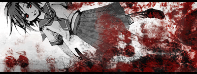 @Vanda-san As I stated above that I lost the PSD I tried my best to de-saturate Rena without de-saturating the blood then did the red eyes. 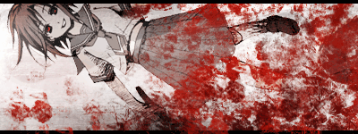 Please don't kill me, both of you. D: Ok now I'll do some C&C Quote:
Quote:
__________________
|
||||
|
|
 |
| Tags |
| contest, sotm |
| Thread Tools | |
|
|


 Administrator


