2010-03-08, 01:47
|
Link #61 | |
|
Kira_Naruto, the ecchi
 Graphic Designer Graphic DesignerJoin Date: Dec 2005
Location: http://www.exciting-tits.com/
|
Quote:
Let see if I still have my l33t googling skill  edit.. cant find it :'( .. but I do found this .. I see arrows!!!  
__________________
Last edited by KiNA; 2010-03-08 at 02:08. |
|

|
|
2010-03-08, 06:33
|
Link #64 | |
|
books-eater youkai
Join Date: Dec 2007
Location: Betweem wisdom and insanity
|
Quote:
__________________
|
|
|
|
|
2010-03-08, 08:32
|
Link #66 | ||
|
Kira_Naruto, the ecchi
Graphic DesignerJoin Date: Dec 2005
Location: http://www.exciting-tits.com/
|
Quote:
Quote:
Its lying inside the rate your signature thread, someone actually quoted the sig so he can look back at laugh at it.. but I cant remember who and searching my own posts yields no result*hintcookieshint*  .. ..
__________________
|
||
|
|
|
2010-03-08, 09:10
|
Link #67 | |
|
books-eater youkai
Join Date: Dec 2007
Location: Betweem wisdom and insanity
|
Quote:
.Anyway, I reworked my entry; corrected some pixels on the render and changed the text for something more meaningfull ( even if my translation d not fully satisfie me ). C&C would be welcome. 
__________________
|
|
|
|
|
2010-03-08, 09:48
|
Link #69 | |
|
Senior Member
Join Date: Nov 2006
Location: Virginia, USA
Age: 62
|
Quote:
__________________
|
|
|
|
|
2010-03-08, 09:59
|
Link #70 | ||
|
Strangely dependable...
Join Date: Nov 2006
Location: some random place out there...
|
Quote:
This is such a good theme but I'm going to have to sit this one out - no time.  Good luck to all.  Quote:
__________________
|
||
|
|
|
2010-03-08, 12:13
|
Link #71 | |
|
books-eater youkai
Join Date: Dec 2007
Location: Betweem wisdom and insanity
|
Thank for the imput everyone. I corrected the text, reworked the render ( used the older version's render for a shadow) and sliced the sig, allowing to be bigger. C&C are always welcome.
    Quote:
@ PreSage yes, the render was squished but in my defence I have to say than it isn't really what I would call a easy render : Spoiler for image source, regular resolution of a illustration from a light novel:
__________________
|
|
|
|
|
2010-03-08, 12:46
|
Link #72 | ||||
|
Black Dragon
Graphic DesignerJoin Date: Dec 2007
Location: In the Netherrealm, thinking who to betray next...
|
Quote:
Quote:
 Quote:
__________________
|
||||
|
|
|
2010-03-09, 01:15
|
Link #75 |
|
Kira_Naruto, the ecchi
Graphic DesignerJoin Date: Dec 2005
Location: http://www.exciting-tits.com/
|
Remove the line behind the arrows.. And brighter red for the arrow animation. (similar to her eyes flash/light )..
edit: CK BANZAI! He found the missing signature 
__________________
|
|
|
|
2010-03-09, 01:23
|
Link #76 | |
|
Strangely dependable...
Join Date: Nov 2006
Location: some random place out there...
|
Quote:
 @KiNA: (not too sure how serious you are about entering this sig but...) the animation could be slowed down a bit, or at least the last image stay on longer to make it easier to read.
__________________
|
|
|
|
|
2010-03-09, 10:20
|
Link #77 | ||
|
Senior Member
Join Date: Nov 2006
Location: Virginia, USA
Age: 62
|
Quote:
Quote:
__________________
|
||
|
|
|
2010-03-09, 15:26
|
Link #78 |
|
books-eater youkai
Join Date: Dec 2007
Location: Betweem wisdom and insanity
|
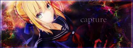
capture beside the file being too heavy and few white area than should be transparent it's a great entry.
And now my entry; I reworked the render ( the body is instretched but not the braids, I maked it very dark gray insted of black ( too oppresive) and coverted it with some white brush at very lo oppacity) put the text in gray scale and changrd the ''shadow''. C&C would be welcome. 
__________________
|
|
|
|
2010-03-09, 20:28
|
Link #80 | |
|
Senior Member
Join Date: Nov 2006
Location: Virginia, USA
Age: 62
|
Quote:
__________________
|
|
|
|
 |
| Tags |
| signature of the month, sotm |
|
|


 :|::|
:|::|