 2006-02-10, 13:42
|
Link #301 | |
|
A complex "maybe"
Join Date: Jul 2003
Age: 33
  |
>>Meaning in Tragedy - You have to rate someone in your post~ but 7/10, I really don't like the "lightening" ._.
Quote:

|
|

|

|
|
2006-02-10, 20:36
|
Link #303 |
|
Retweet Member
Join Date: Dec 2005
Location: ニュー・オーリンズ、LA
|
Komataguri - Simple yet dope...wouldn't hurt if you had some type of wording though...7.78 outta 10...
K_N - You put all your eggs into the eye-glasses shimmer...Undoubtably a cool effect, but as a whole it really doesn't seem like one of your dopest efforts...6.11 outta 10... ahhsin - It's been like a year already...get a new sig xP...I remember you used to be pretty creative...4.40 outta 10...But I know you don't care and will probably give me an "F" anyways...
__________________
|
|
|
|
|
2006-02-10, 21:03
|
Link #304 |
|
...
Join Date: Dec 2005
|
Secca 8/10 - the view from above is very creative,warm expression.
Sakura-chan 6/10 - the color of the arrows and border are the same,that's make the sig look good,even though there is only one color,nicely done.But some minus because not much changes in the posing style in the first two rooms of the sig. Meaning in Tragedy 3/10 too dark and there are alot of things happening to the side where the text is placed. wingdarkness 5/10 - I like the way the text is placed because there is no other place in that picture that will make his/her name more prominent rather than that place. |
|
|
|
|
2006-02-10, 23:03
|
Link #305 |
|
Kira_Naruto, the ecchi
 Graphic Designer Graphic DesignerJoin Date: Dec 2005
Location: http://www.exciting-tits.com/
|
@ WD .. at least you get my initial right this time... you always call me K_R before -_- ... Your sig... white text in a blue black/yellowish BG -_-, Its a simple crop job with a name pasted and twisted it a bit to make it bend .. hell I cant even tell what he's holding too -.-. And its over the rule
 its 160px thus no text allowed .. Croping sig need Sakura-chan style .. Oh wait, she revert to normal rectangular mode o.O. Overall 55% its 160px thus no text allowed .. Croping sig need Sakura-chan style .. Oh wait, she revert to normal rectangular mode o.O. Overall 55%@ lavielove... hmm.. simple, I cant read the text either ... thus cant differentiate wether its a quote, or your name -.- ... 72% ,, its still a clean job. KiNa ... guess we all dont drink the same cup of tea eh 
__________________
|
|
|
|
|
2006-02-10, 23:04
|
Link #306 | |
|
Reverend K-Rist
Join Date: Apr 2004
Location: America's Wang.
Age: 40
|
Quote:
Kawaii Onee-sama with Glasses is an instant 11/10 |
|
|
|
|
|
2006-02-10, 23:13
|
Link #307 |
|
Retweet Member
Join Date: Dec 2005
Location: ニュー・オーリンズ、LA
|
K_N - You seem mad at my ratings :P...Nevertheless would you rezise my sig then?
Anyways, you'd have to be dumb, def, blind and mute not to notice I'm holding a feather ^^...On second glance perhaps I was a bit to harsh on your siggy...Up it 1 whole point...Thanx for pointing out my sig (although that could be construed as you selfishly exposing me), but I'll choose to believe your not like that  ... ...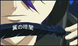
__________________
Last edited by wingdarkness; 2006-02-10 at 23:25. |
|
|
|
|
2006-02-10, 23:42
|
Link #308 |
|
Kira_Naruto, the ecchi
Graphic DesignerJoin Date: Dec 2005
Location: http://www.exciting-tits.com/
|
me? mad? never
... unless I saw an unappropriate red splatter on my CP.... then I'm mad ... Its too dark to distinguished it as a feather ... I've watch DNAngel so long ago I cant even remember the little intricate details ... (and maybe blind a bit as well  )And as I said, we have a different cup of tea... I seldom give hi marks for crop sig either.. unless its really really good... but even a relatively good Brushes and filter BG get hi marks from me .... And again, that harsh rating would benefit Pelli as well )And as I said, we have a different cup of tea... I seldom give hi marks for crop sig either.. unless its really really good... but even a relatively good Brushes and filter BG get hi marks from me .... And again, that harsh rating would benefit Pelli as well  ... btw.. here's a resized version based on the workshop version.. I didnt save the sig ... btw.. here's a resized version based on the workshop version.. I didnt save the sig Spoiler:
@ KiLa ... Caster... but its a tad too bright on the BG ._. 77%.. Still you getting better with brushing compared to the previous Ganbareee!!!@ Sakura-chan ... you a she right? ... keep using a guy on your sig and the -chan in your name. hmm, cant see your name... and the love really look out of place .. 79%
__________________
|
|
|
|
|
2006-02-11, 00:26
|
Link #311 | |
|
A complex "maybe"
Join Date: Jul 2003
Age: 33
|
>>Winter&Summer - CCS~! the loop isn't very good, but still, 8/10
>>wingdarkness - for the picture one - I don't like how it's the same image as the one used for your avatar 7/10 ~_~ for the text one - uh. okay, I love a well done text sig, but this tells me nothing. ._. This sig/ava combo has fake transparency. Deal. I hate it as much as the other person, but hey~! It was fitting, so meh! FYI, the person in them is HYDE from L'arc en ciel, seeing how the last time noone recognized him, I thought I should, maybe, straight out tell you guys? Quote:
And I just don't really like to put my name in my signatures~
|
|
|
|
|
|
2006-02-11, 02:04
|
Link #313 |
|
Kira_Naruto, the ecchi
Graphic DesignerJoin Date: Dec 2005
Location: http://www.exciting-tits.com/
|
@ WD.. sorry.. but all I do is resized the sig's height to 120 .. I dont make any other changes because its not my original work to begin with :|
@ Sakura-chan .. wahh, another siggy .. you change your sig everyday -.- . A lil bit of deduction for using fake trans. Nice BG work.. poor choice of color for your quote ... 81% Make it more readable as Hawq said *sigh* 3 posts a page in this thread.. and I'm not promoting a new sig at all ... Too tired to make a new one  Actually, I still love my current sig Actually, I still love my current sig
__________________
|
|
|
|
|
2006-02-11, 02:56
|
Link #315 | |
|
♪~ Daydreaming ~♪
Graphic Designer Administrator AdministratorJoin Date: Dec 2005
Location: Italy
|
Quote:
You could just say "-10 % because Pelli made it!" Imho the constructive (destructive ? ^^) criticisms belong to the elaborated sign works and hence really doesn't belong here. Anyway as you wish... 1 point from rating on next KiNa's sign will be deducted ... regardless! Mr.Hawq: I like the background but not much how the character is blend into it. Also the fonts are quite cheap but I do remember you said not to consider them since you create sign at school and the fonts are the default ones. 8/10 Sakura-chan: Nice background, the text is kinda harsh to read though o_o <--- glasses  . And wow you change 1 or 2 signs per day, you sure are fast and creative! 7,5/10 . And wow you change 1 or 2 signs per day, you sure are fast and creative! 7,5/10Komataguri: There is plain simple and good simple. I'm guess your sign belongs to the second branch Maybe a bit too wide, but still nicely done and pleasurable to see. 8/10lavielove: Another good simple. That's a style I particularly like. Fascinating 8,5/10 Torrencee: Yay for Caster! So Ambi(ence Blue) won't feel alone anymore now :x And this signature, Kila, is very sweet, nicely done in every details: the background, the transparency on the back. Really an excellent work 9,5/10
__________________
|
|
|
|
|
|
2006-02-11, 06:36
|
Link #317 |
|
Retweet Member
Join Date: Dec 2005
Location: ニュー・オーリンズ、LA
|
Thanks K_N...NSW told me he was cool with the sig and would let me know If I had to take it down later after he consults...
D3athScythe ...7.01 outta 10...
__________________
Last edited by wingdarkness; 2006-02-11 at 06:47. Reason: I talk too much...I should save that for PM's |
|
|
|
|
2006-02-11, 07:56
|
Link #318 |
|
Inflammation
Join Date: Sep 2004
Location: Cardboard Box
Age: 40
|
@Sakura - It looks hawt. Nice stuff, 8/10
@wingd - Not bad. I like your creative style of putting the text on the feather. Did you use vectors to help you align the text? 8/10 @D3ath - It's not a bad saber sig, but just a bit plain. I don't like the background too much, grey seems a bit dreary. 7/10 Well, same style BG and <3 Yuzuyu  . .
|
|
|
|
|
2006-02-11, 14:07
|
Link #319 |
|
"Show it to me"
Join Date: Dec 2005
Location: In solitude, where we are least alone
|
wingdarkness: love that dark sig. 8/10
winter&summer: oh! a cute couple 8/10sakura-chan: i like the bg designs but the color seems to contrast the person don't you think? 8/10 d3athscythe: im a big fan of saber. anyway, the designs are great. color matches perfectly and it's a nice saber image 10/10forevergone: cute and perky 9/10
__________________
|
|
|
|
|
2006-02-11, 17:29
|
Link #320 |
|
LOVELY☆COMPLEX
Join Date: Dec 2005
Location: Ontario, Canada
|
Sakura-chan-i like the bg and its colour and the guy's cute [am i the only person that doesnt ask if sakura-chans sigs ppl are a guy or a girl?] just the text is abit small but everything else is good! 9/10 p.s. i also think im also the only person that thought the guy from her last sig was gorgeous XP
wingdarkness- i like the simple crop and where you cropped it. simple but not plain. theres nothing wrong with it so 10/10 Winter&Summer- w00t! go css! kinda stops every split second though...8/10 D3athScythe- cool saber sig! i like the image and the quote but nothing really pops out at me. other than that *thumbs up* 9/10 ForeverGoNe- do i even need to rate yours?? ill give you the same old rate...10/10!Well yeh to ppl, the reason i make shiny sigs is because i like it shiny! shiny is cool! anywho i also never ever used a brush for those sigs except my rin sig but that was way back. the saber one which Cyz is using now was just me fooling around in my spare time. the ilya one was me fooling around too and the caster one i have now...the bg i made from scratch, not exactly but i think you know what i mean...the things i do when im bored...:P |
|
|
|
 |
| Tags |
| rate, signature |
|
|


