2009-12-14, 17:10
|
Link #142 | |
|
Senior Member
Join Date: Nov 2006
Location: Virginia, USA
Age: 62
|
Quote:

__________________
|
|

|
|
2009-12-14, 17:17
|
Link #143 | |
|
Retired
 Graphic Designer Graphic DesignerJoin Date: Mar 2007
Location: Princeton University
|
Quote:
guh schoolwork!
__________________
|
|
|
|
|
2009-12-15, 10:48
|
Link #148 | |
|
Anxious bookseller
AuthorJoin Date: Aug 2006
Location: Shibuya Psychic Research
|
Quote:

__________________
|
|
|
|
|
2009-12-18, 13:06
|
Link #157 | |
|
Anxious bookseller
AuthorJoin Date: Aug 2006
Location: Shibuya Psychic Research
|
Quote:
__________________
|
|
|
|
|
2009-12-18, 14:07
|
Link #159 | |
|
(ノಠ益ಠ)ノ彡┻━┻
 Moderator ModeratorJoin Date: Mar 2006
|
Quote:
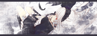
I think what's causing some conflict with the eyes is the top border giving the impression of a popup where there is none. I'll see about making some changes when I have free time and see if that makes a difference. This is also one of the first signatures I've made where I couldn't really fit in any text (outside of my usual watermarks). I think it works better though, no matter what I tried for text it looked out of place and cluttered.
__________________
|
|
|
|
|
2009-12-18, 17:23
|
Link #160 | |
|
Senior Member
Join Date: Nov 2006
Location: Virginia, USA
Age: 62
|
Quote:
__________________
|
|
|
|
 |
| Tags |
| contest, sotm |
|
|