2009-11-08, 23:10
|
Link #1 |
|
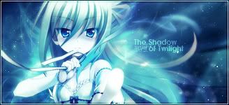
The Shadow of Twilight
 Graphic Designer Graphic DesignerJoin Date: Sep 2008
Location: Cursed land.
  |
-Beruko08's side corner-
Welcome to my thread.
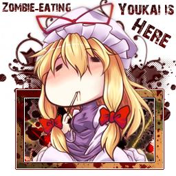
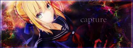
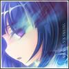
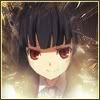
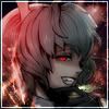
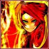
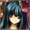
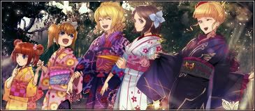
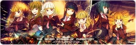
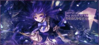
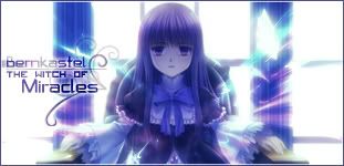
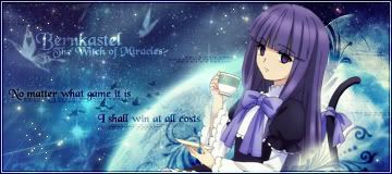
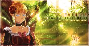
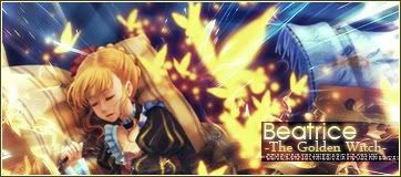
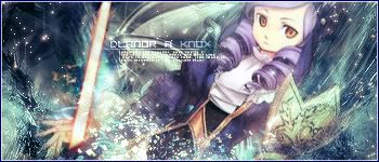
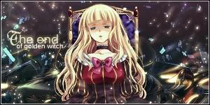
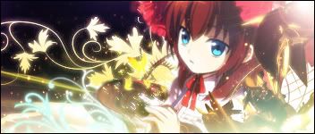
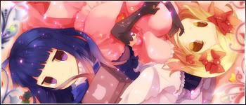
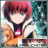
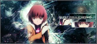
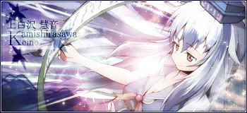
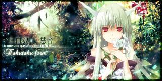
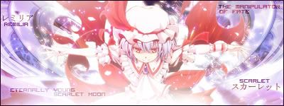
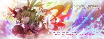
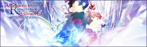
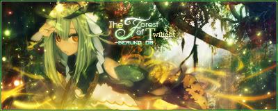
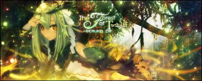
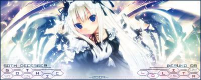
I'm just a newbie who is busy with lots of things and now I finally can start my first own thread since I came here.  I'm not really good at talking much so...let's start here. I'm not really good at talking much so...let's start here. If you really like the works I had been working and want to use it, just TELL ME or contact me via my profile or send p.m (Y!M or Skype is also fine)or claim it in this thread. DO NOT steal them without my permission and act like they were yours no matter what the reason is, I REALLY HATE that kind of people who like to steal others works! If you want to use it, just say it, is it really difficult to you?! You can contact my other usernames as well if you (in case you're Vietnamese) happen don't know how to speak English. Vnsharing.net Sickos Alliance Sincerely, Beruko08. Spoiler for Umineko:
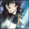
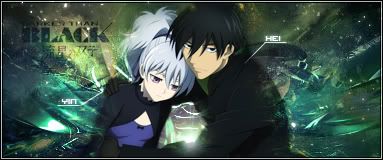
Spoiler for Darker than Black:
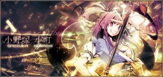
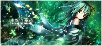
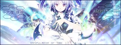
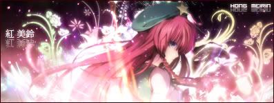
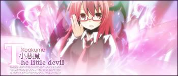
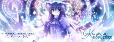
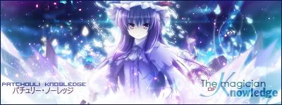
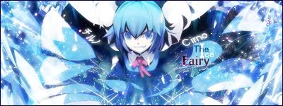
Spoiler for Touhou:
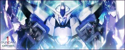
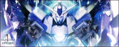
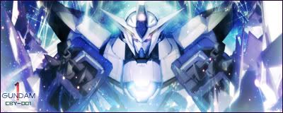
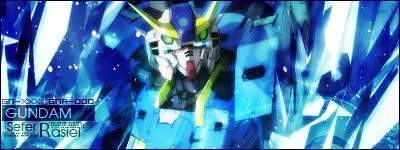
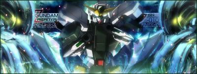
Spoiler for Gundam:
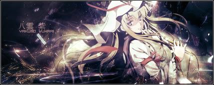
Spoiler for Random stuffs:
Spoiler for SOTM:
Spoiler for Trivial stuffs:
Any kinds of comments will be fine and appreciated as long as they're not too harsh since I'm just a amateur with my PS, that's why I want to learn anything necessary to improve my skills as much as possible  Lastest Updated: 1/26/2010 (Touhou & Random tag) Last edited by Beruko08; 2010-03-18 at 02:46. |

|

|
|
2009-11-09, 02:02
|
Link #2 |
|
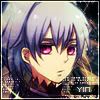
Watcher
Join Date: Oct 2008
Location: who knows.. where you're thinking
|
congrats for opening your own thread, i wonder when you would open it^^.
Great stuff ! Your style seems to be, do a cool background and paste the picture on it ,while adding some effect to melt it with the BG. I Never tried that style , fractal brushes always been so difficult for me -sorry cannot give cookies T_T-
__________________
|
|
|
|
|
2009-11-09, 03:36
|
Link #3 | |
|
The Shadow of Twilight
Graphic DesignerJoin Date: Sep 2008
Location: Cursed land.
|
Quote:
btw I'm not here to check how big of cookies I would get so don't worry about that stuff here  And your style... um, I wonder how I should put it... Well, I'm a bit jealous of it, you know? <__<'' Since it's really hard for me to do something like decorate those stuffs around the signature and add some texts that would give the signature its meaning, I guess that's a big failure for a designer like me  (I'm trying to improve that though) (I'm trying to improve that though)
|
|
|
|
|
|
2009-11-09, 05:05
|
Link #4 | |
|
Pieces Of Me
ArtistJoin Date: May 2008
Location: Tokyo,JP
Age: 39
 |
Quote:
Keep up the good work and I definitely endorse ur creations!
__________________
|
|
|
|
|
|
2009-11-09, 12:30
|
Link #10 | |
|
Watcher
Join Date: Oct 2008
Location: who knows.. where you're thinking
|
Quote:
__________________
|
|
|
|
|
|
2009-11-09, 14:55
|
Link #11 |
|
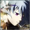
The Interstellar Medium
AuthorJoin Date: May 2008
Location: [SWE]
Age: 34
|
Beautiful stuff. Most fractal styled sigs are total chaos, but almost all of yours has the "organized chaos" which benefits them a lot. Love the text usage too, especially on the Touhou ones. High quality and great color management. Some of your sigs might be lacking in depth though.
As for the wallpapers, very nice work. Clean, soft and high quality, just as they should be.
__________________
|
|
|
|
|
2009-11-09, 20:40
|
Link #12 | |
|
The Shadow of Twilight
Graphic DesignerJoin Date: Sep 2008
Location: Cursed land.
|
Quote:
Some old sigs of mine have been overused with the texture too much that they're totally in chaos and hard to be recognized and some lacked in depth. That's the reason why I've been trying to make the sig with more less that kind of texture recently @Risa chan: Thanks, I really appreciate your comment there. I will definitely keep trying. |
|
|
|
|
|
2009-11-11, 07:36
|
Link #15 | |
|
Watcher
Join Date: Oct 2008
Location: who knows.. where you're thinking
|
Quote:
__________________
|
|
|
|
|
|
2009-11-11, 09:59
|
Link #16 | |
|
The Shadow of Twilight
Graphic DesignerJoin Date: Sep 2008
Location: Cursed land.
|
Quote:
 I had erased some part around her face a bit since I didn't want the pic was too overused with blur Anyways, thnks for the advice, I'll take note of that and be more careful after this.
|
|
|
|
|
|
2009-11-11, 10:24
|
Link #17 |
|
Watcher
Join Date: Oct 2008
Location: who knows.. where you're thinking
|
I see.
But oh well , what i wanted to say is .. I know it's not good to work over other poeple works. But as i cannot explain how i show you what i wanted to say   I painted the picture white and overlay it, left the opacity at 40 % , then paint the bottom part Blue and the rest Purple and masked it with the "Color" , opacity 60% (Actually , i left the Opacity Way too bright, but it was on purpose to show you how i did) Well , it's not better, but that's what i wanted to say ^^".
__________________
|
|
|
|
|
2009-11-11, 10:43
|
Link #18 | |
|
The Shadow of Twilight
Graphic DesignerJoin Date: Sep 2008
Location: Cursed land.
|
Quote:
Well, I've never thought of your way before since I wanted to keep the pic's origin colors while more shading, lighten, blurred at the same time
|
|
|
|
|
|
2009-11-11, 10:51
|
Link #19 | |
|
Watcher
Join Date: Oct 2008
Location: who knows.. where you're thinking
|
Quote:
__________________
|
|
|
|
|
|
2009-11-11, 12:04
|
Link #20 |
|
Imouto-Chan♥
Graphic DesignerJoin Date: Mar 2007
Location: England
Age: 30
|
OMG GORGEOUS GRAPHICS!!!
*Request* Pic: http://i132.photobucket.com/albums/q...papers/007.jpg Text: Hanyuu&Rika Minor Text: Miko Miko Border: No Style: http://i292.photobucket.com/albums/m...astelSign2.jpg <-- Like this. AS Safe: YEPP
__________________
|
|
|
|
 |
|
|


 .
. .
.
 .
. .
. .
. .
.
 .
. .
. .
.
 .
. .
. .
. .
. .
. .
.
 .
. .
. .
. .
. .
.
 .
. .
. .
.
 .
. .
. .
.
 .
. .
.
 .
. .
. .
. .
.
 .
. .
. .
.
 .
. .
. .
.


 .
.
 .
.
 .
. .
.
 .
. .
.

 .
.
 .
.
 .
.


 .
.


 .
. .
. .
. .
. .
. .
.
 .
.

 .
.
 |
|
 .
. .
. .
.
 .
. .
.
 .
. .
.
 .
.
 .
. .
. .
.
 .
. .
. .
. .
. .
.
 .
. .
. .
. .
. .
.

 [/IMG]
 .
. .
.
 .
.
 .
.

 .
.
 .
.
 .
.
 .
.


 .
.
 .
. .
. .
.
 .
. .
. .
.
 .
. .
.

 .
.
 .
.
 .
.
 .
.
 .
. .
. .
. .
.
 .
. .
. .
. .
.
 .
. .
. .
. .
.
 .
.

 .
.
 .
.
 .
.

 .
.
 .
.
 .
.


 .
. .
.
 .
.

 .
. .
. .
.