 2009-11-09, 21:53
|
Link #41 |
|
books-eater youkai
Join Date: Dec 2007
Location: Betweem wisdom and insanity
|
AtomicoX I don't see any more problem tha what you have already found
Drake it's not as bad as you seem to think. Maybe the colors are too '' one kind of bluie and one kind of red''
__________________
|

|
|
2009-11-10, 13:15
|
Link #45 |
|
books-eater youkai
Join Date: Dec 2007
Location: Betweem wisdom and insanity
|
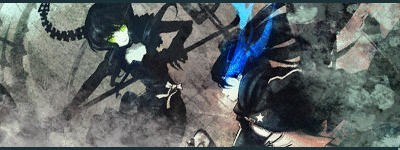
Soul-Stealer I see only one fighter, where's the other ?
After all the comments, I choose to use something more conventional for the SOTM. Edit: sorry I forgot to post on what I am working now. C&C would be welcome. 
__________________
Last edited by ganbaru; 2009-11-10 at 13:46. |
|
|
|
2009-11-10, 13:19
|
Link #46 |
|
Manga Addict
Join Date: Sep 2009
Location: England, UK
Age: 32
 |
Soul Stealer very nice effects, but I have to agree with ganbaru. I can only just make out two fighters in it. Plus, I think you've got too much empty space in it, specifically to the left. Sticking your username there doesn't seem to fulfill that fact
 Otherwise, it's looking great. Otherwise, it's looking great.
|
|
|
|
2009-11-11, 00:14
|
Link #49 | ||||
|
Black Dragon
 Graphic Designer Graphic DesignerJoin Date: Dec 2007
Location: In the Netherrealm, thinking who to betray next...
|
Quote:
 Quote:
 Quote:
 I think you should try to work out the God of War sig, it looked really cool in v1.  Quote:
__________________
|
||||
|
|
|
2009-11-11, 02:54
|
Link #50 |
|
Very Sucky Sig/Ava Maker
Join Date: Nov 2009
Age: 28
|
O.o..........
I dont think i should even submit this compared to everyone else............... I feel so lame but i guess i can feel that way since this is my very first anime siggy, and forst sotm contest. O.o Can i get C&C please? V1 (i guess)  Plain and Simple ftw?????? EDIT: Version 2 is a little brighter and i moved the texts. 
__________________
Last edited by sayinterry; 2009-11-11 at 03:09. |
|
|
|
2009-11-11, 10:22
|
Link #51 | |
|
Permanent Lurker
Graphic DesignerJoin Date: Jun 2008
Location: ᶘ ᵒᴥᵒᶅ...hehe
Age: 29
  |
Quote:
...keep up the good work
__________________
|
|
|
|
|
2009-11-11, 10:23
|
Link #52 |
|
toptoptoptoptoptoptoptopt
Graphic DesignerJoin Date: Jun 2008
Location: Behind you >:)
Age: 27
|
Ok I made the sig more visable
 @sayinterry Not that bad but you might want to use brushes and render you image better. @ganbaru I prefer the first one out of the two but it looks a lot more nicer the the batch before. @Soul-Stealer Its a little hard to tell apart your render. @AtomicoX I find the sig to be a little off but it might just be me =/ @Risa chan As Evil Rick-san said the render is confusing.
__________________
|
|
|
|
2009-11-11, 10:48
|
Link #53 | |||
|
Manga Addict
Join Date: Sep 2009
Location: England, UK
Age: 32
|
Quote:
and I don't like the look of it in that shape. On this one, I would work on bringing down the brightness in the middle, and making the colours a bit more vibrant. Quote:
as everyone will tell you the areas you've done well as well as the areas you need to improve. Aside from that, you need to work on getting renders in without having crutial parts cut off. Also, think about a colour scheme for the sig, from there you can work on what colour and style the text is going to be. I prefer V1 btw  Quote:
but overall, the sig still seems a little grey to me. Getting there though. |
|||
|
|
|
2009-11-11, 11:55
|
Link #54 |
|
Very Sucky Sig/Ava Maker
Join Date: Nov 2009
Age: 28
|
Ok... I made some edits and i drew in the rest of akane's head and natsuru's head and im not sure about what rendering is that much since im new to this so i basiclly looked at the renders filter and used lighting effects. (haha....)
V3  I made a v4 after what JR said and i moved the texts and edited the colors a little bit but my main color scheme is blue for natsuru and red for akane and orange yellow for texts  Can i get a little more C&C please? This is really helping me in making future sigs.
__________________
|
|
|
|
2009-11-11, 12:55
|
Link #55 | ||
|
Black Dragon
Graphic DesignerJoin Date: Dec 2007
Location: In the Netherrealm, thinking who to betray next...
|
Quote:
Quote:
Okay, I know you're new in all this matter of making sigs, so I'll put aside the "Designer" critique I normally give to tell you some basics of how you can make this sig better. 1) Too much text is not always that good, you're treying to "buy" votes so the sig must look tractive at first sig, too much text may make it look boring and drag away interest. 2) I can see 4 renders, too many renders doesn't work either, makes the sig distracting. I sugest you to serach on a site named Safebooru.com using thge tag "fight" and find a suitable image for the theme. Use only that image for your sig and it bwill work a lot better. 3) Try to focus your sig and keep the balance. This is the reason for why too much text and too much renders don't work, your sig must drag atention to one point of it. Once you get the image you want, make sure that the sig is focused on the image and only on the image. I know that a t some point is a bit hard, but hey, when I joined AS forums I didn't knew how to make graphics but through practice and patiente you can see I had improved.
__________________
|
||
|
|
|
2009-11-11, 12:58
|
Link #57 | |
|
Black Dragon
Graphic DesignerJoin Date: Dec 2007
Location: In the Netherrealm, thinking who to betray next...
|
Quote:
__________________
|
|
|
|
|
2009-11-11, 13:10
|
Link #58 | ||
|
Manga Addict
Join Date: Sep 2009
Location: England, UK
Age: 32
|
Quote:
Quote:
Renders are the images that you put into a signature, therefore, in your case they are the images of Natsuru and Akane.I can see how you got a bit muddled up with Render in the 'Filter' tab of Photoshop, but that is a good place to explore in your sig making, as you can create some great effects there. |
||
|
|
|
2009-11-11, 14:10
|
Link #59 |
|
Very Sucky Sig/Ava Maker
Join Date: Nov 2009
Age: 28
|
Ahhhh i see what you mean. Ill try to make a different one then. So subtract the text and some renders???? I think for sotm i dont really need to put my name and i feel as though S.O.T.M on the sig would make it more impactful.
So ill figure some way to maybe get a different fight scene or just meld it together.
__________________
|
|
|
|
2009-11-11, 14:14
|
Link #60 |
|
books-eater youkai
Join Date: Dec 2007
Location: Betweem wisdom and insanity
|
@sayinterry With as little experience as I have, I am probably not the best suited to teach thing to a newby but I can suggest you at least one thing: put the 2 ''fighters'' on the same picture it'S better if they fight agains each others.
@ Ayu-smepai it'S way more clear but still a bit too gray: adding some blue and green brush at low oppacity over the mass of gray might help. For me I made V3 and V4: plaayed a bit with the color and reduced the brightness of at center ( but given the renders, I have to keep some bright light or it would look wrong) C&C would be welcome. V3  V4 
__________________
|
|
|
 |
| Tags |
| contest, sotm |
| Thread Tools | |
|
|


 :|::|
:|::|


 )
)


