2008-05-13, 04:14
|
Link #301 |
|
The endless sky
 Graphic Designer Graphic DesignerJoin Date: Jun 2007
Location: Oosutoraria
Age: 34
|
Final entry:
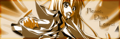
 I'm really too busy with other GFX to be worrying about my entry for this. I guess this might just have to do. I know it sucks, but maybe next month i'll have more spare time. I guess his is better than not entering at all. |

|
|
2008-05-13, 04:36
|
Link #303 | |
|
(ノಠ益ಠ)ノ彡┻━┻
 Moderator ModeratorJoin Date: Mar 2006
|
Quote:
 jk, I know what you mean.  I've also been very busy this month. Haven't opened up PS in two weeks and barely find enough time to lurk there and make a few posts here. I doubt my entry is going to change before the due date. =\ I've also been very busy this month. Haven't opened up PS in two weeks and barely find enough time to lurk there and make a few posts here. I doubt my entry is going to change before the due date. =\Hopefully next month will have more breathing room.
__________________
|
|
|
|
|
2008-05-13, 11:39
|
Link #304 |
|
カカシ
Join Date: Jan 2008
Location: London
 |
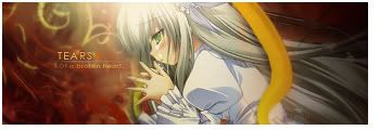
Yes a theme that doesn't have to be girly! Thanks Klashikiri, good choice. I guess I could enter with this? Or is it an unwritten rule that a beautiful females tears are needed? Cummon now Sasuke is nearly female!
 I made this before I lost photoshop sometime ago. I'm not really into graphics anymore but I like this sig. |
|
|
|
2008-05-13, 11:44
|
Link #305 | |
|
Retired
Graphic DesignerJoin Date: Mar 2007
Location: Princeton University
|
Quote:
__________________
|
|
|
|
|
2008-05-13, 14:14
|
Link #306 | |
|
Senior Member
ArtistJoin Date: Apr 2007
Location: England
Age: 31
|
Quote:
__________________
|
|
|
|
|
2008-05-13, 14:25
|
Link #307 |
|
カカシ
Join Date: Jan 2008
Location: London
|
Well the context is his whole family and clan got murdered by his brother. I tried to make it seem like he's nearly crying with his eyes watering up, but he came out looking somewhat happy. But I think the rain makes it fairly obvious it's a sad time. Problem being I'm finding it incredibly difficult to resize it to AS limits without making it a still image. I'll keep trying but if I can't I may just retire, still I'll let whoever's organising it (Solace?) decide if it's not reflecting despair/sorrow.
|
|
|
|
2008-05-13, 17:45
|
Link #311 | |
|
(ノಠ益ಠ)ノ彡┻━┻
ModeratorJoin Date: Mar 2006
|
Quote:
Crying and rain are probably the most common references used. However, just because someone is crying or that it is raining doesn't automatically equal something sad or despairing. A few entries needed the contestant to explain the context. Personally I think that's an automatic fail, because people should be able to grasp such concepts merely by looking at the image. To follow that, tragic character does not equal tragic signature. For people who have never seen that character, they would have no idea *why* that character is tragic. In the case of the Sasuke signature, his mouth and possibly eyebrows need to be changed. He looks like he's cheering up, and this is reinforced with the Smile text. In addition, the filesize is over the limit imposed by the rules. I'm just not feeling a sad element to it, honestly.
__________________
|
|
|
|
|
2008-05-13, 18:58
|
Link #313 | |
|
Love Yourself
Join Date: Mar 2003
Location: Northeast USA
Age: 38
|
Quote:
 Recommendations for how to "fix it up": use the smuge tool to curve the edges of his mouth downward. Doing this even a little will make his expression seem more neutral, or even one of sadness. I don't think there's a whole lot more that can be adjusted, unfortunately. The eyebrows are a good area to manipulate a character's expressions with, but in that image there isn't an easy way to manipulate them. That aside, they're neutral enough that you don't need to. Curve the mouth downward and the eyebrows may contribute to the sad expression as well. Nice work overall, though.
__________________
|
|
|
|
|
2008-05-13, 20:39
|
Link #315 |
|
Member
Join Date: Feb 2008
|
Hmm, i was just looking over the competition this month and im seeing signatures that seem a bit boring but only spiced by the animations. Some are even unnoticable if you take a quick glance. I don't know, but I'm wondering if the animation is worth it if you're only going to make tears or something like that, instead of a composed signature with colors, depth and effects (doesn't have to be big effects.. but just a bit of filters?). I'm not putting my thumbs down for the animated signatures in the thread, but it's just something i always wondered.
|
|
|
 |
| Tags |
| sotm |
|
|