2006-12-12, 21:35
|
Link #2241 |
|
"Show it to me"
Join Date: Dec 2005
Location: In solitude, where we are least alone
|
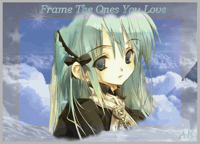
Deathkillz: nice sig. Is that C.C? 8/10
--> New sig made by K. Yamato. This is Lenalee Lee from D. Gray-man. The bg where you can see Allen...I think that's like a poster. It seems the scene is like in a street or alley or something  As for the colorful border and the font...imagine neon lights on the busy midnight street . Thanx for the sig K. Yamato!!! As for the colorful border and the font...imagine neon lights on the busy midnight street . Thanx for the sig K. Yamato!!!
__________________
|

|

|
|
2006-12-13, 00:50
|
Link #2242 | |
|
♪♫ Maya Iincho ♩♬
 Artist ArtistJoin Date: May 2004
Location: Unnecessary
Age: 38
 |
Quote:
Kira_Naruto - she's crying for your sake isn't she K_N? Nice glowing effect on the side, also great job with the tears along the side. 9.5/10 Deathkillz - super cute ^_^. I think you can add a few more effects to create a more amazing signature. 9.5/10 for cuteness. 7.5/10 for creativity. Where'is she from by the way ^_^? Cyz - the image of the girl is rather blurry. THe same goes with your name. I always do the same, i shrink the size of my finished work but it blurrs the name or text. Love the glowing text though, works nice with the pictures. 7.8/10 kaito-kid - Not bad for a 20mins worth. The much of browns matches Kira too, nice job. 8.5/10 CXC - I think you could've added a few more things toward the signature. Looks sorta bland. Add a beach ball ^_^. 7/10 M_Flores - quite nice. Not much to say but great work, I really like the christmas theme you placed on your signature. Ai Suzuki - Same as Zaris said. Your colors has too much depths. It makes it stand out as much as the glowing fist, but great job on the fist. 8.4/10 Zaris - Can't tell who's who's but the image is very clear, no blurrs like mine. The black border you used to seperate the 2 images is quite defining ^_^. 8.5/10 Inuzuka - great signature! It doesn't seems too complex looking at it from the outside. Liked it how you tilted the main image with the black for the original. 9.5/10
__________________
|
|
|
|
|
|
2006-12-13, 01:06
|
Link #2243 |
|
Kira_Naruto, the ecchi
Graphic DesignerJoin Date: Dec 2005
Location: http://www.exciting-tits.com/
|
 Considering my hobby as an ecchi pic collector.. its really no wonder if mai waifu is crying =x .. I'm a bad hubby ='( Considering my hobby as an ecchi pic collector.. its really no wonder if mai waifu is crying =x .. I'm a bad hubby ='(@ DemonGod04 .. 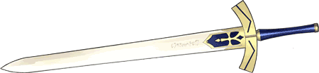 He doesnt come here unfortunately, but damn I love his work .. this 1 is no exception .. Altho that jagged edge do bothers me a bit =/ @ Cyz .. Its Jayson's work .. again... Qualm is, if you look at LenaLee text, you can see the blue glow got cut by the border =/ @ Aoei .. love it ^^ , the dark E raised a bit of a question tho,also the whole quote is kinda hard to read .. maybe gives it a stroke border? Oh btw, the lady in Deathkillz sig is C.C from Code Geass ^^
__________________
|
|
|
|
|
2006-12-13, 01:12
|
Link #2244 |
|
Senior Member
Join Date: May 2006
Age: 34
|
Cyz: Nice image but the image looks blurry, same with your name. Like the glowing text and the boarder if it is glowing... 8.2/10
Aoie_Emesai: everything looks good but that text that just turned darker is really odd imo like the image placement... 8.2/10 |
|
|
|
|
2006-12-13, 02:28
|
Link #2245 |
|
♪♫ Maya Iincho ♩♬
ArtistJoin Date: May 2004
Location: Unnecessary
Age: 38
|
Kira_Naruto - the sword is great. ^_^ 9/10
CXC - it's a panda ^_^, looks like it wants to kill someone. 8/10 ps: I couldn't find a good color to place for my text. I was gonna use a brighter color like brick red for it, but it stood out more than my image. I tried used a light color like sky blue, but it had no place in the signature, it's pratically stood like a transparent text. I used a texture for my text that's why it's the "e" is black. I'll have to fix it so it could be more legiable. I acutally wanted to use this one for my signature, but it was really impossible for me to shrink it to a decent size with it's dimension, while retaining it's proportions. Spoiler:
__________________
Last edited by Aoie_Emesai; 2006-12-13 at 04:37. |
|
|
|
|
2006-12-13, 12:46
|
Link #2248 | |||
|
~ You're dead ^__^* ~
Graphic DesignerJoin Date: Apr 2006
Location: uk, England
Age: 34
 |
Quote:
Quote:
and she is C.C. from code geass Quote:
the edges could use some work like you said and the animation seems a bit fast ~ 8.5/10cyz ~ its nice but i think the quality is a bit low and also the right side is too dull/dark and doesnt fit the BG all that well...7.5/10 Aoie_Emesai ~ beh i really dont like the grayness of the sig >.< and the font seems to blend too much into the BG ~ 7/10
__________________
|
|||
|
|
|
|
2006-12-14, 12:32
|
Link #2251 |
|
Sexy Tornado
ArtistJoin Date: Dec 2005
Location: The European Bunion
Age: 45
|
Cyz - nice sig as always, loving the neon
Hmm, I'm gonna go with a 10/10 here, I just really like the look.Deathkillz - also nice, cute girl (who is she?) though I'm not sure about the random person in the middle... 8.5/10 Ai Suzuki - nice Ed sig, love the blue alchemy effect 9/10Natsumeyashi Meiyo - another Ed sig. coolio. Looking nice 8/10 |
|
|
|
|
2006-12-14, 16:28
|
Link #2253 |
|
♪~ Daydreaming ~♪
Graphic Designer Administrator AdministratorJoin Date: Dec 2005
Location: Italy
|
Riker: Finally I have the chance to rate Riker's Chibi Fairies ^^ - aka my vote on the Winter Banner Contest. You miss the full ten because of the gif compression on the sides, but we all know how hard it is with the rules
 9,75/10 9,75/10Radiosity: Uhmm.. the feeling of copy/paste for the main image is strong, to my eyes. Maybe because the image is very bright, while the rest is not. As usual the Mind Corruptors contaminated me  , because if Riker didn't point out this, I would have never thought of that :x 7,5/10 , because if Riker didn't point out this, I would have never thought of that :x 7,5/10
__________________
|
|
|
|
|
2006-12-14, 21:39
|
Link #2255 |
|
"Show it to me"
Join Date: Dec 2005
Location: In solitude, where we are least alone
|
Radiosity: It's rare to see Shaorin in sigs
. The left side is a little empty though. Also, I think it would be better if you loose the two big blue borders at the top and bottom. It's making the img smaller. 8/10
__________________
|
|
|
|
|
2006-12-14, 23:08
|
Link #2256 |
|
Kira_Naruto, the ecchi
Graphic DesignerJoin Date: Dec 2005
Location: http://www.exciting-tits.com/
|
@ Deathkillz .. Yey.. no more Lulu.. CC is mine you hear that .. MINE!!!!
Not much left to comment ... I kinda like the 2 different face expression style as well ^^@ Rad ..  What have you done .. See what have you done to both Riker and Pelli ... 1 look from them and they already screamed OMG Tentacles O__O What have you done .. See what have you done to both Riker and Pelli ... 1 look from them and they already screamed OMG Tentacles O__O
__________________
|
|
|
|
|
2006-12-15, 01:19
|
Link #2257 | |
|
~ You're dead ^__^* ~
Graphic DesignerJoin Date: Apr 2006
Location: uk, England
Age: 34
|
Quote:
Radiosity ~ really nice but its too empty ~ maybe put more flames (?) or add another image i say i love the font ^_^ 8.5/10(mine is C.C. from code geass btw)
__________________
|
|
|
|
|
|
2006-12-15, 01:30
|
Link #2258 |
|
Kira_Naruto, the ecchi
Graphic DesignerJoin Date: Dec 2005
Location: http://www.exciting-tits.com/
|
Oh my .. What have I done
 Yey!!! Mission : Successful. Yey!!! Mission : Successful.@ Natsume .. 2 very different face expression .. but really.. its kinda empty. @ KiNA .. =x (mine is Kallen from code geass btw) __________________  |
|
|
|
|
2006-12-15, 09:52
|
Link #2260 |
|
"Show it to me"
Join Date: Dec 2005
Location: In solitude, where we are least alone
|
KiNa: Nice sig. I like the bg and the font style. The pic is pretty cool too -- she looks like 007
9/10CXC: pure cuteness no? Although the bg and the font style is far from cute. 8/10
__________________
|
|
|
|
 |
| Tags |
| rate, signature |
|
|