2009-03-10, 04:03
|
Link #189 | ||
|
Mr. Broshido
 Graphic Designer Graphic DesignerJoin Date: Jun 2008
Location: Chile
Age: 30
|
Quote:
Yeah, I'm having some trouble with the border...but borderless looks worse  . .Spoiler for Color version:
Spoiler for First versions:
Quote:
|
||

|
|
2009-03-10, 04:19
|
Link #192 | |||
|
♪ ~ ♫
ArtistJoin Date: May 2008
Location: Europe
Age: 35
  |
Final Entry
 Ended up making a few pixel edits (comparison [here]). >_< Quote:
Quote:
__________________
|
|||
|
|
|
2009-03-10, 06:05
|
Link #194 | ||
|
is not amused
Graphic DesignerJoin Date: Jul 2007
Location: Naval Base
|
Quote:
 Quote:
v2 Spoiler:
__________________
|
||
|
|
|
2009-03-10, 11:05
|
Link #196 |
|
Senior Member
Join Date: Nov 2006
Location: Virginia, USA
Age: 62
|
Version 8 with 2 font options. (I repositioned the text as well.)
Font 1  Font 2  Spoiler for version 7 for reference:
Comments? @ ganbaru I like your entry. If there was one thing that I would recommend fixing, it would be the integration of the girl (whose name I've forgotten) into the picture. The edges between her and the background are too abrupt for my tastes, especially on the left between her and the farm scene.
__________________
Last edited by LKK; 2009-03-10 at 11:12. Reason: added comment to ganbaru |
|
|
|
2009-03-10, 11:10
|
Link #197 |
|
Anxious bookseller
AuthorJoin Date: Aug 2006
Location: Shibuya Psychic Research
|
@Usami: I like the first one.
@Sacchin: Text is better but I still think its too light. @ganbaru: Nice but there is no e at the end of future...(unless its suppose to be spelled that way) @Sensei: I like the top one better.
__________________
|
|
|
|
2009-03-10, 11:13
|
Link #198 | |
|
Star Designer
Graphic DesignerJoin Date: Aug 2008
Location: Europe
Age: 38
|
Quote:

__________________
|
|
|
|
|
2009-03-10, 11:49
|
Link #199 | |||||||||
|
Black Dragon
Graphic DesignerJoin Date: Dec 2007
Location: In the Netherrealm, thinking who to betray next...
|
Quote:
Quote:
Quote:
Quote:
Quote:
 Quote:
 Quote:
But what about the "futur" text?  Quote:
__________________
|
|||||||||
|
|
 |
| Tags |
| contest, sotm |
|
|


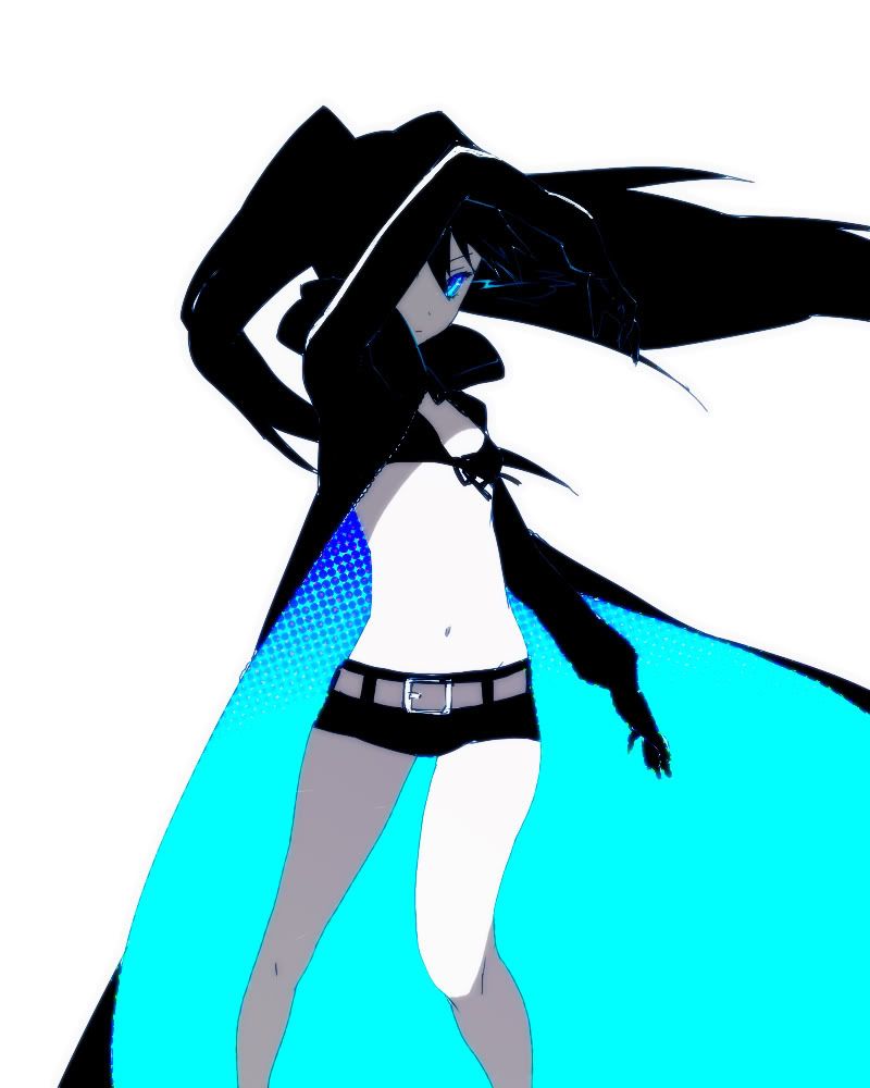
 I was hoping her hair was covering up enough of her lower face *sobs*

 Moderator