 2007-04-29, 15:25
|
Link #81 |
|
~ You're dead ^__^* ~
 Graphic Designer Graphic DesignerJoin Date: Apr 2006
Location: uk, England
Age: 34
 |
wohoo a really nice job in extracting that image
 (did you use the clone stamp for the hat part or just vectored it? O.o) (did you use the clone stamp for the hat part or just vectored it? O.o)and this is where the length of the sig betrays you  being rather empty its just too dam long imo ~ so probably it would look better if you chopped of some of the edges :3 being rather empty its just too dam long imo ~ so probably it would look better if you chopped of some of the edges :3 i really like the colours however that is one problem...whilst the background is that of the day and quite bright ~ youve kept the colours on matsuri from when you extracted it...having a dark purple hue contrasting onto a clear light blue BG doesnt fit imo...so i think it would look better if you did some colour changing :3 other than that it looks really nice ^_^ *thumbs up*
__________________
|

|

|
|
2007-04-30, 00:05
|
Link #82 |
|
阿賀野型3番艦、矢矧 Lv180
Graphic Designer Moderator ModeratorJoin Date: Mar 2006
Location: Belgium, Brussels
Age: 37
|
I vectored it (in fact, i wanted to vector matsuri completely... but considering i never tried to do a vector first, i just did that tiny part
)as for the size, I noticed also... i was gambling : well... does the extra space will give some "scenery" impression? conclusion : now way x_X Well, the colors were a bit contradictory first, but when i considered some added filter and brightness, the result was matching the official arts i found (in fact, there is only 1 art where matsuri is slightly different, and this is the church one, where you see her with bright black hair) meh, i tried to tone the "night purple" down, here is what i have changed so far :   the first one is the a tiny correction for her hair : between purp and black, without darkening it like an idiot XD the second is a noobish attempt to give some "under the sun" impression. i also slightly corrected the color of her skin (it was a bit too bright)
__________________
Last edited by Klashikari; 2007-04-30 at 00:22. |
|
|
|
|
2007-05-04, 13:45
|
Link #85 |
|
阿賀野型3番艦、矢矧 Lv180
Graphic DesignerModeratorJoin Date: Mar 2006
Location: Belgium, Brussels
Age: 37
|
not really often that i can stick with one subject (except higurashi, of course
), i could do a... Yorito signature XD The Dusk Scenery was the primary choice, since it was the best fitting "sky" for "passion" : red/orange (lively and burning colors), soothing radiance, the amount of patience to grab that scenery, etc. then, the picture choice was a bit "too natural", because of 2 reasons : 1) the amount of material for male characters is simply... absurdly low (1 yorito pic, you got 6-7 matsuri )2) this was almost the only picture which fits "passion" (the other could be yorito lying on the bed but... it is too small, and rather clumsy to place with dusk X_X) Solar rays were really an hindrance to merge... not sure if they are well blended by the way. the far left contrast with the right worries me a bit :/ not as appealing as Matsuri i guess...
__________________
Last edited by Klashikari; 2007-05-04 at 18:02. |
|
|
|
|
2007-05-04, 19:33
|
Link #86 | |
|
AniMexican!
Join Date: Dec 2005
Location: Monterrey N.L. Mexico
|
Hmmm, I didn't realized it until now, but I have become quite used to sigs being 120 pixels height. Dont have anything against the tall ones, but if I had to choose, I'll certainly pic the shorter one most of the time.
Wich of course, is another reason to like your sigs.  Quote:
__________________
|
|
|
|
|
|
2007-05-05, 06:07
|
Link #88 | |
|
阿賀野型3番艦、矢矧 Lv180
Graphic DesignerModeratorJoin Date: Mar 2006
Location: Belgium, Brussels
Age: 37
|
Quote:
well, sometimes i still consider them slightly too tall this is really irony, considering that i begun with 200 pixel height (which is horribly tall for me now), and i was like : how can i put pictures in such tiny space? X_X i don't have any clue how i could barely decrease the the height... as i can see, with the X signatures, but even with 150-160, i feel it was too small well then, i dunno what is happening with me, but already done the third sola signature :  As opposite of Matsuri signature, i had to add a specific hue, instead of removing it XD i must say... i had hell time for her "word of sky", since Aono is really hard to understand ^^" i couldn't find anything which could match her and the midnight scenery, except maybe "silence" which doesn't work pretty well. i tried to make some really dim but smooth ray of light on her, much more discrete than Mai signature.
__________________
|
|
|
|
|
|
2007-05-05, 06:39
|
Link #90 |
|
阿賀野型3番艦、矢矧 Lv180
Graphic DesignerModeratorJoin Date: Mar 2006
Location: Belgium, Brussels
Age: 37
|
Oi... i'm not a factory like you
you know me... a new signature within 1 week is sometimes rare. so, a new one the very next day isn't really something you will see often with me XD and note that, except higurashi, i rarely stay with the same subject, even when i have some "set" project for the animes i'm doing T_T (who said i should have done Yuuji, Friagne, Chrono, Nayuki and Ayu signatures for a very long time? ~~)
__________________
|
|
|
|
|
2007-05-05, 07:26
|
Link #92 | ||||
|
sleepyhead
AuthorJoin Date: Dec 2005
Location: event horizon
|
Haha~ same here, and I'm proud of my lazzy.. modest pace. -------------
__________________
|
||||
|
|
|
|
2007-05-05, 07:36
|
Link #93 | ||
|
Peek a boo
Graphic DesignerJoin Date: Dec 2005
|
Quote:
However, I probably can work fast if I get into the mood and have ideas for sigs. Quote:
|
||
|
|
|
|
2007-05-05, 11:18
|
Link #94 | |||||||
|
阿賀野型3番艦、矢矧 Lv180
Graphic DesignerModeratorJoin Date: Mar 2006
Location: Belgium, Brussels
Age: 37
|
Quote:
Quote:
sounds like you like giving various nicknames XD Quote:
As for the themes, nein, i didn't want it dreamy, but much more like mystery and silence ^^" "should" be the final version (still a V2) 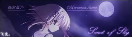 -Blur effect removed -opacity slightly decreased -correction with the "y" position, of "sky" Quote:
i'm just wondering how often he is lurking the picture thread of AS and 4chan Quote:
Quote:
__________________
|
|||||||
|
|
|
|
2007-05-05, 13:29
|
Link #95 |
|
~ You're dead ^__^* ~
Graphic DesignerJoin Date: Apr 2006
Location: uk, England
Age: 34
|
considering that you used a screen cap stock i have got to say that this sig is awesome you did a stunning job with the merger between the original BG and the artificially made one...might i say that you are an expert in this field but the problem with the sig is that the overall brightness is too low...okey it may be a sunset but with such a bright light source i would expect the sides to be a bit lighter or displaying a few other tones of orange (where the shadows hit etc) ~ and maybe a need of a landscape would be welcomed (i do see a bit but not enough imo) :3 not as good as your yorito one im afraid...even with the "shadows" to be the sig seems rather flat in comparison...make the moon illuminating is my tip
__________________
|
|
|
|
|
2007-05-05, 14:18
|
Link #96 |
|
阿賀野型3番艦、矢矧 Lv180
Graphic DesignerModeratorJoin Date: Mar 2006
Location: Belgium, Brussels
Age: 37
|
Humpf... you nailed pretty much the points i was really afraid of
Yurito signature : Well, i was hesitating about that matter, since brigh orange is kinda an agressive color to me :x but the amount of orange levels is sure big enough to have nice contrast. as a side note : the very first version of this signature was even a bit darker than this (the text was also in black. sounds like the crash test with Pelli was a good idea ^^")so i let you imagine how it was XD here is a tiny correction of the contrast :  guess the left part has better yellow tones now. but is this really that impressive to use a screencap shot? i didn't really work a lot on this (obviously, the original picture was really too convenient XD) Aono signature : well... not really outstanding, but this is the comment i was expecting, since it is supposed to be a discrete, yet calm signature ^^ once again, the moon didn't have enough work, but i must admit i didn't really use a better contrast here, because of the quality of the BG pic :x meh, i still followed your advice, so slightly tweeked too :3  i also changed slightly the glow effect of the text, which is a bit less outstanding i think. completely off topic note : w00t, this thread has finally a proper name XD Thanks to pellisier-sama  (and of course to deathie, without him, i couldn't try that XD) (and of course to deathie, without him, i couldn't try that XD)i was really fed up with that weird title, but i wasn't really brave enough to ask for the little story : back when i created the thread, i didn't have any idea of a name. thus, I picked a random (and surely frenglish) title, and validated it a bit too hasty. but what i didn't know was how the edit function works on AS forums : editting the "title" in the first original post will only modify the sub-title. so to much my horror, i had to use that freaky frenglish title like... 6 months... eouch...
__________________
Last edited by Klashikari; 2007-05-05 at 14:28. |
|
|
|
|
2007-05-06, 10:26
|
Link #97 |
|
阿賀野型3番艦、矢矧 Lv180
Graphic DesignerModeratorJoin Date: Mar 2006
Location: Belgium, Brussels
Age: 37
|
Fourth and Last "Words of Sky" signature
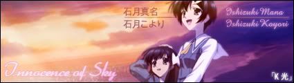 koyori-chan, and Mana. Some of you might figure already, the stock was taken from the same original picture used for Matsuri. so, once again, i had... "fun" time with extracting (not as painful as matsuri : less merging blue and noises) and correcting the hue (as tricky as matsuri ~~) as for the BG, it was a bit hard to get a picture, with a clear difference with a regular sunset (this is dawn after all, and the difference is obvious, yet rather hard to explain properly) meh... i had hard time for this fourth "word", considering the 2 sisters, the scenery and the 3 others signatures but, i think i succeeded with the "cycle" : Day => Dusk => Night => Dawn => ... Dream => Passion => Secret => Innocence => ... geh... sounds like i'm a bit too serious sometimes (or weird fetish...)
__________________
|
|
|
|
|
2007-05-06, 12:16
|
Link #98 | |
|
AniMexican!
Join Date: Dec 2005
Location: Monterrey N.L. Mexico
|
Quote:
I used to be all about making sigs as big as possible; same with rounded borders. Yep, rounded borders were actually the "in" thing some time ago.
__________________
|
|
|
|
|
|
2007-05-06, 22:09
|
Link #99 | |
|
hiatus almost permanent
Join Date: Apr 2007
|
Quote:
*Oh yeah you did =/* At any rate I really enjoy the concepts you use as well as the way everything seems to fall in place so neatly. =D Uhh, but due to my incapability in designing I have no idea how to provide constructive criticism as the sub forum requests... How? how? >< |
|
|
|
|
|
2007-05-07, 05:09
|
Link #100 | ||
|
阿賀野型3番艦、矢矧 Lv180
Graphic DesignerModeratorJoin Date: Mar 2006
Location: Belgium, Brussels
Age: 37
|
Quote:
well, it is a bit weird first, but i think it suits better and the title ACTUALLY rings a bell for the readers, instead of my frenglish "little oldies and some" Quote:
thus, well... i don't see any problem for you or anyone "who doesn't know a lot on "how to make them"" to critize signatures, as long as it is constructive ^^" constructive doesn't mean you should be able to tell which blending, the default of opacity etc. just write up what you think (optional : with the least biased mind, positive or negative )
__________________
|
||
|
|
|
 |
| Thread Tools | |
|
|


