2009-09-02, 23:22
|
Link #1 |
|
(ノಠ益ಠ)ノ彡┻━┻
 Moderator ModeratorJoin Date: Mar 2006
|
SOTM 2009 - September (Cybernetics) - Entry Thread
 !!!Welcome to the SOTM!!! ~Congratulations to AtomicoX for winning the August Contest!~ The theme chosen for September is - Cybernetics. What is that? See here for details. About the SOTM: The Signature Of The Month contest is open to all members of the Animesuki Forums. The goal of the contest is to provide a fun and competitive way of showing off and improving the signatures and personal skills of contestants. The winner of each months contest is given the privilege of choosing the theme for the next month. About the SOTM Theme: Each month prospective contestants are given a theme to base their entries on. This theme is decided by the winner of the previous contest. The theme can be anything, as long as it does not break forum rules regarding inappropriate material. At the end of the month, voters choose which entries they liked best out of all submitted entries and a new winner is decided. Themes cannot be used twice in a row. The Rules of the SOTM:
About the SOTM Entry Process: Every month, a new entry thread is created. Each month's entry thread is a central spot meant to give contestants a chance to create and improve their entries as well as their skills, in addition to providing them a place to post their official submissions. The thread is solely about helping contestants with entries, and as such these things will not be tolerated:Anyone disrupting the thread will be asked to take it privately, to the SOTM Generic Discussion Thread, or if the offense is severe enough - reported to the moderators.1. Nonconstructive and negative criticism (if you truly dislike something about an entry, be polite and helpful) This Month's Entry Period:: This months entry period officially starts Thursday, September 2nd, 2009 and lasts until Friday, September 18th, 2009. Entries will be gathered and put up for voting on Sunday, September 20th, 2009. Voting will end on the following Sunday. The due date ends at 11:59 (midnight basically) UTC/GMT. The polling will be up one day later after 11:59 (again, midnight). I will try to be as lenient as I can with last minute submissions but only slightly. It is up to you as a contestant to know what your time zone is in relation to UTC/GMT. I cannot do this for you. Here is a site that can help you figure that out: http://www.worldtimeserver.com/convert_time_in_UTC.aspx Good luck to all contestants, and most importantly, have fun!!! |

|
|
2009-09-03, 01:56
|
Link #3 | ||
|
The Interstellar Medium
 Author AuthorJoin Date: May 2008
Location: [SWE]
Age: 34
|
Quote:
For those who don't know who she is she can easily pass as a cyborg anyway so I think it's fine. Quote:
EDIT: Actually, most androids do have human looks by definition, so I'm in the error there. I think the same human - tech ratio counts so go ahead. Also as a sidenote, Mecha Musume or something similar don't count. I don't really consider that cybernetics. I could go on forever about cybernetics, sorry 
__________________
Last edited by NorthernFallout; 2009-09-03 at 02:07. |
||
|
|
|
2009-09-03, 08:00
|
Link #5 | |
|
books-eater youkai
Join Date: Dec 2007
Location: Betweem wisdom and insanity
|
Quote:
 My first draws, C&C would be welcome;  
__________________
|
|
|
|
|
2009-09-03, 15:34
|
Link #8 |
|
dn ʎɐʍ sıɥʇ
Graphic DesignerJoin Date: Dec 2005
Location: Northern Ireland
|
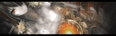
Here is my first draft so far, Hope it fits the theme ok.
 Cant really think of anything that needs done so I'll make it my final entry.
__________________
Last edited by Drake; 2009-09-06 at 22:45. Reason: Final entry update. |
|
|
|
2009-09-03, 17:08
|
Link #10 |
|
books-eater youkai
Join Date: Dec 2007
Location: Betweem wisdom and insanity
|
@ Drake, yes I think it fit the theme
@ Risa chan Your entrys have the same proplem than had at first escimo's last month, it's too hard to tell what we are seeing. You should make the form of the body a little bit more obvious, for now it blend so much on the light...
__________________
|
|
|
|
2009-09-04, 12:17
|
Link #11 |
|
time waits for no one <3
Graphic DesignerJoin Date: Aug 2008
Location: Portugal, Lisbon
Age: 32
|
ok I wasn't even going to participate this month because it's one of the themes I like the least *hates robotics, cybernetic and so on x.x* but then I thought it'd be an interesting challenge to make a good sig with a theme I don't like...
so I tried, and I'm not really sure about the result, but anyway, here's my first try... and I hope it fits the theme since she's an android here... 
__________________
|
|
|
|
2009-09-04, 19:24
|
Link #12 |
|
books-eater youkai
Join Date: Dec 2007
Location: Betweem wisdom and insanity
|
@ Vandakiara she seem android enough for me if you could focus more on the mechanic part ( hairs and her left uper arm ) it wouldn't hurt. Beside this, maybe reworking the background.
My third batch reworked the text, added some light to the ''third arm'' and try some variation for the color, C&C would be welcome.    Spoiler for the second try:
__________________
|
|
|
|
2009-09-04, 19:53
|
Link #13 |
|
Senior Member
Join Date: Nov 2006
Location: Virginia, USA
Age: 62
|
@ ganbaru: I like the middle one with the reddish tint best. The red tinting gives the pic more depth than the other ones. In all three pics, the girl and her gun seem to sitting on top of the picture rather than sitting in the picture. Maybe a little more blending around the edges?
__________________
|
|
|
|
2009-09-04, 23:01
|
Link #15 | |||||
|
Black Dragon
Graphic DesignerJoin Date: Dec 2007
Location: In the Netherrealm, thinking who to betray next...
|
Quote:
Quote:
 Quote:
 Quote:
Also, try this: Filter/ Render/ Lens flare on the gun. It would look good, I think. Quote:
__________________
|
|||||
|
|
|
2009-09-05, 08:03
|
Link #18 | |
|
books-eater youkai
Join Date: Dec 2007
Location: Betweem wisdom and insanity
|
Ichigo-Sora It's exellent, the only change than I can think of would be of makint the text a little more readable, and yet I am not sure it would be a good idea...
Quote:
4th version, I removed the text ( exept her name, the only thing than I would think of placing on this sig wouldn't fit , not enough room ) tonned down the render, added a photo filter, and added some lens flare over the first one. C&C would be welcome. 
__________________
|
|
|
|
|
2009-09-05, 08:53
|
Link #20 | |
|
toptoptoptoptoptoptoptopt
Graphic DesignerJoin Date: Jun 2008
Location: Behind you >:)
Age: 27
 |
Quote:

__________________
|
|
|
|
 |
| Tags |
| contest, sotm |
|
|