2010-10-12, 00:58
|
Link #84 | |
|
Panzer Vor!
Join Date: Sep 2007
Location: Inside a WWII German tank
|
Quote:
|
|

|
|
2010-10-12, 02:07
|
Link #85 | ||||
|
Call me MK! :)
 Graphic Designer Graphic DesignerJoin Date: Oct 2009
Location: The top of the world.
Age: 34
|
Quote:
Quote:
Quote:
Quote:
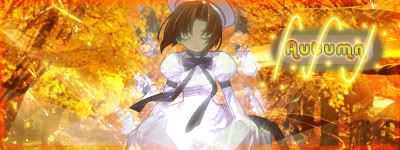
 I changed the background using gradient but only on BG, the colors sre still similar but now it's easier to distinguish the BG (branches and falling leaves). I also changed the text (also I put the text closer to the render), I don't have many fonts and I don't know how to install new ones And non of the colors I put are able to blend the text much so I had to use blending option and came up with this. I changed the background using gradient but only on BG, the colors sre still similar but now it's easier to distinguish the BG (branches and falling leaves). I also changed the text (also I put the text closer to the render), I don't have many fonts and I don't know how to install new ones And non of the colors I put are able to blend the text much so I had to use blending option and came up with this.V6 
__________________
|
||||
|
|
|
2010-10-12, 03:21
|
Link #86 |
|
books-eater youkai
Join Date: Dec 2007
Location: Betweem wisdom and insanity
|
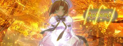
milan kyuubi there's still some part of the text than hard to read. You could use the ''Horizontal type mask tool'' combined with a adjustement layer insted of the ''Horizontal type tool''. And about the font, monotype corsiva is the type than I usually trust for text and you should have it if you have Photoshop or Photoshop Element.
__________________
|
|
|
|
2010-10-12, 08:05
|
Link #88 | |
|
Panzer Vor!
Join Date: Sep 2007
Location: Inside a WWII German tank
|
Quote:
|
|
|
|
|
2010-10-12, 08:36
|
Link #89 |
|
Call me MK! :)
Graphic DesignerJoin Date: Oct 2009
Location: The top of the world.
Age: 34
|
After some thinking I decided to remove 'quote'. Ganbaru I tried to do what you told me, but I don't have that font in my photoshoop (the only font I have that resemblance yours is ''Brush Script Std'' but it was still not good), also ''Horizontal type mask tool'' only made text animated and it was even more impossible to read it.
V7 (probably final)  Edit: Well after reading your post Star-Wing I decided to make small changes after all V8  c&c? Please, for both versions I would like to know what version you like the better 
__________________
Last edited by milan kyuubi; 2010-10-12 at 08:52. |
|
|
|
2010-10-12, 08:37
|
Link #90 |
|
Covered in Darkness
Graphic DesignerJoin Date: Jul 2010
Location: Missing~
 |
Finally got an hour free
 Was browsing through the thread and….. Was browsing through the thread and…..@Namiey Spoiler for RnR:
@MK Spoiler for RnR:
@Sworn Spoiler for RnR:
@CM Spoiler for RnR:
@RGC Hey, I think you are a fresh face here! Welcome to the forums and so glad to see you taking interest in SOTM <3 (On a side note, loved your signature  ) )Spoiler for RnR:
@Mittwoch Spoiler for RnR:
EDIT @MK Ooops, my RnR is for your v7 ^^; @Ganbaru I think I missed your entry -.-"
__________________
Last edited by Star-Wing; 2010-10-12 at 09:11. |
|
|
|
2010-10-12, 09:07
|
Link #91 |
|
books-eater youkai
Join Date: Dec 2007
Location: Betweem wisdom and insanity
|
@ milan kyuubi I don't know which softeare you are using but, in Photoshop Element 7 '' Monotype Corsiva'' isn't place inthe right order, look for ''Corsiva''. I have to say than v8 is better.
Edit; my new version, I replaced the blow (but lighter) and some shade. C&C would be appreciate. 
__________________
Last edited by ganbaru; 2010-10-12 at 09:38. |
|
|
|
2010-10-12, 17:23
|
Link #93 | |
|
Formerly -> CMHerrera
Graphic DesignerJoin Date: May 2008
Location: Around
Age: 30
 |
Quote:
__________________
|
|
|
|
|
2010-10-12, 22:46
|
Link #97 |
|
Call me Anego!~
Join Date: Jul 2009
Location: In a room as blue as the sky, as cool as the autumn wind and as quiet as the desert
|
My first entry...
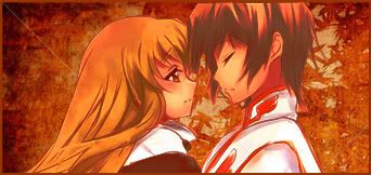
 @RGC Railgun I prefer the second one, although her face can be a bit brighter, and a border may look nice. @ganbaru It's perfect! @MK I prefer the second version, the darker colour at the bottom looks good, but her hands looks a bit blurred. @Sworn definitely better now 
__________________
|
|
|
|
2010-10-12, 22:53
|
Link #98 |
|
Kaiba
Join Date: Jul 2010
Location: David Tennant's bedroom in the TARDIS
|
Railgun: it's better but still needs more orange. Photo filter or gradient map?
Chimuts: it's a nice start, cute idea. I think though you should smooth some of the edges of the leaves and choose a different font.
__________________
|
|
|
|
2010-10-13, 07:42
|
Link #100 |
|
books-eater youkai
Join Date: Dec 2007
Location: Betweem wisdom and insanity
|
Sworn to Belive, your latest version is better, the more autumn-like.
Chimuts the idea is nice but the quality is kind of lacking. Fake transparency or a background might be a better idea
__________________
|
|
|
 |
| Tags |
| contest, signature of the month, sotm |
| Thread Tools | |
|
|


 I find nothing wrong in my end..