2008-04-14, 14:38
|
Link #6325 |
|
Black Dragon
 Graphic Designer Graphic DesignerJoin Date: Dec 2007
Location: In the Netherrealm, thinking who to betray next...
|
KasumiGirl: First One= I like that withe hair girl (Like that add onn at the right too) 9/10
KasumiGirl: Second one= Quite shoking but honestly I don't like it 6/10 WinterSerenade: Needs a border and maybe another background but still is pretty cool 6.5/10 Endrance: I really like that 9/10 $akura: First one = Pixel Dolls! ^.^ 7/10 $akura: Second one= Nice sig of Sakura  8/10 8/10
__________________
|

|

|
|
2008-04-14, 16:05
|
Link #6326 |
|
~La-la Land~
Graphic DesignerJoin Date: Jul 2007
Location: Seattle
Age: 37
|
Evil Rick - 6/10 not really digging that text. Colors and font of it don't suit the signature at all. I do however like the animation of the eyes glowing.
Kasumi-chan - displayed one: 10/10 like I said on your thread, I really like it ^_^ I see you're going for the no-border look? current one: 8/10 I like this one too, but for some reason I like the background more than the render *shrug* don't ask me why!
__________________
|
|
|
|
|
2008-04-14, 19:09
|
Link #6327 | |
|
Senior Member
Join Date: Nov 2007
Location: Somewhere out there.................
|
Quote:
Evil Rick: Cool/creepy glowing eyes  8/10 8/10Marina: How cute!!! 10/10 |
|
|
|
|
|
2008-04-14, 19:23
|
Link #6328 |
|
I'm a commin'
Graphic DesignerJoin Date: Dec 2007
|
Kasumigirl
1: 8 Colors are really good. Text and effects are also nice. 2: 7 Nice flow. Lighting seems a bit forced. Evil Rick - 5 The text is really really distracting. Font, color, and size wise. WinterSerenade - 6 It's pretty plain. -How will people ever rate this one- \/ |
|
|
|
|
2008-04-15, 01:12
|
Link #6331 |
|
Black Dragon
Graphic DesignerJoin Date: Dec 2007
Location: In the Netherrealm, thinking who to betray next...
|
Marina: Love it 10/10
WinterSerenade: I stand in what I tell before 6.5/10 BearShare: It's a picture from a cell phone? 5/10 starry:sky45: A bit small and I think it needs a border 6.5/10 Endrance: Still like it 9/10 O.k, my las sig = BAD So I just made me a new one
__________________
|
|
|
|
|
2008-04-15, 01:24
|
Link #6332 |
|
ISML Technical Staff
Graphic DesignerJoin Date: Dec 2006
Location: Phoenix, AZ
Age: 35
  |
BearShare: 7/10, I didn't really get it.
starry_sky45: 8/10 Endrance: 7/10, I don't know. It doesn't seem very blended. Evil Rick: 8/10, I actually like it, a lot. The font that you always use fits here, I think, and thank God it's not red this time. 
__________________
|
|
|
|
|
2008-04-15, 01:29
|
Link #6333 | |
|
Black Dragon
Graphic DesignerJoin Date: Dec 2007
Location: In the Netherrealm, thinking who to betray next...
|
Quote:
I think I abuse a bit of the red in my sigs  KholdStare: Like that efect of the color in the girl's face 9/10
__________________
|
|
|
|
|
|
2008-04-15, 03:56
|
Link #6335 |
|
Ka-na-me...^^
Join Date: Jan 2007
Location: Holland
Age: 33
|
Kasumigirl: Hmmm...something is missing i dunno...6/10
Evil Rick: I just adore wolves but werewolves i just don't like...and it looks a bit simple 6/10 Kholdstare: I like how you put borders around there heads to notice them, cute indeed 9/10 |
|
|
|
|
2008-04-15, 22:51
|
Link #6336 |
|
~La-la Land~
Graphic DesignerJoin Date: Jul 2007
Location: Seattle
Age: 37
|
Shinbou - 7/10 my eye is more drawn to the text than to the characters
Evil Rick - 7.5/10 much better than your previous one! Next step: work on font! KholdStare - 8/10 very original ^_^
__________________
|
|
|
|
|
2008-04-16, 00:15
|
Link #6337 |
|
♪♫ Maya Iincho ♩♬
ArtistJoin Date: May 2004
Location: Unnecessary
Age: 37
 |
Marina - sooo cute ^^ and I like the snow. 9.5/10
KholdStare - I love this one too, with the mono color. 9.5 -- I always make mine a almost 3 to 4 times larger than it's suppose to be and downsize them. This time the brushes didn't want to downsize >.<. Trying to work out the kinks on this one now so I can finally post it >.< ps: You can never have enough Maya ^^ ex. Spoiler:
the downsized one - Spoiler:
edit - Well... I got that on my sig. Looks good enough ^^
__________________
Last edited by Aoie_Emesai; 2008-04-16 at 00:45. |
|
|
|
|
2008-04-16, 07:14
|
Link #6339 |
|
The endless sky
Graphic DesignerJoin Date: Jun 2007
Location: Oosutoraria
Age: 34
|
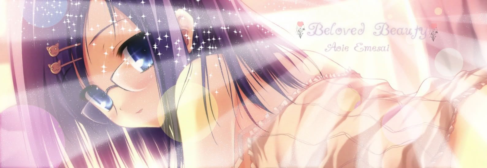
Aoie: I love the colours. ^^ The rays of light and the sparkle thinggys should be just a bit less noticeable, though. Text is another problem, but it's only a minor one. 7.5/10
Icy: MIKU! 7.8/10 Please rate this, thanks 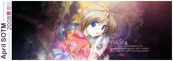
Last edited by KasumiGirl; 2008-04-16 at 09:45. |
|
|
|
|
2008-04-16, 08:55
|
Link #6340 |
|
Reisen FTW!
Graphic DesignerJoin Date: Aug 2006
Location: Chicago,IL, USA!!!!
Age: 31
|
@Kasumigirl: Pretty but the text is a bit blurry. Moe detail on your thread. 7.5/10
@ICY: Cute Miku siggy: 8/10 @Aoie: Like Kasumi said, the text is hard to read and the light should be less noticeable. Nice 8/10@Evil Rick: Freaky but cool 7/10 @KholdStare: YAY!! summer.<33 9/10 @Marina: Don't know if I rated this yet. Oh well. XD 8.5/10 New Aika Siggy: Sorry its poor and I don't think I did a good job on it.  
__________________
|
|
|
|
 |
| Tags |
| rate, signature |
|
|


 8/10
8/10