 2007-07-13, 02:21
|
Link #181 | |
|
Falling for Ginsama ^3^
 Graphic Designer Graphic DesignerJoin Date: Feb 2007
Location: Airantou
 |
Quote:
she is the one that has a thread here its called "Milky Way Renders" look through her renders and u will come upone the KOS-MOS one =) Cel>> Yea I know I was never good at drawing the hands >,< and thx for the comment and I will try and stroke like u said, MimI>> THankies For the links =3 DJ>> yea I for that red circle thing it was called red planet or something and I thought it would kinda go with the render in the sense that the anime and game takes place in space =/ thx for the comment. edit: O and WOOOOOOOOOOOOT its me 10th page xD  and to celebrate here is another drawing I did awhile ago but is the few things I got scanned  all Manga readers SHOULD know who those two *cough* "girls" are <,< >,> *walks away* edit#2: okay since I hate having to double post xD Here is a sig request I just did, I haven't done a request in awhile kinda feel rusty =/  (sig requested by Shuin) Tell me if i misspelled Louise(sp?) oh and it seems the quality went to crap again when i saved in Jpg >,< hehe I know ONE PERSON WHO IS GOING TO HATE THIS Sig xD
__________________
Last edited by bigdave; 2007-07-13 at 04:58. |
|

|

|
|
2007-07-14, 15:24
|
Link #182 |
|
Falling for Ginsama ^3^
Graphic DesignerJoin Date: Feb 2007
Location: Airantou
|
Okay why does it say I have 180 posts but My post here is the 181 post o__O;;;
lalallalalalalalalalla dancing on the edge of oblivion is fun xD Well I finally got off my butt and made my first banner >,> XP  
__________________
|
|
|
|
|
2007-07-14, 16:17
|
Link #183 | |
|
Retired
Graphic DesignerJoin Date: Mar 2007
Location: Princeton University
|
Quote:
GJ on the first banner, but i think she could blend a little more =3 P.S. the 181 posts is b/c the first post (the starting your thread post) doesn't count as a post, so thats why 
__________________
|
|
|
|
|
|
2007-07-15, 03:34
|
Link #184 |
|
~Anpan~
ArtistJoin Date: Sep 2006
Location: Yuri Land
Age: 37
|
Ah ..one more banner entry ...damn i should have known PS >.<
Neway..ur entry should have lighter colors. The darkish appearance doesnt match up with the sky..as the PS experts put it..more blending...and maybe we can include more of the girl in the pic 
|
|
|
|
|
2007-07-15, 04:06
|
Link #186 |
|
Thinking outside the box
Graphic DesignerJoin Date: May 2007
Location: The Netherlands
Age: 37
|
I like the old font style choice more on your first banner. But the effect and placing is better on the second version.
I like the belldandy one. Nice blending on the left. Perhaps give the right a bit blending to. Not as much as the left but just a it of blending. As for the font, i think it looks to plane.
__________________
|
|
|
|
|
2007-07-17, 00:11
|
Link #188 |
|
Falling for Ginsama ^3^
Graphic DesignerJoin Date: Feb 2007
Location: Airantou
|
oh man I wished i could get more of my drawings scanned T__T
but I have no scanner =/ well here is the next drawing ^^; ( I think most ppl should be able to identify that nun, and if not guess u don't like magical academies with MANY girls xD)  Seph>> yea I guess I should combine those two then huh xD and for the belldandy one I was just trying out something and yea I don't think the text is to appealing too >,< I will try blending the right side too. Toxic>> hehe thx toxic, I will get on this soon and fix it up to look very kakoi! xD
__________________
|
|
|
|
|
2007-07-17, 00:20
|
Link #189 |
|
Retired
Graphic DesignerJoin Date: Mar 2007
Location: Princeton University
|
Don't worry Dave, I dont have a scanner either
 *clasp hands *clasp handsNs drawings again, and again, I envy you for being able to draw without looking at a reference I should post of some of my latest ones too lol On the banner, hmm I really like the 2nd one too, but iono cuz i did an Ayu one with wings and failed miserably I am really glad you managed to do it really well GJ Dave Anyways, good work on your latest stuff and keep it up =]
__________________
|
|
|
|
|
2007-07-17, 00:58
|
Link #190 |
|
~Anpan~
ArtistJoin Date: Sep 2006
Location: Yuri Land
Age: 37
|
@Dave..nice to see ur works...well..still some more way to go for u in the drawing field..but starting out with doodling is nice. Ur characters look cute.so u r on the right track..keep practicing and keep posting
|
|
|
|
|
2007-07-17, 22:56
|
Link #191 | |
|
Ha ha ha ha ha...
Graphic DesignerJoin Date: Apr 2006
Location: Right behind you.
Age: 35
|
Quote:
My suggestions (as an observer, not an artist.  ) )Top one: The left side seems a bit empty. Could use more clouds, or something. Bottom one: The way the text is splitbugs me, as does the fading images. I can't place my finger on it exactly, but might I suggest not overlapping the images, or perhaps overlapping them a bit less? Also, keep AnimeSuki together, and add forums, so we can have a kind of uniformity in all banners. Well, that's my two cents. Keep up the excellent work!
__________________
|
|
|
|
|
|
2007-07-18, 00:30
|
Link #192 |
|
Falling for Ginsama ^3^
Graphic DesignerJoin Date: Feb 2007
Location: Airantou
|
SI>> hehe thx for the advice and comment ^^
and here is my sigs for today! =D This is my first set of sigs, although they all have the same bg xD 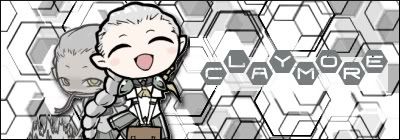 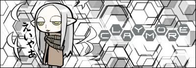 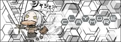 I know that the bg design is random
__________________
|
|
|
|
|
2007-07-18, 01:46
|
Link #193 |
|
~Anpan~
ArtistJoin Date: Sep 2006
Location: Yuri Land
Age: 37
|
Tadaima de arimasu~ ^_^
And what a cute sight it is...as for the IDs..its Ophelia, Irene and Miria respectively Cute sigs..but i think the BG could be cuter..but i guess as u said..u just pulled out something random |
|
|
|
|
2007-07-18, 15:43
|
Link #194 |
|
Falling for Ginsama ^3^
Graphic DesignerJoin Date: Feb 2007
Location: Airantou
|
Toxic>> Aregato ^^
I blanked on there names when I finished them =__= xD well Here is the fix to the first banner, I tried combining what everyone liked about the different versions. =D 
__________________
|
|
|
|
|
2007-07-19, 03:46
|
Link #199 | |
|
The ______ maker
Graphic DesignerJoin Date: May 2007
Location: MMO
 |
Quote:
and yeah, i couldnt find it, the wireless connection around my campus is kinda suck so i guess thats the prob... lol, i like weird sig, so this one really suit my taste.. sigh....some people just cant accept the art of weirdeness anyways... where did you get the render for this one? i became more shameless for each day that passed...XD Last edited by genryou; 2007-07-19 at 22:11. |
|
|
|
|
|
2007-07-19, 03:48
|
Link #200 |
|
Kira_Naruto, the ecchi
Graphic DesignerJoin Date: Dec 2005
Location: http://www.exciting-tits.com/
|
But the other ones also fits them ^^
Glad the pic I posted turned out as sig by somebody else.. btw, change the BG and offer it in claymore sig thread... would be claimed like there's no tomorrow ^^ +edit+ Lol .. You actually did it already.. and claimed as well see.. They sells like hot butter ^^ Chibi Claymore ... wonder if I can find more chibi Clare moe @ Genryou.. OO sneaky, you sneak a post in between.. Those chibies are from claymore image thread.. I posted it couple of days ago
__________________
|
|
|
|
 |
| Tags |
| signature |
|
|


