2006-07-07, 19:55
|
Link #2 |
|
AniMexican!
Join Date: Dec 2005
Location: Monterrey N.L. Mexico
|
Lame!? What are you talking about?
Your stuff is pretty good as far as I am concerned. I particulary like the last one best. Hope you can show us a colored version in the future.  Keep up the good work!
__________________
|

|

|
|
2006-07-07, 19:58
|
Link #3 | |
|
Champion of Obscurity
Join Date: Jun 2006
Location: Sweden
 |
Quote:
 I'm afraid I'll have to kill you, Zeeke. You have commited a sin by saying such beautiful and proffesional drawing is LAME. You're definately getting +repped for this. |
|
|
|
|
|
2006-07-07, 23:43
|
Link #5 | |
|
Guide my hand...
Join Date: Mar 2006
Age: 40
|
Quote:
 And I honestly have to say..., Zeeke's work on portraying him realy is very good.., specialy on the 2nd picture. It realy captures that look that Hao has.., so needless to say.., amazing designs
|
|
|
|
|
|
2006-07-08, 11:48
|
Link #8 |
|
Junior Member
Join Date: Jul 2006
|
You've been getting positive feedback which you have earned, especially the details of clothes (I can't do folds and such).
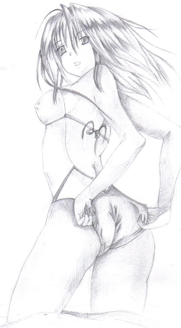
Here's some negative things though. All my comment from here on out is referring to the last two drawing, and not Hao. I think that the body of both is a bit odd. Specifically, I think the body of the sword girl is a bit too big, as well as her hand. In short, fix the proportions. Also, for the same drawing, the legs are very awkward looking (looks like she's about to fall/squat). Again the proportion needs to be worked on. The sheath also looks out of place. Your last drawing: The shoulder looks like it was disjointed. Face is a bit chubby, but that could just me being picky. Also the positioning of the right butt is too far (i.e. it looks weird). Proportion is better, with minor errors For both of them: The eyes are different (i.e. the left one is different from the eye). When you want to change the size and shape, do so properly and appropriately. This, in my opinion, is one of the hardest thing there is to do (alongside with proportions and in my case, clothings). You have a very good potential though, and I can see that you put a lot of effort in this. Continue on drawing. I'm sorry for my rather harsh comments, but I think criticism is good for development. So, remember: Proportions!!! Jinx |
|
|
|
|
2006-07-08, 12:28
|
Link #9 |
|
I will eat your cookies!!
Join Date: May 2006
Location: in my house
  |
hey no prob, its just an issue that drawing at school (in class) is rather harder than drawing at home.. u have to do it fater.. and there are annoying noises and classmates come up and say "hey your good can i watch?" blah blah blah.. anyway, ill put up much better painting in the near future, cuz schools over - paint at home ^^
|
|
|
|
|
2006-07-19, 10:51
|
Link #11 |
|
Kairin-chan's #1 Fan
 Artist ArtistJoin Date: Jul 2003
Location: Canada
|
I like the first 2 and the last one with the bathing suit girl
 Not much to suggest in terms of anatomy and such. If I had to say anything maybe it would be to try and improve the line quality. For example, the bathing suit girl is well drawn, however I think the graininess detracts from the picture a bit. Now this is more or less personal preference since some people like the grany effect. One technique I used to clean my drawings up when I sketched them was to draw it, and then of course the lines would be a little jagged or what have you. So, what I did was, I erased one section at a time (say a shoulder or an arm) but just enough so you could still see where the lines used to be. Then I would redraw what I erased but made an effort to keep it smooth and dark (almost like inking). It worked well for me anyways. I'm weird. Looking forward to more!
__________________
|
|
|
|
 |
|
|


 thank you all i really apreciate it ^^ but sadly.. colouring the last one is too hard.. im not a good vector tracer...