 2012-03-31, 17:48
|
Link #1641 | ||
|
Paparazzi
Join Date: Mar 2008
Age: 41
|
Quote:
Quote:

|
||

|

|
|
2012-04-08, 06:17
|
Link #1644 |
|
sleepyhead
 Author AuthorJoin Date: Dec 2005
Location: event horizon
|
@SweetHoney
Extra little thing you should know about that. It applies to transparency on png as well. Transparency is essentially a different channel so you can think of the transparency of the image as a whole other image on top of your non-transparent image. What this means is, even if you hide part of a image with transparency, it's only visually hidden, but the data is still there; to optimize it either run it though a tool, or paint the invisible things with black or some other color to minimize the size (just select the layer mask to get a perfect selection).
__________________
|
|
|
|
|
2012-04-09, 20:47
|
Link #1645 |
|
Junior Member
Join Date: Mar 2010
|
Hi I have a quick question regarding the use of empty space & how not to make a signature too plain.
Right now I'm currently making a Facebook cover for my charity on a FB Page, as it stands the cover is basically the name of the organization, and what our mission is, however the problem is that its to plain, and looks "awkward" because of the simplicity and the empty space. I'm really not sure what to do to make it looks better/what to add in general, currently I'm using paint.net since I don't have my mac w/ PS on it. Any tips/advice? (can't add pictures). Thanks >_< |
|
|
|
|
2012-04-09, 20:57
|
Link #1646 |
|
Manga Addict
Join Date: Sep 2009
Location: England, UK
Age: 32
 |
Hmm, it's kinda difficult to give some advice based on so little info.
What kind of charity is it? What sort of theme are you going for? If your charity has a logo, maybe adding that in there somewhere, although that could make it look even more awkward Or, take some of the colours used in the logo and use them to make a background.Sometimes, simplicity is best. It's a shame you can post an image of what you have. |
|
|
|
|
2012-04-10, 01:45
|
Link #1647 | |
|
Permanent Lurker
Graphic DesignerJoin Date: Jun 2008
Location: ᶘ ᵒᴥᵒᶅ...hehe
Age: 29
  |
Quote:
I agree with JRendell though, we can't really help you out without having a clear image of your idea 
__________________
|
|
|
|
|
|
2012-04-14, 08:46
|
Link #1648 |
|
Still Alive
Join Date: Aug 2010
Location: Somewhere far far away
Age: 30
|
Could someone tell me how to give lighting effect(assuming they are. I'm new to this
 ) like the one on the sword in this pic.....please. ) like the one on the sword in this pic.....please.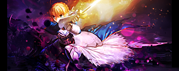
__________________
Last edited by Eragon; 2012-04-14 at 09:04. |
|
|
|
|
2012-04-14, 17:51
|
Link #1649 | ||
|
Manga Addict
Join Date: Sep 2009
Location: England, UK
Age: 32
|
Quote:
Here's a basic lighting tutorial I did a long way back. If you follow it through you'll get to grips with how simple brushes and some layer filters can create some interesting lighting. Once you know the basics, you can then get a bit creative and play around until you create some awesome effects. I'll also give you this .psd of one of my signatures which has lot's of lighting in. It might help. Outbound Link to Hotfile Lemme know if you have any more questions. Quote:
|
||
|
|
|
|
2012-04-14, 18:34
|
Link #1650 |
|
Banned
Join Date: Oct 2010
Location: Philippines
Age: 36
 |
Guys, how do you lower the avatar size without having to cut your frames shorter? I've seen other to have been using so many frames but the size is only 50kb (yes, I check some of them).
Is it because of the transparency? Whats your ideal setting? (1-100) Is it the quality? What's you ideal setting? (1-100) *GIMP user. |
|
|
|
|
2012-04-19, 06:59
|
Link #1654 | |
|
Senior Member
Join Date: Oct 2008
Location: Finland
Age: 33
|
Quote:
__________________
|
|
|
|
|
|
2012-04-21, 00:33
|
Link #1655 |
|
Quietly Lurking
Graphic DesignerJoin Date: Mar 2010
Location: Beneath the prodigious sky...
|
Signature tutorial!
Part 1: Part 2: PSD for reference: http://www.mediafire.com/download.php?5234da6bwayub2i
__________________
Last edited by Rennir; 2013-06-19 at 12:44. |
|
|
|
|
2012-04-21, 21:00
|
Link #1656 |
|
Manga Addict
Join Date: Sep 2009
Location: England, UK
Age: 32
|
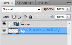
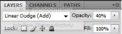
Wow, nice one Rennir! Here's my result;
 I like to use the clipping-mask and linear-dodge lighting effects too. I didn't bother with any text 'cause text is a ballache When I saw you using a fair amount of orange, I thought I'd try at making it look like an explosion happening behind my render. The smudging and clip-masking helped add to that I think.One thing I will mention is the blurring at the end. I'd normally blend the background right at the beginning, before I've even stuck my render on there. That way you don't have to work around what you've already created. I detest C4Ds too, but that's a personal thing
|
|
|
|
|
2012-04-21, 21:35
|
Link #1658 | |
|
Quietly Lurking
Graphic DesignerJoin Date: Mar 2010
Location: Beneath the prodigious sky...
|
Quote:
Yeah, they're pretty great techniques for any gfx artist's arsenal, especially splatter-brushed clipping masks because they're applicable in tons of situations. Don't worry about the text, because a lot of sigs look better without text too The explosion looks great, only thing I would say is to add some smaller particles using a splatter brush to accentuate the effect more. Everything else was pulled off well  Yeah, a lot of that stuff you can do either before or after I probably should've mentioned that. Sometimes I do it in the beginning and sometimes at the end, same with text, lighting, and a bunch of the other details
__________________
|
|
|
|
|
|
2012-04-22, 09:52
|
Link #1659 | |
|
Permanent Lurker
Graphic DesignerJoin Date: Jun 2008
Location: ᶘ ᵒᴥᵒᶅ...hehe
Age: 29
|
Quote:
 ....Thanks for clearing that up! ....Thanks for clearing that up! I will definitely try the tutorial out when I done with my other projects ;D
__________________
|
|
|
|
|
 |
| Tags |
| avatar, graphic, photoshop, signature |
|
|


 .
. 
 .
. 


 .
. 

 .
. 
 .
.  .
. 


 It's a really good tutorial Renn-kun, I think I'll try something out with it too


