2007-07-20, 01:22
|
Link #221 | |
|
Oniai loveru!
 Graphic Designer Graphic DesignerJoin Date: May 2007
Location: South Dakota!
Age: 35
|
Quote:
__________________
|
|

|

|
|
2007-07-26, 17:10
|
Link #224 |
|
阿賀野型3番艦、矢矧 Lv180
Graphic Designer Moderator ModeratorJoin Date: Mar 2006
Location: Belgium, Brussels
Age: 37
|
Oi... not sure if it is so perfect heh...
Here are the 3 banners, which should be in their definite version : Dawn Time :   Day Time :   Dusk Time :   Night Time :   Don't hesitate to comment and criticise... there is still 25 hours for the contest 
__________________
Last edited by Klashikari; 2007-07-26 at 17:34. |
|
|
|
|
2007-07-27, 05:57
|
Link #226 |
|
阿賀野型3番艦、矢矧 Lv180
Graphic DesignerModeratorJoin Date: Mar 2006
Location: Belgium, Brussels
Age: 37
|
^ not sure if it was that quick.
but yeah, 3 banners in a go isn't something I have ever done, and i'm not really fond of rushed work huh... that said, since the extension are still in a rather awkward state, i will wait for a definite declaration about this. If the show goes on, i will probably change various thing, especially the Gradient, considering it isn't set in stone apparently. that said, i believe i will do a signature, it has been a long time ~~"
__________________
|
|
|
|
|
2007-07-27, 08:34
|
Link #227 |
|
sleepyhead
AuthorJoin Date: Dec 2005
Location: event horizon
|
Your 3rd submission for the Banner contest and the 1st 2nd and 4th of the xBanner contest are buggy at the edges. Especially the Night one. Don't you see them?!
What I do... Before I do anything, I get the marque and select a few pixels on the left and on the right and with it create a layer for the sides. I then take that layer and stick it on top as a forground and lock it. Now sure I'm sacrificing a few pixels in width, but if I go out of bounds it strikes me in the face right away. Another method would be to set 2 guides for the extreme left and right, then extend the canvas and gradient. After it's extended do the above for the extention (marque should snap to the guides) Hide the guides while your working, when your done, un-hide the guides and crop-snap to a perfect banner. - BTW, that's one looong Higurashi review you wrote, again. I think it's better if you place your thoughts on top, some people might just want to take a little spoiler in instead of the full package.
__________________
|
|
|
|
|
2007-07-27, 08:46
|
Link #228 | |||
|
阿賀野型3番艦、矢矧 Lv180
Graphic DesignerModeratorJoin Date: Mar 2006
Location: Belgium, Brussels
Age: 37
|
Quote:
It is really weird why you are finding something wrong on the second Xbanner, since it is absolutely the same from the regular contest. i don't see any problem with the first Xbanner either. However, i noticed the gradient problem on the night banner. (left edge, that is what i can see) but anyway, i believe it is something i shouldn't care much, considering what NW said on the thread, we might get customized or other gradients for these. that said, i wasn't really able to notice any noticeable points... 3 banners in a go, at late time isn't something healthy for concentration. Quote:
the second method i use is simply duplicate the gradient template, putting it on the top, and sliding to see if there is a problem. Quote:
furthermore, I think the episode structure itself is separated enough, and a simple "end key" can quickly get through without any spoiler. again, it is rather the responsability of the readers, not mine, and it is quite a regular format for "review then my thoughts" type of entry (which is also used by the other bloggers, so I think keeping this structure is fine enough). oh well ~~
__________________
|
|||
|
|
|
|
2007-07-27, 08:56
|
Link #229 | |
|
~ You're dead ^__^* ~
Graphic DesignerJoin Date: Apr 2006
Location: uk, England
Age: 34
 |
Quote:
if you highlight the side tabs and see where they meet the banner i cant see anything wrong ~ as for the summary...it is only natural to put your thoughts after you made a summary on the eps itself...and for those who dont like the full package they can just skip down :3
__________________
|
|
|
|
|
|
2007-07-27, 10:13
|
Link #230 |
|
sleepyhead
AuthorJoin Date: Dec 2005
Location: event horizon
|
What I see is a hair thin edge were the transition from the gradient to what appears to be wind-effects in the banner. But I guess this is too nitpicky stuff. Except for the Dawn and Night one. The night is obvious, on the dawn one look at the bottom right edge. What is that little messy line doing there?
 Oh yeah the 3rd from the Banner contest has a little white on the bottom right corner that should probably deleted.
__________________
|
|
|
|
|
2007-08-01, 11:11
|
Link #231 |
|
阿賀野型3番艦、矢矧 Lv180
Graphic DesignerModeratorJoin Date: Mar 2006
Location: Belgium, Brussels
Age: 37
|
geh... no more "banner stress" (well maybe later for the extension, with various tweeks)
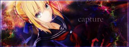
that's said, finally a sig after all this time. another "Singing Swordmaiden"  Another charming source pic   First, if you didn't notice (which would relieving me ^^), the left part of the sig was a "transplant". I took me 1 hour for this job, and i'm not too disppointed of this. Various work besides the added cloth : smudges, brushes, and some other tweeks..." the text is a bit narrow, but i don't have the place oh well ^^"
__________________
|
|
|
|
|
2007-08-01, 11:20
|
Link #232 | |
|
Retired
Graphic DesignerJoin Date: Mar 2007
Location: Princeton University
|
Quote:
omg she is HAWT lolVery nice job on the "transplant" as you call it I really can't tell the difference from the original to be frank Hehe ns job again and good work ^ ^b
__________________
|
|
|
|
|
|
2007-08-01, 11:26
|
Link #233 |
|
Thinking outside the box
Graphic DesignerJoin Date: May 2007
Location: The Netherlands
Age: 37
|
Yarr i shall be the first to comment on it than.
Awesome render choice. And gj on recreating the cloth. The overall look is nice. Just my 2 cent would be. Lower the render a bit so we can see more of her face. Or make the render smaller. It should give you more space for the text at the same time. Personally i think making the render smaller and recreating more of the cloth at the left would be the best. Btw what anime is she from? Edit: ./moo ice_climber was first ^.^
__________________
|
|
|
|
|
2007-08-01, 11:36
|
Link #234 | |
|
阿賀野型3番艦、矢矧 Lv180
Graphic DesignerModeratorJoin Date: Mar 2006
Location: Belgium, Brussels
Age: 37
|
Quote:
Also, i must admit i'm a bit lazy and unfortunately, i merged the layers this time (otherwise, the additional cloth wouldn't blend with the main render :/) thus, if i redo the sig, i will have to redo that part @.@ oh well, i will try to do it someday... if i have the courage to do so as for her identity, i don't have a clue, and i'm asking in the ID thread XD
__________________
|
|
|
|
|
|
2007-08-01, 11:43
|
Link #235 | |
|
hiatus almost permanent
Join Date: Apr 2007
|
Quote:
I like the signature alot actually xP. I think the crop is very artistic. The cloth recreation is v.great, needlesstosay, but it seems blurred as compared to the other parts of the cloth. But it's still very nice =3 However, as opposed to Sephi, I would have thought raising the render to see less of the face would be more appropriate. It shows less of the character and more of the... concept, yes! Dunno, but again I have no talent for graphics designing, so. Might as well take Sephi's suggestion ^^. |
|
|
|
|
|
2007-08-01, 11:54
|
Link #236 | |
|
Retired
Graphic DesignerJoin Date: Mar 2007
Location: Princeton University
|
Quote:
but that is just IMHOagain, great job =]
__________________
|
|
|
|
|
|
2007-08-01, 15:21
|
Link #237 | |
|
阿賀野型3番艦、矢矧 Lv180
Graphic DesignerModeratorJoin Date: Mar 2006
Location: Belgium, Brussels
Age: 37
|
Quote:
i must admit that Innominate idea to crop more, to leave only the mouth might work even more (something sensual huh ? ^^') that said, it can't be really helped for various instances, considering the size. (not that i'm complaining of the height... i sometimes wanted to reduce it again, into 100 pxl) oh well, by the way, aohige answered about who it is ^^ for the lazy guys : Tamami Minatogawa, from Moshimo Ashita ga Hare naraba (eroge, as expected)
__________________
|
|
|
|
|
|
2007-08-13, 18:48
|
Link #240 |
|
阿賀野型3番艦、矢矧 Lv180
Graphic DesignerModeratorJoin Date: Mar 2006
Location: Belgium, Brussels
Age: 37
|
Haha, thanks for your support ^^
Well, finally could pull something else than "swordmaiden"... (well i lied... she is somewhat related to this ) Suigintou (talk about obvious ^^") Geh, just finished the series not long time ago, so it was kinda fresh, thus... why not a signature on my favourite character, humm? (i'm absolutely not sure about a "Rozen Maiden" set, considering the horrible amount of renders for Karania, Hina and kirakishou -___-") Considering how mercury lam... i mean gin (^^") is, i tried something not that fancy. not sure if i was able to enforce the focal point on the rosa mystica. Wasn't able to find a proper "gothic" or rather "stylish" background, so it is the usual nightish one, with some light and the usual window ^^"
__________________
Last edited by Klashikari; 2007-08-13 at 19:09. |
|
|
|
 |
|
|