AnimeSuki Forums

Register Forum Rules FAQ Community Today's Posts Search

Go Back   AnimeSuki Forum > Anime Related Topics > Fan Creations

Notices

Reply
 
Thread Tools
Old 2008-12-06, 15:43   Link #681
escimo
Paparazzi
 
 
Join Date: Mar 2008
Age: 41
Quote:
Originally Posted by Hakuryu View Post

(The text on the right translates to Amaterasu)
Whoa!
That's very very good. Beautiful, I love it.

Did I say it's very very good. Well it is.
escimo is offline   Reply With Quote
Old 2008-12-06, 17:42   Link #682
Ice Climbers
Retired
*Graphic Designer
 
 
Join Date: Mar 2007
Location: Princeton University
Quote:
Originally Posted by Hakuryu View Post

(The text on the right translates to Amaterasu)
That is indeed very very well done, I love the flow (gives me a sense of impact ) . Great job Haku-chan ^^
__________________
Ice Climbers is offline   Reply With Quote
Old 2008-12-07, 14:02   Link #683
Hakuryu
Klutz
 
 
Join Date: Jun 2007
Location: California
Age: 32
Wow, I'm so glad everyone liked this sig, I'm surprised. xD
Quote:
Originally Posted by AtomicoX View Post
Wonderful sig, especially the colors. The render blends in just about perfectly, and the background is really sweet. Also, good choice to put the text on the right and make it kinda seperate from the rest. Doesn't attack the rest in any way.
Thanks Atomico. I had such a difficult time figuring out what to do with the text since once I was done I couldn't find a good place to put it. I'm glad you think it fits on the side like that, I didn't want it to take the attention away from the sig itself.
Quote:
Now that you mention it, I agree.
Haku! You must do a vector of it and resize +x100. Imagine the result...
Haha...ha...ha.
NO WAY. That...wouldn't even be possible for me. Or is it...?
Quote:
Originally Posted by Larthak View Post
Niiice. Now THIS is art in its true form. Love it, love it, love it!

One of the few sigs, that would look absolutely fabulous even as a real picture hanged on a wall somewhere...
Wow, thanks so much. It makes time well spent with comments like yours.


Quote:
Originally Posted by Marina View Post
Joining in on the worship of your new Okami sig ^_^
It really is a gorgeous image, and I love all those circle-thingies surrounding Ammy... are those brushes? They look great!
The circle thingies are actually from a stock image I found on DeviantArt, I didn't have the patience to do them with the pen tool at the time. xD

Quote:
Originally Posted by Ledgem View Post
Agreed, the new Okami signature looks fantastic. The dark outlines of the objects around Amaterasu really maintain the feel of the game.
Ooh, Ledgem got it! That's exactly what I was going for. I'm so happy you noticed.

Quote:
Originally Posted by escimo View Post
Whoa!
That's very very good. Beautiful, I love it.

Did I say it's very very good. Well it is.
Quote:
Originally Posted by Ice Climbers View Post
That is indeed very very well done, I love the flow (gives me a sense of impact ) . Great job Haku-chan ^^
Sankyuu, to you both.


To share; I used this stock for my previous Okami sig. Much love to it's creator. ♥

And another sig I made as a request on another forum. Not AS-safe.

If anyone wants it, I can make it AS safe. ^^
__________________
Hakuryu is offline   Reply With Quote
Old 2008-12-07, 14:43   Link #684
Mon Cheri
nope
*Graphic Designer
 
 
Join Date: Jun 2007
Quote:
Originally Posted by Hakuryu View Post
And another sig I made as a request on another forum. Not AS-safe.

If anyone wants it, I can make it AS safe. ^^
Is that Miharu and Yoite?
It looks good! And so does your current siggy

Keep up the good work
Mon Cheri is offline   Reply With Quote
Old 2008-12-08, 16:43   Link #685
Hakuryu
Klutz
 
 
Join Date: Jun 2007
Location: California
Age: 32
^ I believe that's who they are, not too sure though. ^^;

Some very overdue Lucky Star OVA avatars. (I finally got a good raw)


__________________
Hakuryu is offline   Reply With Quote
Old 2008-12-08, 16:52   Link #686
Marina
~La-la Land~
*Graphic Designer
 
 
Join Date: Jul 2007
Location: Seattle
Age: 37
Cherry-chan! Baka-inu....maguro...

Great avatars as always Haku-chan, I'd like to fetch this one:
__________________
My Anime Blog:
Anime B&B
Follow me on Twitter!
_________________

Co-host of Kaiseki Anime Podcast
Find us on Apple Podcasts and Google Play
_________________

AniList

Sig: HSxHoneycomb
Marina is offline   Reply With Quote
Old 2008-12-08, 17:25   Link #687
NorthernFallout
The Interstellar Medium
*Author
 
 
Join Date: May 2008
Location: [SWE]
Age: 34
Oh no...Yutaka...moe...3 of them! And Tsukasa! OVERLOAD *reaches for insulin but don't make it in time*
__________________

NorthernFallout is offline   Reply With Quote
Old 2008-12-08, 19:59   Link #688
Daniel E.
AniMexican!
 
 
Join Date: Dec 2005
Location: Monterrey N.L. Mexico


Miyuki-Chan I still love you!

Nice work on the whole set. It really pays off when you wait for a good source to show up.
__________________
Daniel E. is offline   Reply With Quote
Old 2008-12-10, 15:36   Link #689
Avantoe
In Memories
*Graphic Designer
 
Join Date: Apr 2007
Great stuff Haku-chan! But where is the Cosplay Konata love
Avantoe is offline   Reply With Quote
Old 2008-12-11, 18:13   Link #690
Hakuryu
Klutz
 
 
Join Date: Jun 2007
Location: California
Age: 32
Quote:
Originally Posted by Avantoe View Post
Great stuff Haku-chan! But where is the Cosplay Konata love
I didn't make much of Konata and Kagami since there were already quite a few in the Lucky Star avatar thread.

Kagamiku Vector for Marina-chan! I didn't forget.

Whee~ It's also wallpaper sized~

Psst...Daniel-kun, I HATE using colored lines. xD
__________________
Hakuryu is offline   Reply With Quote
Old 2008-12-11, 18:25   Link #691
TheZap
Mod Magnet XD
 
Join Date: Nov 2008
Hey Haku,
I saw some of these works on another site, do you show your work to another site or is it a theft?
You want me to PM the site to you?
TheZap is offline   Reply With Quote
Old 2008-12-11, 19:04   Link #692
Daniel E.
AniMexican!
 
 
Join Date: Dec 2005
Location: Monterrey N.L. Mexico
Quote:
Originally Posted by Hakuryu View Post
Psst...Daniel-kun, I HATE using colored lines. xD
I'll admit that they are a bit tricky to use unless you are used to them.

Unlike black outlines, you cannot simply connect all points using colors. You need to follow an specific layer order for specific parts and you always need to respect that order.

Regardless, I think you ended up with a very cute vector, and I seriously believe colored outlines helped in that regard.
__________________
Daniel E. is offline   Reply With Quote
Old 2008-12-11, 20:18   Link #693
Marina
~La-la Land~
*Graphic Designer
 
 
Join Date: Jul 2007
Location: Seattle
Age: 37
Quote:
Originally Posted by Hakuryu View Post
Kagamiku Vector for Marina-chan! I didn't forget.

Whee~ It's also wallpaper sized~
Well....I forgot! Hehehe, but now I remember, thank you so much! It looks great, I'll have to ask you tips on vectoring someday if and when I try it...
*shifts vector to personal files for later use*
I'll make sure to credit you when I use it
__________________
My Anime Blog:
Anime B&B
Follow me on Twitter!
_________________

Co-host of Kaiseki Anime Podcast
Find us on Apple Podcasts and Google Play
_________________

AniList

Sig: HSxHoneycomb
Marina is offline   Reply With Quote
Old 2008-12-13, 12:27   Link #694
Hakuryu
Klutz
 
 
Join Date: Jun 2007
Location: California
Age: 32
Quote:
Originally Posted by Daniel E. View Post
I'll admit that they are a bit tricky to use unless you are used to them.

Unlike black outlines, you cannot simply connect all points using colors. You need to follow an specific layer order for specific parts and you always need to respect that order.

Regardless, I think you ended up with a very cute vector, and I seriously believe colored outlines helped in that regard.
It's very frustrating sometimes working with them. I wasn't sure what order to put them in so I ended up going back and erasing some of the lines for it to look more pleasing to the eye.

Is there a trick to knowing what colors go on top? I'm used to just using one layer for the out line, and I ended up having about 6 or so. xD

But I'm glad you do think it turned out well. ^^

Quote:
Originally Posted by Marina View Post
Well....I forgot! Hehehe, but now I remember, thank you so much! It looks great, I'll have to ask you tips on vectoring someday if and when I try it...
*shifts vector to personal files for later use*
I'll make sure to credit you when I use it
You forgot? xD Silly Marina-chan~
And you're very welcome, happy to hear you like it.


And now, a Colette Signature.

Text didn't work out as much as I had hoped. And I need to get some help on levels as well as curves, because there isn't as much "depth" on the sig as I'd hoped. ^^;

Geez, my style keeps changing...>.>;;
__________________
Hakuryu is offline   Reply With Quote
Old 2008-12-13, 14:21   Link #695
The Chaos
ǾΝΈ ΡЇΈÇΈ is the Best !!
 
 
Join Date: Apr 2007
Location: away from you
Age: 35
Quote:
Originally Posted by Hakuryu View Post
Cute work on these avatars Haku-Chan
__________________
The Chaos is offline   Reply With Quote
Old 2008-12-13, 18:48   Link #696
Daniel E.
AniMexican!
 
 
Join Date: Dec 2005
Location: Monterrey N.L. Mexico
Quote:
Originally Posted by Hakuryu View Post
Is there a trick to knowing what colors go on top? I'm used to just using one layer for the out line,
Not much of a trick, but you can always try to visualize the order of every element before you even start tracing.

Such as hair accesories wich usually go on top of the hair, face outlines that usually go below the hair, clothing outlines that covers the skin ones and so on and so on.

There are always exceptions, but if you plan ahead, you can easy the process of colored outlining greatly.

Quote:
Originally Posted by Hakuryu View Post
I ended up having about 6 or so. xD
I always split the trace in subsections to give myself more freedom to make changes. Up to 3 or 5 layers for every big or complicated part within a trace.


-Hair outlines
-Layer 01
-Layer 02
-Layer 03
-Skin outlines
-Layer 04
-Layer 05
-Layer 06

"Hair outlines" and layers 1,2 and 3 are only used for the hair, whereas "Skin outlines" and the ones below are (obviously) for the skin parts of the character.

I never repeat a line in the same layer and I never use two colors within the same section. Of course, this is just the basic of it; If the hair covers the face but the arms cover a bit of hair, what is one to do?

You create even more layers, of course!

-Skin extra outlines
-Hair outlines
-Layer 01
-Layer 02
-Layer 03
-Skin outlines
-Layer 04
-Layer 05
-Layer 06
-Hair extra outlines

You could always try to use the eraser tool and avoid all this, but for the most part, I try hard not to rely too much on it.

Once everything is set, I merge all the sublayers (with some exceptions here and there) and end up with the following:

-Skin extra outlines
-Hair outlines
-Skin outlines
-Hair extra outlines

With this, I usually have a total of 25 - 40 layers just for outlines........and just for one character.
__________________
Daniel E. is offline   Reply With Quote
Old 2008-12-15, 10:02   Link #697
Nikusu
Senior Member
 
 
Join Date: Apr 2008
Age: 36
Send a message via AIM to Nikusu Send a message via MSN to Nikusu


haha YES! Yume Miru Katsuri or something like that. Don't ask how I know. I've seen your work all over the place, but I think this is my first visit to your thread. You're quite the master of animated and transparent work.
Nikusu is offline   Reply With Quote
Old 2008-12-17, 17:34   Link #698
Hakuryu
Klutz
 
 
Join Date: Jun 2007
Location: California
Age: 32
OMG, Daniel-kun that has helped so much. Thanks! Cookied~

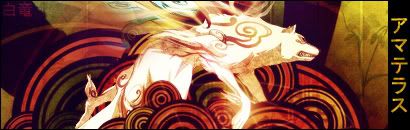
Lv, why do you bring up one of my OLDEST sigs. Lulz, it looks so horribly plain. But thanks for your kind words.


Just one sig this time.

Made for a friend of mine.
__________________
Hakuryu is offline   Reply With Quote
Old 2008-12-17, 17:43   Link #699
NorthernFallout
The Interstellar Medium
*Author
 
 
Join Date: May 2008
Location: [SWE]
Age: 34
Let me just say that this sig is completed simply by the light. The light rays seems to be in the right place and the clouds in the bg fit in with that. The render also, somehow, fits in, even if the color contrast a bit much. However, the contrast does help against the slightly red bg. Good thing you skipped the text too as it would ruin the calmness I feel.
All in all, a great sig as usual.
__________________

NorthernFallout is offline   Reply With Quote
Old 2008-12-18, 16:32   Link #700
Nikusu
Senior Member
 
 
Join Date: Apr 2008
Age: 36
Send a message via AIM to Nikusu Send a message via MSN to Nikusu
I bring it up because it's OH SO cute regardless of age. Simplicity can also look MUCH better than a cluttered signature. And that new signature is... Basically everything AtomicoX said. Except I like contrast so that signature is my idea of perfection. You really picked good spots for the lighting.
Nikusu is offline   Reply With Quote
Reply

Tags
avatars, okami


Posting Rules
You may not post new threads
You may not post replies
You may not post attachments
You may not edit your posts

BB code is On
Smilies are On
[IMG] code is On
HTML code is Off

Forum Jump


All times are GMT -5. The time now is 19:55.


Powered by vBulletin® Version 3.8.11
Copyright ©2000 - 2024, vBulletin Solutions Inc.
We use Silk.