2012-01-02, 05:22
|
Link #63 |
|
<em style="color:#808080;">Disabled By Request</em>
Join Date: Jul 2009
Location: Australia
  |
I never watched any of the Onegai series, so I can't compare it with the two PVs. Nonethelss, whilst PV2 gave me Anohana vibes, this PV (PV3) is giving me Toradora vibes. Hence, I predict a series that's going to be a Anohana/Toradora mix, hopefully combining the best elements of the two series. I have faith in Negai as a director when it comes to "real world" settings (aka slice of life), much like I like had faith in Kenichi Kasai who I think is most comparable (Kasai did a lot of the traditional noitamina shows such as Honey and Clover S1 and the three Nodame Cantabile seasons).
Probably my highest anticipated series of the season, alongside P A Works "Another". Cmon J C Staff... show me some of your past spark for once... |

|

|
|
2012-01-02, 06:02
|
Link #64 |
|
Senior Member
Join Date: Jul 2009
|
I dunno. They've both been successful with dramas, but their styles and sensibilities don't seem similar at all. In particular, Nagai has established a distinct identity to his work (facial animation style, framing that's reused across various shows and OP/ED sequences, heavy-handed approach to melodrama) ever since directing Toradora.
At any rate, the PV borrows strongly from Railgun too. |
|
|
|
|
2012-01-02, 06:09
|
Link #66 | |||
|
<em style="color:#808080;">Disabled By Request</em>
Join Date: Jul 2009
Location: Australia
|
Quote:
Quote:
Quote:
|
|||
|
|
|
|
2012-01-02, 06:12
|
Link #67 | |
|
Criminal Unrequitor
 Graphic Designer Graphic DesignerJoin Date: Jul 2010
|
Quote:
Also in regards to JC Staff coloring, I actually find it very appealing if used properly. It gives a more faded vibe, and its unique to be honest. The only reason it somehow looks generic is because they produce way too much shows, half of which are terrible.
__________________
|
|
|
|
|
|
2012-01-03, 15:05
|
Link #69 | |
|
Member
Join Date: Mar 2007
|
Quote:
I'll take a few episodes at this show to see how it does. It looks liked a good average show to watch. |
|
|
|
|
|
2012-01-03, 21:01
|
Link #70 |
|
Try me! <3
Join Date: Apr 2011
Location: Germany
Age: 40
|
Don't like the chara designs much, especially that one guy is just plain horrible:
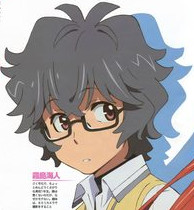 The 70s called and want heir hair style back, and their glasses, too. Ewww. *shudders* Then still dark grey hair on top of that. Double ewww. Overall colouring is poorly done, too ") Never liked the "Onegai" series, and it looks like this one will do nothing to change that.
__________________
|
|
|
|
|
2012-01-04, 04:10
|
Link #72 | |||
|
Banned
Join Date: Jun 2004
Location: London
Age: 43
 |
AnoHana/ToraDora vibes? Well, both revolving around love polygons, indeed, but that can be said for any rom-com, right? I doubt though that a character would turn out to be a ghost. In addition, not being in NoitaminA will give it 40-90 minutes more to develop characters, and save it from all its other lame restrictions
 Quote:
Quote:
|
|||
|
|
|
|
2012-01-04, 04:17
|
Link #73 | |
|
Hyakko Fanboy
Join Date: Nov 2008
Age: 32
|
Quote:
__________________
|
|
|
|
|
|
2012-01-04, 04:27
|
Link #74 |
|
Banned
Join Date: Jun 2004
Location: London
Age: 43
|
Switch "old" with "retro" and I will agree
 SHAFT used a similar approach in Natsu no Arashi to a great effect... at least in the visual appeal department SHAFT used a similar approach in Natsu no Arashi to a great effect... at least in the visual appeal department And it's way better than some recent attrocities, like P4's sunburned skin, or Maken-ki's and other H's skin irritation, in the place of highlights 
|
|
|
|
|
2012-01-04, 04:35
|
Link #75 | |
|
Hyakko Fanboy
Join Date: Nov 2008
Age: 32
|
Quote:
P4's sunburned effect is indeed looked ugly n useless, but that's rather facial but not coloring problem in general.
__________________
|
|
|
|
|
|
2012-01-04, 04:42
|
Link #76 |
|
Banned
Join Date: Jun 2004
Location: London
Age: 43
|
For Natsu no Arashi I had in mind the WWII scenes, and the first couple of episodes, generally it might have been less yellowish and/or blurred... but don't take my word for it, it's been quite some time since I watched it.
|
|
|
|
|
2012-01-04, 05:38
|
Link #77 |
|
Senior Member
Join Date: May 2004
|
I liked Onegai Twins, but not Onegai teacher. And watching the PV it give me the Onegai teacher vibes.
 I'm guessing why ...   Now I understand why they give the MC a so non-standard, just to be nice, design.  
__________________
Last edited by Arya; 2012-01-04 at 06:13. Reason: put pics on the same line |
|
|
|
|
2012-01-04, 05:56
|
Link #78 |
|
Banned
Join Date: Jun 2004
Location: London
Age: 43
|
Let complete this comparison...
  Rennon <- Ichigo (hair colour, troll, uniform, pettanko... probably more)   Mio <- Kaede (hair colour, doujiko, oppai, manner of dressing) Kanna <- Koishi@Teacher or Karen@Twins... that's the only not fitting very well, maybe EDIT: Ichigo, Koishi, and Kaede had the most interesting stories, let's hope the 2012 adaption will live up to its predecessor EDIT2: Changed host for the images, now they should work fine for everyone. Last edited by Malkuth; 2012-01-04 at 06:53. |
|
|
|
|
2012-01-04, 10:47
|
Link #80 | |
|
Senior Member
Join Date: Jul 2011
|
Quote:
As for the coloring ... well, JC Staff is no KyoAni or PA Works, but I don't think that's a bad thing in itself. Kimi to Boku is even rougher than these previews (and some of the characters downright ugly -- sorry Shun) but that doesn't make it any less enjoyable for me. |
|
|
|
|
 |
| Tags |
| romantic comedy, shounen |
|
|